Download
User Rating: 1.7/5 ( 4 votes)
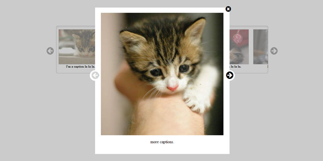
baguetteBox.js - Simple and easy to use lightbox script in pure JavaScript
Features
-
Written in pure JavaScript, no dependencies required
-
Multiple galleries support with custom options each
-
Touch-screen devices support with swipe gestures
-
Modern and minimal look
-
Image captions support
-
Responsive images
-
CSS3 transitions
-
SVG buttons, no extra files to download
-
Around 1.9KB gzipped
Compatibility
-
IE8+
-
Chrome
-
Firefox 3.6+
-
Opera 12+
Source: github.com
1. INCLUDE CSS AND JS FILES
<link rel="stylesheet" href="css/baguetteBox.min.css">
<script src="js/baguetteBox.min.js" async></script>
2. HTML
<div class="gallery">
      <a href="img/2-1.jpg" data-caption="Additional image caption"><img src="img/thumbs/2-1.jpg"></a>
      <a href="img/2-2.jpg"><img src="img/thumbs/2-2.jpg"></a>
    ...
</div>
To use captions, put data-caption attribute on a tag.
3. JAVASCRIPT
baguetteBox.run('.gallery', {
    // Custom options
});
4. OPTIONS
{
  captions: true,       // true|false - Display image captions
  buttons: 'auto',      // 'auto'|true|false - Display buttons
  async: false,         // true|false - Load files asynchronously
  preload: 2,           // [number] - How many files should be preloaded from current image
  animation: 'slideIn'  // 'slideIn'|'fadeIn' - Animation type
}
5. RESPONSIVE IMAGES
To use this feature, simply put data-at-{width} attributes on a tags with value being a path to the desired image. {width} should be the maximum screen width at which the image can be displayed. The script chooses the first image with {width} being bigger or equal to the current screen width for best user experience.
That's how the HTML code can look like:
<a href="img/2-1.jpg"
  data-at-450="img/thumbs/2-1.jpg"
  data-at-800="img/small/2-1.jpg"
  data-at-1366="img/medium/2-1.jpg"
  data-at-1920="img/big/2-1.jpg">
    <img src="img/thumbs/2-1.jpg">
</a>
If you have 1366x768 resolution it'll choose "img/medium/2-1.jpg". If, however, it's 1440x900 it'll choose "img/big/2-1.jpg". Keep href attribute as a fallback (link to a bigger image eg. Full HD).
 JS Tutorial


