- Overview
- Documents
SkinnyTip is a JavaScript tooltip library that produces customizable popup tooltips based on easy configuration variables. There are many tooltip libraries out there, but most are overly-burdoned with unnecessary features, making packages too large for some applications.
The SkinnyTip tooltip library is under 10kb in size, and supports the latest versions of IE, Firefox, and Netscape. View browser compatibility chart.
SkinnyTip is also available as a Wordpress plugin, which allows you to generate SkinnyTip Tooltips easily when you create a post in your Wordpress site.
Best of all, SkinnyTip is easy to install and configure. Very easy. And it is free!
Easy Setup Instructions
To use skinny tip, you must do three things:
- Include skinnytip.js in the head section of your web page
- Include a special html div tag in the body of your page
- Attach the tooltip by setting onmouseover and onmouseout properties of the link, button, or graphic.
Include skinnytip.js Details
To include the skinnytip.js file in your web page, you need to insert the following code into the head section of your html code.
<script type="text/javascript" src="skinnytip.js">
<!-- SkinnyTip (c) Elliott Brueggeman -->
</script>
Include Div Tag Details
Next, you have to include this div tag in the body of your
<div id="tiplayer" style="position:absolute; visibility:hidden; z-index:10000;"></div>
Attaching the Tooltip
Lastly include the onmouseover and onmouseout properties in the tag of the link, button, or graphic that you want to attach the tooltip to in your html.
<img src="lightbulb.png" onMouseOver="return tooltip('Tooltip text.', 'Tooltip Title'
,'width:200');" onMouseOut="return hideTip();">
The two functions called are the tooltip() function and the hideTip() function. The tooltip function takes three arguments.
- The first argument (required) is the tool tip text.
- The second (optional) is the tooltip title.
- The last argument is the tooltip configuration paramaters separated by commas.
The hideTip() function should be called on the onMouseOut property to close the tooltip. Note the "return" before the calls to the functions. This is important!
Example Tooltip Function Calls
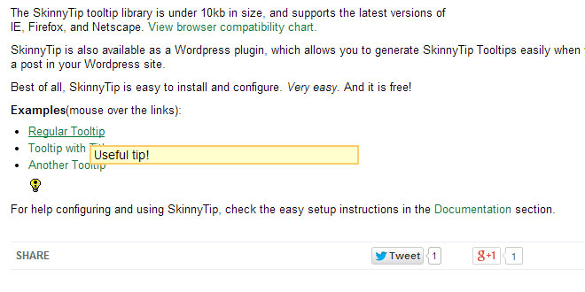
Example 1: Basic tooltip using SkinnyLib defaults for color and layout.
<a href="#" onmouseover="return tooltip('Useful tip!');" onmouseout="return hideTip();"
onClick="return false;">View tooltip</a>
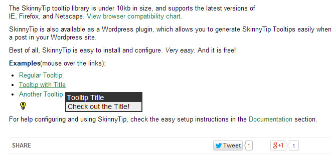
Example 2: More advanced tooltip
<a href="#" onMouseOver="return tooltip('Yet another tool tip.', 'Tooltip Title',
'width:200, border:5, fontsize:16, titlefontsize:16, bordercolor:#FF0000,
textcolor:#FF0000');" onmouseout="return hideTip();" onClick="return false;">
View tooltip</a>
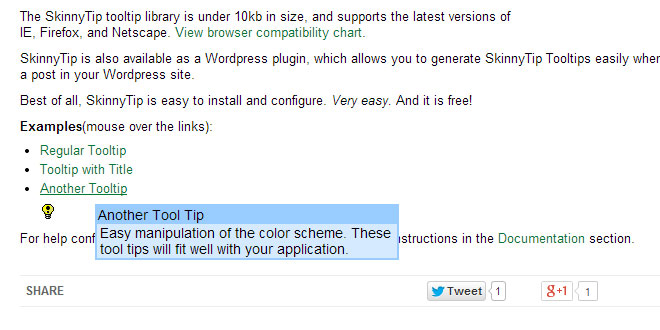
Example 3: Another advanced tooltip.
<a href="#" onMouseOver = "return tooltip('Tooltip Text!', 'Tooltip Title',
 'width:150, titletextcolor:#FFFFFF, bordercolor:#333333, backcolor:#EEEEEE');"
onmouseout="return hideTip();" onClick="return false;">View tooltip</a>
Example 4: Tooltip attached to an image.
<img src="http://www.ebrueggeman.com/sites/www.ebrueggeman.com/files/images/icon_lightbulb.png"
alt="Tooltip" width="16" height="16" onMouseOver="return tooltip('Yet another tool tip.',
'Image Tooltip', 'width:200,border:5,cellpad:5,textsize:3,titletextsize:3,textcolor:#FF0000');"
onMouseOut="return hideTip();" onClick="return false;"/>
For details on all the variables that you can use to configure your SkinnyTip Tooltip, see the Configuration Variable Reference (below.)
Note: in the above examples you'll notice that the links are "dummy links," as they don't actually go anywhere. The link is used to get the user's attention so they will put their mouse over the link and see the tooltip, but the link won't go anywhere when clicked. To make a dummy link, put # as the link destination and add the property onClick="return false;" to the tag.
Configuration Variable Reference
The following variables can be set during in the call to the tooltip function. The arguments should be in the form: 'variable:argument,variable:argument' or they will not work. See above usage examples.
| Variable | Default Value | Description |
|---|---|---|
| width | 300 | The width of the tooltip box in pixels. |
| border | 2 | The border size in pixels. A 0 value means no border. |
| title_padding | 1px | Padding inside the title area, if there is a title specified. Note that this argument is in the css style of padding formatting. You must include the px when specifying this configuration variable. |
| content_padding | 1px 3px | Padding inside the tooltip text area. Note that this argument is in the css style of padding formatting, so it is set to 1px padding on the bottom and top, and 3px padding on the right and left. You must include the px when specifying this configuration variable. |
| bordercolor |
#FFCC66 |
The border color, which is also the background color of the title text, if a title is included. #FFCC66 = orange yellow. |
| backcolor | #FFFFCC | The background color of the tooltip box. #FFFFCC = light yellow. |
| textcolor | #000000 | The color of the tooltip text. #000000 = black. |
| titletextcolor | #000000 | The color of the tooltip title text. #000000 = black. |
| fontface | Arial, Helvetica, Sans-Serif | The font family specification of both the tooltip text and title |
| fontsize | 14 | The font size of the tooltip text, in pixels. |
| titlefontsize | 14 | The font size of the tooltip title, in pixels. |
| xoffset | 15 | Number of pixels the tooltip is horizontally from the cursor, in pixels. |
| yoffset | 15 | Number of pixels the tooltip is vertically from the cursor, in pixels. |
 JS Tutorial
