- Overview
- Documents
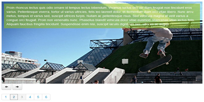
Moodular is a jQuery plugin which allows to create carousel/slider very easily.
Moodular comes from the contraction of two words : mood & modular.
- Mood for many reasons likes "in the mood - Glenn Miller", ...
- Modular because this plugin has some modules integrated (controls & effects).
It's modular too, cause you can create your own controls & effects to perform your personal carousel
Le HTML
<ul id="moodular">
	<li><p style="background-image: url(photo1.jpg);">Lorem...</p></li>
	<li><p style="background-image: url(photo2.jpg);">Quisque...</p></li>
	<li><p style="background-image: url(photo3.jpg);">Proin...</p></li>
	<li><p style="background-image: url(photo4.jpg);">Phasellus...</p></li>
	<li><p style="background-image: url(photo5.jpg);">Phasellus...</p></li>
	<li><p style="background-image: url(photo6.jpg);">Vestibulum...</p></li>
</ul>
Le CSS
#moodular {
	overflow: hidden;
}
#moodular, #moodular li {
	margin: 0;
	padding: 0;
	list-style: none;
	width: 100%;
}
Le JavaScript
jQuery('#moodular').moodular({
/* core parameters */
	// effects separated by space
	effects: 'mosaic',
	// controls separated by space
	controls: 'keys',
	// if you want some yummy transition
	easing: '',
	// step
	step: 1,
	// selector is to specify the children of your element (tagName)
	selector: 'li',
	// if timer is 0 the carrousel isn't automatic, else it's the interval in ms between each step
	timer: 5000,
	// speed is the time in ms of the transition
	speed: 2000,
	// queuing animation ?
	queue: false,
/* parameters for controls or effects */
	// keys control
	keyPrev: 37, // left key
	keyNext: 39, // right key
	// mosaic effects
	slices: [10, 4],
	mode : 'random',
	// others
	your_params : 'cause you can create your own effect or control'
});
Technical part
Moodular has 3 public methods :
- start: start the moodular. what did you expect ?
- stop: stop the moodular. easy, no ?
- moveTo: go to the element which correspond to the index passed in argument ( integer )
Moodular has public parameters :
- $element: the DOM element where event are binded and the moodular container
- opts: the options
- current: the current position
- next: the next position, used before the moodular.next or moodular.prev event
- items: the items of the slider
- nbItems: the number of items
For animation, moodular use two events :
- moodular.next: the event for going next
- moodular.prev: the event for going before
How to use the moodular object ?
As simple as $('#mySelector').moodular({ params ... }).
After that, you can use the public function like that
$('#mySelector').moodular('start'); or$('#mySelector').moodular('moveTo', 4); ...
The "animate" effect
demo coming soon
The animate effect is not a standalone effect, it must be used with another one like "left".
The elements you want to animate must have the data-mood attribute.
Example of a moodular item:
<li>
	<p style="background-image: url(photo1.jpg);">
		Lorem...
		<img src="myimg" data-mood="speed: 1.5; easing: easeInElastic; delay: 1000; effects: top left;" />
		Ipsum ...
	</p>
</li>
In this example, the image will be hidden, begin to animate 1000ms (delay:1000;) after the begin of the animation.
Its animation will durate 1.5 (speed:1.5;) longer than the moodular item animation with an easeInElastic easing (easing:easeInElastic;).
The effects used for this animation will be top & left (effects:top left;).
- speed: the speed relative to the moodular item animation (default : 1)
- delay: the delay in ms before starting the animation (default: 0)
- easing: the easing used for the animation (default: '')
- effects: list of effects (default: '')
- top: animate from bottom to top
- bottom: animate from top to bottom
- left: animate from right to left
- right: animate from left to right
- fade: animate from hidden to show
Create your own effect
Make your own effect with Moodular is very simple.
You have to extend the moodular.effects object through
!function($){
	$.extend($.fn.moodular.effects, {
		/* your code here */
	}
)}(window.jQuery);
Example : The Alert effect
!function($){
	$.extend($.fn.moodular.effects, {
		alert: function (m) { // m is the moodular object
			// init
			alert('Here is the initialisation');
			m.$element.on('moodular.prev', function() {
				// prev event
				alert('Backward ' + m.opts.name + ' !');
			}).on('moodular.next', function() {
				// next event
				alert('Forward ' + m.opts.name + ' !');
			});
		}
	}
)}(window.jQuery);
Here, the m.opts.name may correspond to John Doe in
$('#sample').moodular({
	effects: 'left alert',
	name: 'John Doe'
});
Create your own control
Make your own control with Moodular is very simple too.
You have to extend the moodular.controls object through
!function($){
	$.extend($.fn.moodular.controls, {
		/* your code here */
	}
)}(window.jQuery);
Example: The nextPrev controller
!function($){
	$.extend($.fn.moodular.controls, {
		nextPrev: function(m) {
			m.opts.prev.on('mouseenter', function() {
				m.$element.trigger('moodular.prev');
				return false;
			});
			m.opts.next.on('mouseenter', function() {
				m.$element.trigger('moodular.next');
				return false;
			});
		}
	}
)}(window.jQuery);
 JS Tutorial


