- Overview
- Documents
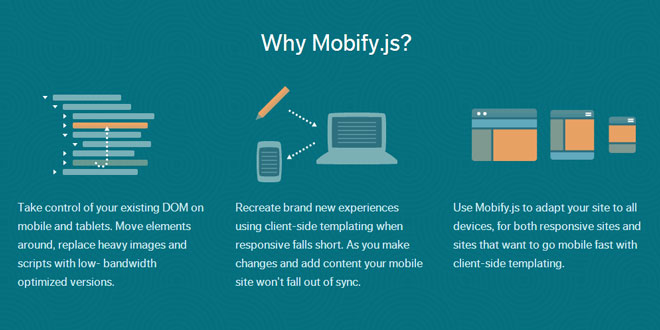
Mobify.js is an open source library for improving responsive sites by providing responsive images, JS/CSS optimization, Adaptive Templating and more.
Mobify.js also provides a Capturing API for manipulating the DOM before any resources have loaded, giving developers the ability to enable the listed features above without changing any backend markup
Quick Start
What is Mobify.js?
Mobify.js is an open source library for improving responsive sites by providing responsive images, JS/CSS optimization, Adaptive Templating and more. Mobify.js also provides a “Capturing” API for manipulating the DOM before any resources have loaded, giving developers the ability to enable the listed features above without changing any backend markup.
Getting started
Let’s get started by using the Image API (one of many APIs available in mobify.js) to automatically resize and optimize images in your page.
- Note: If you’re using this API locally and your images aren’t publicly available, the original images will load. To see the images resize, try this on an environment that is publicly available.
With Capturing
If you don’t want to have to worry about changing src attributes, you can let Capturing take care of that for you. It requires a special script tag that must be placed after the opening <head> tag (must be placed above any element that loads external resources!): Unminified version on Github
<script>!function(a,b,c,d,e){function g(a,c,d,e){var f=b.getElementsByTagName("script")[0];a.src=e,a.id=c,a.setAttribute("class",d),f.parentNode.insertBefore(a,f)}a.Mobify={points:[+new Date]};var f=/((; )|#|&|^)mobify=(\d)/.exec(location.hash+"; "+b.cookie);if(f&&f[3]){if(!+f[3])return}else if(!c())return;b.write('<plaintext style="display:none">'),setTimeout(function(){var c=a.Mobify=a.Mobify||{};c.capturing=!0;var f=b.createElement("script"),h="mobify",i=function(){var c=new Date;c.setTime(c.getTime()+3e5),b.cookie="mobify=0; expires="+c.toGMTString()+"; path=/",a.location=a.location.href};f.onload=function(){if(e)if("string"==typeof e){var c=b.createElement("script");c.onerror=i,g(c,"main-executable",h,mainUrl)}else a.Mobify.mainExecutable=e.toString(),e()},f.onerror=i,g(f,"mobify-js",h,d)})}(window,document,function(){a=/webkit|(firefox)[\/\s](\d+)|(opera)[\s\S]*version[\/\s](\d+)|(trident)[\/\s](\d+)|3ds/i.exec(navigator.userAgent);return!a||a[1]&&4>+a[2]||a[3]&&11>+a[4]||a[5]&&6>+a[6]?!1:!0},

// path to mobify.js
"//cdn.mobify.com/mobifyjs/build/mobify-2.0.7.min.js",

// calls to APIs go here (or path to a main.js)
function() {
  var capturing = window.Mobify && window.Mobify.capturing || false;

  if (capturing) {
    Mobify.Capture.init(function(capture){
      var capturedDoc = capture.capturedDoc;

      var images = capturedDoc.querySelectorAll("img, picture");
      Mobify.ResizeImages.resize(images);

      // Render source DOM to document
      capture.renderCapturedDoc();
    });
  }
});</script>
Without Capturing
If you want to use the Image API without Capturing, you must change srcto x-src (this is configurable) for every <img> and <picture> element you have in your site (you also may want to add <noscript> fallbacks if you’re worried about browsers with JavaScript disabled/unavailable). This snippet will load mobify.js asynchronously in order to be able to start loading images before the DOM is ready.
Then, paste the following tag before </head>, or top of <body>:
<script async src="//cdn.mobify.com/mobifyjs/build/mobify-2.0.7.min.js"></script>
<script>
    var intervalId = setInterval(function(){
        if (window.Mobify) {
            var images = document.querySelectorAll('img[x-src], picture');
            if (images.length > 0) {
                Mobify.ResizeImages.resize(images);
            }
            // When the document has finished loading, stop checking for new images
            if (Mobify.Utils.domIsReady()) {
                clearInterval(intervalId)
            }
        }
    }, 100);
</script>
Capturing
- Capture and modify the DOM before any resources have loaded by delay the lookahead pre-parser.
To use the Capturing API, you must first install the Mobify.js tag on your site. If you have not already, please refer to the quickstart guide to get setup.
Capture.init(callback, [document], [prefix="x-"])
callback gets a capture object upon completion of capturing.
document and prefix are optional.
Creates a new instance of a capture object and passes it to the callback upon completion, which will parse the existing document in order to create an entirely new captured document, which is an exact replica of the original document, but with certain properties prepended with a prefix to prevent resources from loading.
Modified elements/attributes
- element: img, attributes: src
- element: iframe, attributes: src
- element: script, attributes: src, type
- element: link, attributes: href
- element: style, attributes: media
Example
// Change src of first script
Mobify.Capture.init(function(capture){
    var capturedDoc = capture.capturedDoc;
    var script = capturedDoc.getElementsByTagName("script")[0];
    // Must use x-src, not src
    script.setAttribute("x-src", "/path/to/script.js");
    capture.renderCapturedDoc();
});
Useful properties
- capture.doc - Original document being captured
- capture.prefix - Prefix used to prevent resource loading
- capture.doctype - Doctype of captured document
- capture.htmlOpenTag - String of opening <html> tag
- capture.headOpenTag - String of opening <head> tag
- capture.bodyOpenTag - String of opening <body> tag
- capture.htmlEl - Reference to html element of captured doc
- capture.headEl - Reference to head element of captured doc
- capture.bodyEl - Reference to body element of captured doc
- capture.capturedDoc - Captured document object
getCapturedDoc()
Returns a reference to the captured document inside of a captureobject.
You have access to all DOM API methods on the captured document.
Usage/Example:
Mobify.Capture.init(function(capture){
    var capturedDoc = capture.getCapturedDoc();
    var paragraphs = capturedDoc.querySelectorAll("p");
});
capturing variable
window.Mobify.capturing is an indicator of the state that your code is running. Mobify.js is executed both during capturing, and after capturing. First it stops the original document from rendering (at this timecapturing is true). After rendering the captured document, Mobify.js is run again in a non-capturing context (at this time capturing is false).
Usage/Example:
var capturing = window.Mobify && window.Mobify.capturing || false;
if (capturing) {
    console.log("Executing during capturing phase!");
    Mobify.Capture.init(function(capture){
        capture.renderCapturedDoc();
    });
else {
    console.log("Executing during post-capturing phase!");
}
escapedHTMLString()
Returns a string representation of the captured document, but with all resources enabled (prefix removed). Can be considered an alternative tocapturedDoc.outerHTML.
Usage/Example:
Mobify.Capture.init(function(capture){
    var htmlString = capture.escapedHTMLString();
});
render(htmlString)
Opens the original document and renders it from a clean slate with the htmlString.
Usage/Example:
Mobify.Capture.init(function(capture){
    capture.render("<html><body><h1>Test!</h1></body></html>");
});
Note: This method is async
renderCapturedDoc()
Writes out the captured document to the original document.
Usage/Example:
Mobify.Capture.init(function(capture){
    // Removes all scripts
    var scripts = capturedDoc.getElementsByTagName("script");
    for (var i = 0; i < scripts.length; i++) {
        var script = scripts[i];
        script.parentNode.removeChild(script);
    }
    capture.renderCapturedDoc();
});
Note: This method is async
restore()
Restores the original document after using capturing.
Note: This method is async
Usage/Example:
var capture = Mobify.Capture.init(function(capture){
    if (/ipad/i.test(navigator.userAgent)) {
        // Do a bunch of stuff...
    } else {
        // If not iPad, just restore everything back to normal
        capture.restore();
    }
});
patchAnchorLinks()
On Firefox, links to anchors eg (<a href="#foo">) cause the browser to navigate when using Capturing, because Firefox considers the re-written document to be a different location.
If you have click handlers on such a tags, which do not calle.preventDefault(), you’ll probably experience issues as the page will reload before you callback completes. The ideal fix is that all events calle.preventDefault().
However, we do provide a patch for this, which behaves as expected, but it does not actually update window.location.hash to reflect the hash in the anchor. This can cause problems with users who want to copy-and-paste URLs with anchor tags, or sites that trigger logic based ononhashchange or based on the hash at load time.
It should also be noted, that history.pushState() is broken on Firefox, when used with capturing and no fix exists currently.
This patch is not executed by default - if you want to use it, follow the example below:
Usage/Example:
var capturing = window.Mobify && window.Mobify.capturing || false;
if (capturing) {
    // Grab reference to a newly created document
    Mobify.Capture.init(function(capture){
        var capturedDoc = capture.capturedDoc;
        // Render source DOM to document
        capture.renderCapturedDoc();
    });
} else {
    // This should be called in the post-capturing phase.
    Mobify.Capture.patchAnchorLinks();
}
Image Resizer
- Automatically resize <img> and <picture> elements to the maximum width of the screen.
- Automatically determine support for WEBP, and convert images on the fly.
- Manual resize of <picture> elements by specifying different widths on each <source> element breakpoint.
- Cache all images on Mobify’s CDN.
- Image resizing powered by the Mobify Performance Suite.
- Can be overridden to use another resizing service.
To automatically add resizing to your site without modifying any markup on your backend, you must have the ability to Capture the DOM, which requires the Mobify.js tag on your site. You can also use this API if you have access to change all src to x-src in your backend markup.
Please refer to the quickstart guide to get setup.
ResizeImages.resize(images, [options])
images must be an array of <img> and/or <picture> elements.
options are optional.
Rewrites the src of every <img>/<picture> in the images array on the page based on the options passed.
- By default, images are requested through ir0.mobify.com (part of the Mobify Performance Suite).
- Maximum dimensions are based on the size of the device, taking into account pixel density. This can be overridden in the options.
- Determines support for WEBP and uses that on images whenever possible. Otherwise it defaults to the original image format.
Note: The image resizer backend must have access to the images in order to resize them. If your development server is not publicly accessible, ir0.mobify.com will serve a 302 redirect back to the original image location.
Our image resizing service backend service is free to use up to a certain number of views per month. If you plan on using this service on a website with high amounts of traffic, feel free to visit ourpricing page for more detail.
Options
- sourceAttribute: The attribute to get the source value from. Defaults to “x-src”. “x-“ is the default escape prefix used in Capturing
- targetAttribute: The attribute to set witht he resized url. Defaults to “x-src” when capturing, and “src” without capturing.
- cacheHours: Sets the length of time for the image(s) to be cached on the CDN. The default is 2 months.
- format: Output format of the image(s) being resized. Defaults to original format, except non-animated gifs, which are converted to png.
- quality: An integer from 1-100 used as a quality parameter when encoding jpg and webp images, can only be set along with theformat parameter.
- maxWidth: Maximum width of the image(s) being resized (in CSS pixels). Defaults to automatically determine width of device.
- maxHeight: Maximum height of the image(s) being resized (in CSS pixels). Only usable when maxWidth is specified.
- devicePixelRatio: Override the default devicePixelRatio. Defaults to window.devicePixelRatio.
- resize: A boolean that controls whether to scale the image(s). When false, the image(s) are served through the image resizer backend but are not resized. A value of null auto detects whether to resize images from the document’s viewport meta tag. The default is true.
Example
There are many examples using Image Resizer on the examples page.
Automatic image resizing (using Capturing):
Mobify.Capture.init(function(capture){
    var capturedDoc = capture.capturedDoc;
    // Resize images using Mobify Image Resizer
    var images = capturedDoc.querySelectorAll('img, picture');
    Mobify.ResizeImages.resize( images, {
        cacheHours: "2",
    } );
    capture.renderCapturedDoc();
});
Specify a custom width for a group of images:
Mobify.Capture.init(function(capture){
    var capturedDoc = capture.capturedDoc;
    // Resize images using Mobify Image Resizer
    var images = capturedDoc.querySelectorAll('#footer img');

    var maxWidth;
    if (window.matchMedia( "(min-width: 768px) and (max-width : 1024px)" ).matches) {
        maxWidth = 500;
    };

    Mobify.ResizeImages.resize( images, {
        cacheHours: 2,
        maxWidth: maxWidth
    } );
    capture.renderCapturedDoc();
});
ResizeImages.getImageURL(url, [options])
url is the image URL being modifed.
options are optional.
This method takes a URL and modifies it based on the options passed. It is executed by ResizeImages.resize for each element. It can be overridden to use this API for a different image resizing service (such assrc.sencha.io).
If you want to get a resized URL string (instead of resizing an img element), this is the method to use.
Options
The same as ResizeImages.resize options.
Usage/Examples:
// Override getImageURL to use the src.sencha.io backend
Mobify.ResizeImages.getImageURL = function(url, options) {
    return "http://src.sencha.io/" + options.maxWidth + "/" + url
};

// Get an optimized image URL from a URL string
Mobify.ResizeImages.getImageURL('http://www.foo.com/bar.png');

// Get an optimized image URL from a URL string with options overridden
var options = Utils.extend(ResizeImages.processOptions(), {
    cacheHours: '8',
});
Mobify.ResizeImages.getImageURL('http://www.foo.com/bar.png', options);
ResizeImages.processOptions()
This method returns all of the default options.
Usage/Examples:
Mobify.ResizeImages.processOptions()

// returns (for iPhone 5):
// {
//     proto: '//',
//     host: 'ir0.mobify.com',
//     projectName: "oss-" + location.hostname.replace(/[^\w]/g, '-'),
//     sourceAttribute: "x-src",
//     targetAttribute: (capturing ? "x-src" : "src"),
//     webp: ResizeImages.supportsWebp(),
//     onerror: 'ResizeImages.restoreOriginalSrc(event);'
//     maxWidth: 640
// }
WebP
WebP is a new image file format from Google which offers significantly smaller file sizes than JPEG compression with similar image quality.
Using the Image Resizer API with Mobify.js, image files referenced by your img and picture elements will automatically be converted to WebP for browsers that support it. This can have a significant impact on the total weight of your pages for supported browsers.
Have a look at http://caniuse.com/webp to see the current state of browser support for this format.
Simplified Picture Element
Mobify.js comes with a <picture> polyfill. In combination with the Image Resize API, you can have much simplier <picture> elements. You also no longer need a <noscript> fallback when using the Resize API (with Capturing).
The problem with the <picture> element is that using it to specify the same image at different widths can be extremely tedious. Nobody wants to generate 4 versions of every image at all of the possible resolutions, and constantly update those versions in the markup. Scaling image widths can be automated (although the <picture> element is the best solution for art direction).
To solve this problem, Mobify.js allows for alternate <picture> markup that allows you to specify widths as attributes on <source> elements, instead of specifying a different src attribute for each breakpoint.
For example, you could write your element like this:
<picture data-src="horse.png">
    <source src="alt-horse.png" data-media="(max-width: 480px)">
    <source media="(min-width: 480px)" data-width="200">
    <source media="(min-width: 800px)" data-width="400">
    <source media="(min-width: 1000px)">
    <img src="horse-small.png">
</picture>
Notice the use of the data-src attribute inside of the <picture>element. This gives us a basis that we can resize to produce an asset for other breakpoints.
Let’s break down how this will actually work in the browser:
-
If the browser width is between 0 and 480px (smartphone):
- Use “alt-horse.png” for art direction purposes.
-
If the browser width is between 480px and 799px:
- Use “horse.png” since src is not specified in the <source>element corresponding to that media query. Resize to 200px wide.
-
If the browser width is between 800px and 999px:
- Use “horse.png” since src is not specified in the <source>element corresponding to that media query. Resize to 400px wide.
-
If the browser width is 1000px or greater:
- Use “horse.png” since src is not specified in the <source>element corresponding to that media query. Automatically determine width since data-width isn’t specified.
- If Javascript isn’t supported, fallback to regular old <img> tag. (which needs no <noscript> wrapping as with other solutions).
The resize method will cause the above markup to transform into this (on an iPhone):
<picture data-src="horse.png">
    <source src="ir0.mobify.com/320/http://site.com/alt-horse.png" data-media="(max-width: 480px)">
    <source src="ir0.mobify.com/200/http://site.com/horse.png" media="(min-width: 480px)" data-width="200">
    <source src="ir0.mobify.com/400/http://site.com/horse.png" media="(min-width: 800px)" data-width="400">
    <source src="ir0.mobify.com/320/http://site.com/horse.png" media="(min-width: 1000px)">
    <img src="horse-small.png">
</picture>
After resize changes the markup, the Picture polyfill will run and select the appropriate image based on running the media queries.
ir0.mobify.com
Mobify’s image resizing backend that can manipulate the width, height, file format, and quality of any image. All requests through this service are cached on Mobify’s CDN.
The image resizer API in Mobify.js uses this service by default for image manipulation.
Requests are in the form of:
http://ir0.mobify.com/<format><quality>/<maximum width>/<maximum height>/<url>
 JS Tutorial


