- Overview
- Documents
Magnific Popup is a responsive lightbox & dialog script with focus on performance and providing best experience for user with any device
What makes this plugin different?
Light and modular
You can choose to include only the features that you need using the online build tool or by compiling it yourself with Grunt.js. Size of core JS file is about 3KB+ each module weighs about 0.5KB (gzipped). Sass CSS preprocessor is used for easier skinning, but you're not obligated to use it.
Content is resized with CSS
The majority of lightbox plugins require you to define size of it via JS option. Magnific Popup does not - feel free to use relative units like EM's or resize lightbox with help of CSS media queries. Update content inside lightbox without worrying about how it'll resize and center.
Fast
Magnific Popup displays images before they're completely loaded to take full advantage of progressive loading. For in and out transitions CSS3 is used instead of slow JavaScript animation.
High-DPI (Retina) display support
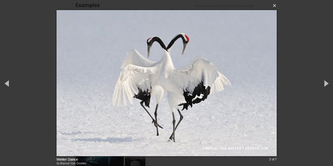
Default controls are made with pure CSS, without external graphics. For the main image there is a built in way to provide appropriate source for different pixel density displays.
Conditional lightbox
Plugin has an option to automatically switch to alternative mobile-friendly source on small screen size. Brad Frost has a terrific article about this technique.
Memory management
Popup has an extendable micro templating engine that reuses existing DOM elements, which is especially useful when your popups same pattern.
Browser support
Tested on desktop: Chrome, Safari, FF, Opera, IE8+, partial support of IE7 (works, but some visual layout features, like vertical centering, are missing). Mobile: default browser in Android 2.3+, iOS5+, Blackberry 10+, WP7+, mobile Opera and Chrome on Android.
Including files
You can get Magnific Popup JS and CSS file from the build tool, from the dist/ folder in the GitHub repository, or by compiling it yourself with Grunt.
<!-- Magnific Popup core CSS file -->
<link rel="stylesheet" href="magnific-popup/magnific-popup.css">

<!-- jQuery 1.7.2+ or Zepto.js 1.0+ -->
<script src="//ajax.googleapis.com/ajax/libs/jquery/1.9.1/jquery.min.js"></script>

<!-- Magnific Popup core JS file -->
<script src="magnific-popup/jquery.magnific-popup.js"></script>
It’s not required, but we recommend placing CSS files in <head> and JavaScript files and initialization code in the footer of your site (before the closing </body> tag).
If you already have jquery.js on your site, don’t include it a second time, or use jQuery.noConflict(); mode. Optionally, you can include Zepto.js instead of jQuery, or choose which one to include based on browser support.
Initializing popup
Popup initialization code should be executed after document ready, for example:
$(document).ready(function() {
  $('.image-link').magnificPopup({type:'image'});
});
There are three ways to initialize a popup:
1. From an HTML element
<a class="test-popup-link" href="path-to-image.jpg">Open popup</a>
$('.test-popup-link').magnificPopup({
  type: 'image'
	// other options
});
2. From a group of elements with one parent
Same as first one, but use this method if you are creating a popup from a list of elements in one container. Note that this method does not enable gallery mode, it just reduces the number of click event handlers; each item will be opened as a single popup. If you wish to enable gallery, add the gallery:{enabled:true} option.
<div class="parent-container">
  <a href="path-to-image-1.jpg">Open popup 1</a>
  <a href="path-to-image-2.jpg">Open popup 2</a>
  <a href="path-to-image-3.jpg">Open popup 3</a>
</div>
$('.parent-container').magnificPopup({
  delegate: 'a', // child items selector, by clicking on it popup will open
  type: 'image'
  // other options
});
3. From the ‘items’ option
The items option defines data for the popup item(s) and makes Magnific Popup ignore all attributes on the target DOM element. The value for items can be a single object or an array of objects.
// Example with single object
$('#some-button').magnificPopup({
    items: {
      src: 'path-to-image-1.jpg'
    },
    type: 'image' // this is default type
});

// Example with multiple objects
$('#some-button').magnificPopup({
    items: [
      {
        src: 'path-to-image-1.jpg'
      },
      {
        src: 'http://vimeo.com/123123',
        type: 'iframe' // this overrides default type
      },
      {
        src: $('<div>Dynamically created element</div>'), // Dynamically created element
        type: 'inline'
      },
      {
        src: '<div>HTML string</div>',
        type: 'inline'
      },
      {
        src: '#my-popup', // CSS selector of an element on page that should be used as a popup
        type: 'inline'
      }
    ],
    gallery: {
      enabled: true
    },
    type: 'image' // this is default type
});
Play with this example on CodePen.
Content Types
By default, Magnific Popup has 4 types of content: image, iframe, inline, and ajax. There is no any “auto-detection” of type based on URL, so you should define it manually.
The type of a popup can be defined in a two ways:
-
Using the type option. E.g.: $('.image-link').magnificPopup({type:'image'}).
-
Using the mfp-TYPE CSS class (where TYPE is the desired content type). For example: <a class="mfp-image image-link">Open image</a>, $('.image-link').magnificPopup().
The second option always overrides the first, so you may initialize popups with multiple content types from one call.
inline is the default content type (from v0.8.4), so you may skip its definition.
The source of the the popup content (for example, a path to an image, a path to an HTML file, a path to a video page) can be defined in a few ways:
Method #1: From the href attribute:
<a href="image-for-popup.jpg">Open image</a>
Method #2: From the data-mfp-src attribute (overrides the first method):
<a href="some-image.jpg" data-mfp-src="image-for-popup.jpg">Open image</a>
Method #3: From the items option
$.magnificPopup.open({
  items: {
    src: 'some-image.jpg'
  },
  type: 'image'
});
If you want to modify how the source is parsed, you may hook into the elementParse callback. For example:
$('.image-link').magnificPopup({
  type:'image',
  callbacks: {
    elementParse: function(item) {
      // Function will fire for each target element
      // "item.el" is a target DOM element (if present)
      // "item.src" is a source that you may modify

      console.log(item); // Do whatever you want with "item" object
    }
  }
});
Image Type
The path to the image must be set as the main source if you selected this type. If your popup doesn’t have an image source and doesn’t have an image that shouldn’t be preloaded (and retina-ized, etc.), use the inlinetype.
image: {
  markup: '<div class="mfp-figure">'+
            '<div class="mfp-close"></div>'+
            '<div class="mfp-img"></div>'+
            '<div class="mfp-bottom-bar">'+
              '<div class="mfp-title"></div>'+
              '<div class="mfp-counter"></div>'+
            '</div>'+
          '</div>', // Popup HTML markup. `.mfp-img` div will be replaced with img tag, `.mfp-close` by close button

  cursor: 'mfp-zoom-out-cur', // Class that adds zoom cursor, will be added to body. Set to null to disable zoom out cursor.

  titleSrc: 'title', // Attribute of the target element that contains caption for the slide.
  // Or the function that should return the title. For example:
  // titleSrc: function(item) {
  //   return item.el.attr('title') + '<small>by Marsel Van Oosten</small>';
  // }

  verticalFit: true, // Fits image in area vertically

  tError: '<a href="%url%">The image</a> could not be loaded.' // Error message
}
Please note that Magnific Popup doesn’t implement any Javascript-based client-side caching for images. So make sure that your server adds expires headers so the image won’t be downloaded each time.
Iframe Type
By default Magnific Popup supports only one type of URL for each service:
// YouTube
"http://www.youtube.com/watch?v=7HKoqNJtMTQ"

// Vimeo
"http://vimeo.com/123123"

// Google Maps
"https://maps.google.com/maps?q=221B+Baker+Street,+London,+United+Kingdom&hl=en&t=v&hnear=221B+Baker+St,+London+NW1+6XE,+United+Kingdom"
But you can extend it and make it support absolutely any URL or any other service (view example that adds Dailymotion support). Iframe options:
iframe: {
  markup: '<div class="mfp-iframe-scaler">'+
            '<div class="mfp-close"></div>'+
            '<iframe class="mfp-iframe" frameborder="0" allowfullscreen></iframe>'+
          '</div>', // HTML markup of popup, `mfp-close` will be replaced by the close button

  patterns: {
    youtube: {
      index: 'youtube.com/', // String that detects type of video (in this case YouTube). Simply via url.indexOf(index).

      id: 'v=', // String that splits URL in a two parts, second part should be %id%
      // Or null - full URL will be returned
      // Or a function that should return %id%, for example:
      // id: function(url) { return 'parsed id'; }

      src: '//www.youtube.com/embed/%id%?autoplay=1' // URL that will be set as a source for iframe.
    },
    vimeo: {
      index: 'vimeo.com/',
      id: '/',
      src: '//player.vimeo.com/video/%id%?autoplay=1'
    },
    gmaps: {
      index: '//maps.google.',
      src: '%id%&output=embed'
    }

    // you may add here more sources

  },

  srcAction: 'iframe_src', // Templating object key. First part defines CSS selector, second attribute. "iframe_src" means: find "iframe" and set attribute "src".
}
Inline Type
To create popup from inline element you need to:
1) Create a HTML element that you wish to display in popup and add it somewhere. Class mfp-hide is required to hide the popup from the page.
<div id="test-popup" class="white-popup mfp-hide">
  Popup content
</div>
2) Style this element. Magnific Popup by default doesn’t apply any styles to it, except vertical centering (ifalignTop:false). Close button will be automatically appended inside (if closeBtnInside:true).
.white-popup {
  position: relative;
  background: #FFF;
  padding: 20px;
  width: auto;
  max-width: 500px;
  margin: 20px auto;
}
3) Add button that will open the popup (source must match CSS id of an element (#test-popup in our case).
<!-- Like so: -->
<a href="#test-popup" class="open-popup-link">Show inline popup</a>

<!-- Or like so: -->
<a href="mobile-friendly-page.html" data-mfp-src="#test-popup" class="open-popup-link">Show inline popup</a>
4) Initialize script.
$('.open-popup-link').magnificPopup({
  type:'inline',
  midClick: true // Allow opening popup on middle mouse click. Always set it to true if you don't provide alternative source in href.
});
Here are some other ways to initialize popup:
// From HTML string
$('button').magnificPopup({
  items: {
      src: '<div class="white-popup">Dynamically created popup</div>',
      type: 'inline'
  }
});

// From an element with ID #popup
$('button').magnificPopup({
  items: {
      src: '#popup',
      type: 'inline'
  }
});

// From jQuery object
$('button').magnificPopup({
  items: {
      src: $('<div class="white-popup">Dynamically created popup</div>'),
      type: 'inline'
  }
});

// Open directly via API
$.magnificPopup.open({
  items: {
    src: '<div class="white-popup">Dynamically created popup</div>', // can be a HTML string, jQuery object, or CSS selector
    type: 'inline'
  }
});
I have created two examples on CodePen that will help you better understand how it works:
Ajax Type
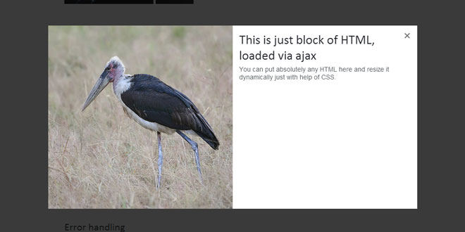
To create such type of popup, first of define the path to the file that you wish to display and select ajax type of the popup. Popup itself should be styled in exactly the same way as an inline popup type.
Important note! The contents of the file that you load is already a popup itself, so there must be only one root element.
<a href="path-to-file.html" class="ajax-popup-link">Show inline popup</a>
$('.ajax-popup-link').magnificPopup({
  type: 'ajax'
});
Note that path to the file that will be loaded should have the same origin (e.g. be on the same domain), learn more.
Ajax options:
ajax: {
  settings: null, // Ajax settings object that will extend default one - http://api.jquery.com/jQuery.ajax/#jQuery-ajax-settings
  // For example:
  // settings: {cache:false, async:false}

  cursor: 'mfp-ajax-cur', // CSS class that will be added to body during the loading (adds "progress" cursor)
  tError: '<a href="%url%">The content</a> could not be loaded.' //  Error message, can contain %curr% and %total% tags if gallery is enabled
}
To modify content after it’s loaded, or to select and show just specific element from loaded file, there is aparseAjax callback:
callbacks: {
  parseAjax: function(mfpResponse) {
    // mfpResponse.data is a "data" object from ajax "success" callback
    // for simple HTML file, it will be just String
    // You may modify it to change contents of the popup
    // For example, to show just #some-element:
    // mfpResponse.data = $(mfpResponse.data).find('#some-element');

    // mfpResponse.data must be a String or a DOM (jQuery) element

    console.log('Ajax content loaded:', mfpResponse);
  },
  ajaxContentAdded: function() {
    // Ajax content is loaded and appended to DOM
    console.log(this.content);
  }
}
Options
Options should be passed to the initialization code and separated by comma, e.g.:
$('.some-link').magnificPopup({
  // main options
  disableOn: 400,
  key: 'some-key',

  gallery: {
    // options for gallery
    enabled: true
  },
  image: {
    // options for image content type
    titleSrc: 'title'
  }

});
Options for specific modules are explained in their sections of documentation (e.g. related to text are in translating section, related to gallery are in gallery section. Here you can find the list of general options:
disableOn
null
If window width is less then number in this option - lightbox will not be opened and default behavior of element will be triggered. Set to 0 to disable behavior. Option works only when you initialize Magnific Popup from DOM element.
Can also accept Function as a parameter, which should return true if lightbox can be opened and falseotherwise. For example:
disableOn: function() {
  if( $(window).width() < 600 ) {
    return false;
  }
  return true;
}
key
null
“Key” option is a unique identifier of a single or a group of popups with the same structure. If you will not define it, DOM elements will be created and destroyed each time when you open and close popup.
You may (and should) set an equal key to different popups if their markup matches. By markup I mean options that change HTML structure of the popup (e.g. close icon placement and HTML code of it).
For example: you have many popups that show title, some text and button - you may use one key for all of them, so only one instance of this element is created. Same for popup that always contains image and caption.
You can delete cached templates like so:
// delete template with key "your-key"
delete $.magnificPopup.instance.popupsCache['your-key'];

// delete all templates
$.magnificPopup.instance.popupsCache = {};
midClick
false
If set to true lightbox is opened if the user clicked on the middle mouse button, or click with command/ctrl key. Option works only when you initialize Magnific Popup from DOM element.
mainClass
empty string
String that contains classes that will be added to the root element of popup wrapper and to dark overlay. For example "myClass", can also contain multiple classes - 'myClassOne myClasTwo'.
preloader
true
Preloader in Magnific Popup is used as an indicator of current status. If option enabled, it’s always present in DOM only text inside of it changes. Below you can see explanation of CSS names that are applied to container that holds preloader and content area depending on the state of current item:
/* Content loading is in progress */
.mfp-s-loading { }

/* Content successfully loaded */
.mfp-s-ready { }

/* Error during loading  */
.mfp-s-error { }
For example, if you want your error message to be in red add such CSS:
.mfp-s-error .mfp-preloader {
  color: red;
}
You can trigger change of status manually by calling instance.updateStatus('error', 'error message').
focus
empty string
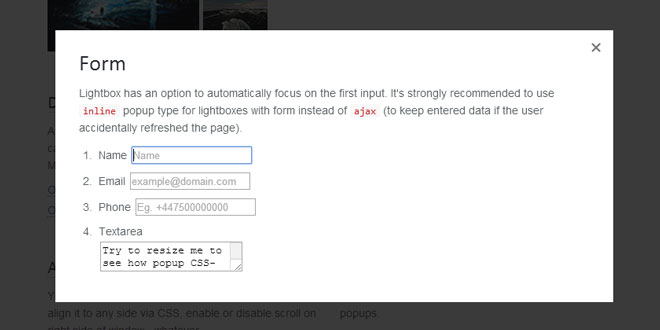
String with CSS selector of an element inside popup that should be focused. Ideally it should be the first element of popup that can be focused. For example 'input' or '#login-input'. Leave empty to focus the popup itself.
closeOnContentClick
false
Close popup when user clicks on content of it. It’s recommended to enable this option when you have only image in popup.
closeOnBgClick
true
Close the popup when user clicks on the dark overlay.
closeBtnInside
false
If enabled, Magnific Popup will put close button inside content of popup, and wrapper will get class mfp-close-btn-in (which in default CSS file makes color of it change). If markup of popup item is defined element with classmfp-close will be replaced with this button, otherwise close button will be appended directly.
showCloseBtn
true
Controls whether the close button will be displayed or not.
enableEscapeKey
true
Controls whether pressing the escape key will dismiss the active popup or not.
modal
false
When set to true, the popup will have a modal-like behavior: it won’t be possible to dismiss it by usual means (close button, escape key, or clicking in the overlay).
This is is a shortcut to set closeOnContentClick, closeOnBgClick, showCloseBtn, and enableEscapeKey tofalse.
alignTop
false
If set to true popup is aligned to top instead of to center. (basically all this option does is adds mfp-align-topCSS class to popup which removes styles that align popup to center).
fixedContentPos
auto
Popup content position. Can be "auto", true or false. If set to true - fixed position will be used, to false - absolute position based on current scroll. If set to "auto" popup will automatically disable this option when browser doesn’t support fixed position properly.
fixedBgPos
auto
Same as an option above, but it defines position property of the dark transluscent overlay. If set to false - huge tall overlay will be generated that equals height of window to emulate fixed position. It’s recommended to set this option to true if you animate this dark overlay and content is most likely will not be zoomed, as size of it will be much smaller.
overflowY
auto
Defines scrollbar of the popup, works as overflow-y CSS property - any CSS acceptable value is allowed (e.g.auto, scroll, hidden). Option is applied only when fixed position is enabled.
There is no option overflowX, but you may easily emulate it just via CSS.
removalDelay
0
Delay before popup is removed from DOM. Used for the animation.
closeMarkup
<button title="%title%" class="mfp-close"><i class="mfp-close-icn">×</i></button>
Markup of close button. %title% will be replaced with option tClose.
prependTo
document.body
The DOM element to which popup will be added. Useful when you’re using Asp.NET where popup should be inside form. Option available since 2013/12/04.
Gallery
Basically all galery module does is allows you to switch content of popup and adds navigation arrows. It can switch and mix any types of content, not just images. Gallery options:
gallery: {
  enabled: false, // set to true to enable gallery

  preload: [0,2], // read about this option in next Lazy-loading section

  navigateByImgClick: true,

  arrowMarkup: '<button title="%title%" type="button" class="mfp-arrow mfp-arrow-%dir%"></button>', // markup of an arrow button

  tPrev: 'Previous (Left arrow key)', // title for left button
  tNext: 'Next (Right arrow key)', // title for right button
  tCounter: '<span class="mfp-counter">%curr% of %total%</span>' // markup of counter
}
Example:
// This will create a single gallery from all elements that have class "gallery-item"
$('.gallery-item').magnificPopup({
  type: 'image',
  gallery:{
    enabled:true
  }
});
Multiple galleries
To have multiple galleries on a page, you need to create a new instance of Magnific Popup for each seperate gallery. For example
<div class="gallery">
    <a href="path-to-image.jpg">Open image 1 (gallery #1)</a>
    <a href="path-to-image.jpg">Open image 2 (gallery #1)</a>
</div>
<div class="gallery">
    <a href="path-to-image.jpg">Open image 1 (gallery #2)</a>
    <a href="path-to-image.jpg">Open image 2 (gallery #2)</a>
    <a href="http://vimeo.com/123123" class="mfp-iframe">Open video (gallery #2). Class mfp-iframe forces "iframe" content type on this item.</a>
</div>
$('.gallery').each(function() { // the containers for all your galleries
    $(this).magnificPopup({
        delegate: 'a', // the selector for gallery item
        type: 'image',
        gallery: {
          enabled:true
        }
    });
});
You don’t necessarily need to use delegate option, it can be just $(this).find('a').magnificPopup( ....
Lazy-loading
Lazy-loading option preloads nearby items. It accepts array with two integers, first one - is a number of items to preload before the current, second one - the number of images to preload after the current. For examplepreload: [1,3] will load 3 next items and 1 that is before current. These values are automatically switched based on direction of movement.
By default all what it does is just searches for an image tag and preloads it with JavaScript. But you can extend it and do your custom preloading logic with help of lazyLoad event, like so:
callbacks: {
  lazyLoad: function(item) {
    console.log(item); // Magnific Popup data object that should be loaded
  }
}
“Preload” option can be changed dynamically. To disable it set preload:0.
Animation
Animation can be added to any example. For Ajax based popup content animation is fired only after content is loaded.
After popup is opened popup wrapper and background overlay get class mfp-ready. Before popup is removed they get class mfp-removing.
For example:
// Initialize popup as usual
$('.popup-link').magnificPopup({
  // Delay in milliseconds before popup is removed
  removalDelay: 300,

  // Class that is added to popup wrapper and background
  // make it unique to apply your CSS animations just to this exact popup
  mainClass: 'mfp-fade'
});
Then just play with CSS3 transitions:
/* overlay at start */
.mfp-fade.mfp-bg {
  opacity: 0;

  -webkit-transition: all 0.15s ease-out;
  -moz-transition: all 0.15s ease-out;
  transition: all 0.15s ease-out;
}
/* overlay animate in */
.mfp-fade.mfp-bg.mfp-ready {
  opacity: 0.8;
}
/* overlay animate out */
.mfp-fade.mfp-bg.mfp-removing {
  opacity: 0;
}

/* content at start */
.mfp-fade.mfp-wrap .mfp-content {
  opacity: 0;

  -webkit-transition: all 0.15s ease-out;
  -moz-transition: all 0.15s ease-out;
  transition: all 0.15s ease-out;
}
/* content animate it */
.mfp-fade.mfp-wrap.mfp-ready .mfp-content {
  opacity: 1;
}
/* content animate out */
.mfp-fade.mfp-wrap.mfp-removing .mfp-content {
  opacity: 0;
}
Please use animation wisely and when it’s really required. Do not enable it when your popup may contain large image or a lot of HTML text.
Retina
“Retina” module allows you to display high-resolution images on high-dpi screens with differentdevicePixelRatio. Module works only with “image” type and only when window.devicePixelRatio > 1.
First of prepare two sets of images. Default supported syntax requires @2x at the end of the image file name, e.g.: image.jpg > [email protected]. Then initialize popup as usual and add ratio in retina set of options.
<a href="image.jpg" class="image-link">Open popup</a>
// Initialize popup as usual
$('.image-link').magnificPopup({
  type: 'image',

  retina: {
    ratio: 1, // Increase this number to enable retina image support.
    // Image in popup will be scaled down by this number.
    // Option can also be a function which should return a number (in case you support multiple ratios). For example:
    // ratio: function() { return window.devicePixelRatio === 1.5 ? 1.5 : 2  }


    replaceSrc: function(item, ratio) {
      return item.src.replace(/\.\w+$/, function(m) { return '@2x' + m; });
    } // function that changes image source
  }

});
View example of retina popup on CodePen.
Zoom effect
Zooming only works for images, for now. To add zooming effect, first of make sure that you included “zoom” module to Magnific Popup build (since v0.9.1.). Then follow steps:
1) Add the thumbnail with link that will open the popup, for example:
<a href="image.jpg" class="image-link">
   <img src="thumbnails.jpg" />
</a>
You need to make sure that ratio of your thumbnail matches the ratio of the big image, to avoid “jumps” at the end of zoom-out animation.
2) Initialize popup with zoom options:
// Initialize popup as usual
$('.image-link').magnificPopup({
  type: 'image',
  mainClass: 'mfp-with-zoom', // this class is for CSS animation below

  zoom: {
    enabled: true, // By default it's false, so don't forget to enable it

    duration: 300, // duration of the effect, in milliseconds
    easing: 'ease-in-out', // CSS transition easing function

    // The "opener" function should return the element from which popup will be zoomed in
    // and to which popup will be scaled down
    // By defailt it looks for an image tag:
    opener: function(openerElement) {
      // openerElement is the element on which popup was initialized, in this case its <a> tag
      // you don't need to add "opener" option if this code matches your needs, it's defailt one.
      return openerElement.is('img') ? openerElement : openerElement.find('img');
    }
  }

});
3) Optionally, add CSS fading animation to background overlay
.mfp-with-zoom .mfp-container,
.mfp-with-zoom.mfp-bg {
  opacity: 0;
  -webkit-backface-visibility: hidden;
  /* ideally, transition speed should match zoom duration */
  -webkit-transition: all 0.3s ease-out;
  -moz-transition: all 0.3s ease-out;
  -o-transition: all 0.3s ease-out;
  transition: all 0.3s ease-out;
}

.mfp-with-zoom.mfp-ready .mfp-container {
    opacity: 1;
}
.mfp-with-zoom.mfp-ready.mfp-bg {
    opacity: 0.8;
}

.mfp-with-zoom.mfp-removing .mfp-container,
.mfp-with-zoom.mfp-removing.mfp-bg {
  opacity: 0;
}
Zoom module adds zoomAnimationEnded callback, which fires when zoom-in animation is finished.
API
There is a much bigger list of public events, methods and variables than provided here which is used for module development, look inside code or type in console $.magnificPopup.instance. to find them, if you think that something should be added to docs - please submit commit.
Events
You can define callbacks in callbacks option. Besides that, all Magnific Popup events are also dispatched usingtriggerHandler on target element (or to document if the element doesn’t exist).
$('.image-link').magnificPopup({
  // you may add other options here, e.g.:
  preloader: true,

  callbacks: {
    open: function() {
      // Will fire when this exact popup is opened
      // this - is Magnific Popup object
    },
    close: function() {
      // Will fire when popup is closed
    }
    // e.t.c.
  }
});

// Alternative method: using events
// Name of event should start from  `mfp` and the first letter should be uppercase.
// e.g. 'open' becomes 'mfpOpen', 'beforeOpen' becomes 'mfpBeforeOpen'.
$('.image-link').on('mfpOpen', function(e /*, params */) {
  console.log('Popup opened',  $.magnificPopup.instance);
});
List of callbacks. In each callback this is $.magnificPopup.instance, so you can execute methods (this.close()) or access public variables (this.currItem).
callbacks: {
  beforeOpen: function() {
    console.log('Start of popup initialization');
  },
  elementParse: function(item) {
    // Function will fire for each target element
    // "item.el" is a target DOM element (if present)
    // "item.src" is a source that you may modify

    console.log('Parsing content. Item object that is being parsed:', item);
  },
  change: function() {
    console.log('Content changed');
    console.log(this.content); // Direct reference to your popup element
  },
  resize: function() {
    console.log('Popup resized');
    // resize event triggers only when height is changed or layout forced
  },
  open: function() {
    console.log('Popup is opened');
  },

  beforeClose: function() {
    // Callback available since v0.9.0
    console.log('Popup close has been initiated');
  },
  close: function() {
    console.log('Popup removal initiated (after removalDelay timer finished)');
  },
  afterClose: function() {
    console.log('Popup is completely closed');
  },

  markupParse: function(template, values, item) {
    // Triggers each time when content of popup changes
    // console.log('Parsing:', template, values, item);
  },
  updateStatus: function(data) {
    console.log('Status changed', data);
    // "data" is an object that has two properties:
    // "data.status" - current status type, can be "loading", "error", "ready"
    // "data.text" - text that will be displayed (e.g. "Loading...")
    // you may modify this properties to change current status or its text dynamically
  },
  imageLoadComplete: function() {
    // fires when image in current popup finished loading
    // avaiable since v0.9.0
    console.log('Image loaded');
  },


  // Only for ajax popup type
  parseAjax: function(mfpResponse) {
    // mfpResponse.data is a "data" object from ajax "success" callback
    // for simple HTML file, it will be just String
    // You may modify it to change contents of the popup
    // For example, to show just #some-element:
    // mfpResponse.data = $(mfpResponse.data).find('#some-element');

    // mfpResponse.data must be a String or a DOM (jQuery) element

    console.log('Ajax content loaded:', mfpResponse);
  },
  ajaxContentAdded: function() {
    // Ajax content is loaded and appended to DOM
    console.log(this.content);
  }
}
Public methods
// Open popup immediately. If popup is already opened - it'll just overwite the content (but old options will be kept).
// - first parameter: options object
// - second parameter (optional): index of item to open
$.magnificPopup.open({
  items: {
    src: 'someimage.jpg'
  },
  type: 'image'

  // You may add options here, they're exactly the same as for $.fn.magnificPopup call
  // Note that some settings that rely on click event (like disableOn or midClick) will not work here
}, 0);

$.magnificPopup.close(); // Close popup that is currently opened (shorthand)


/*
  Methods below don't have shorthand like "open" and "close".
  They should be called through "instance" object.
  "instance" is available only when at least one popup was opened.
  For example: $.magnificPopup.instance.doSomething();
*/

var magnificPopup = $.magnificPopup.instance; // save instance in magnificPopup variable


magnificPopup.close(); // Close popup that is currently opened


// Navigation when gallery is enabled
magnificPopup.next(); // go to next item
magnificPopup.prev(); // go to prev item
magnificPopup.goTo(4); // go to item #4


magnificPopup.updateItemHTML(); // updates the popup content. Useful after you change "items" array


// Update status of popup
// First param: status type, can be: 'loading', 'error' or 'ready'.
// Second param: message that will be displayed.
magnificPopup.updateStatus('loading', 'The loading text...');
You may also call ANY method via $.fn.magnificPopup('methodName' /*, param1, param2 ... */) after you initialized the popup, for example:
// First of make sure that you initialized popup on element $('.element-with-popup')

// Then
$('.element-with-popup').magnificPopup('open'); // Will open the popup
$('.element-with-popup').magnificPopup('open', 5); // Will open popup with 5th item
$('.element-with-popup').magnificPopup('next');
$('.element-with-popup').magnificPopup('goTo', 3);
You may also open the popup directly at initialization:
$('.element-with-popup').magnificPopup({
  items: {
    src: 'path-to-image.jpg',
    type: 'image'
  }
  // (optionally) other options
}).magnificPopup('open');
Public properties
Most properties are available only after the popup is opened. Only most used are listed here.
var magnificPopup = $.magnificPopup.instance;


magnificPopup.items // array that holds data for popup items
magnificPopup.currItem // data for current item
magnificPopup.index // current item index (integer)

magnificPopup.content // direct reference to jQuery DOM element that you open in popup
magnificPopup.bgOverlay // transluscent overlay
magnificPopup.wrap // container that holds all controls and contentContainer
magnificPopup.contentContainer // container that holds popup content, child of wrap


magnificPopup.st.el // Target clicked element that opened popup (works if popup is initialized from DOM element)
magnificPopup.st.mainEl // Main element (or collection of elements) from which popup was initialized (--''--)


magnificPopup.isIE7
magnificPopup.isIOS
Translating
Internationalization of Magnific Popup is very simple, all you need is to extend default settings object with new values, or just pass options to your initialization code. If you’re making some public plugin or theme, it’s strongly recommended to use only second method to avoid conflicts.
Some properties contain %keys% that should not be translated, but may be reordered or removed.
// Add it after jquery.magnific-popup.js and before first initialization code
$.extend(true, $.magnificPopup.defaults, {
  tClose: 'Close (Esc)', // Alt text on close button
  tLoading: 'Loading...', // Text that is displayed during loading. Can contain %curr% and %total% keys
  gallery: {
    tPrev: 'Previous (Left arrow key)', // Alt text on left arrow
    tNext: 'Next (Right arrow key)', // Alt text on right arrow
    tCounter: '%curr% of %total%' // Markup for "1 of 7" counter
  },
  image: {
    tError: '<a href="%url%">The image</a> could not be loaded.' // Error message when image could not be loaded
  },
  ajax: {
    tError: '<a href="%url%">The content</a> could not be loaded.' // Error message when ajax request failed
  }
});
Same thing, but applied only to specific slider:
$('.some-button').magnificPopup({
  tClose: 'Close (Esc)',
  tLoading: 'Loading...',
  gallery: {
    tPrev: 'Previous (Left arrow key)',
    tNext: 'Next (Right arrow key)',
    tCounter: '%curr% of %total%'
  },
  image: {
    tError: '<a href="%url%">The image</a> could not be loaded.'
  },
  ajax: {
    tError: '<a href="%url%">The request</a> failed.'
  }

  // surely, you may add other options here

});
 JS Tutorial
