- Overview
- Documents
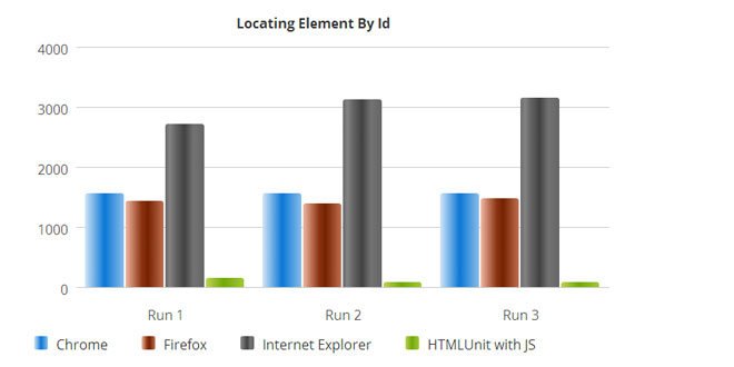
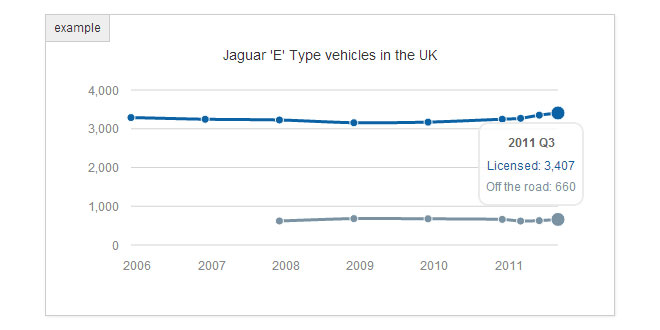
This custom JS charting library implements custom HTML tags which allow creating charts and graphs for infographics.
It is a light-weight, pure JavaScript charting library (NO jQuery or other libraries required) which makes use of HTML5 technologies and works on all modern browsers including IE, Chrome, Firefox, Opera, Safari.
To use it you do not need to know any JavaScript, as all the charts are added as HTML tags. You can follow the very straight forward documentation which also contains examples.
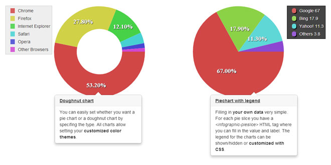
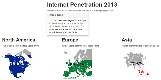
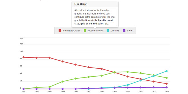
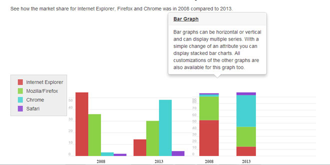
The library allows creating: - Piecharts and doughnuts - Shape graphs – you can transform any image(PNG) into a graph - Shape bar graphs – use any image (PNG) to construct a bar chart - Line graphs - Barchart graphs
1. INCLUDE STYLESHEET AND JAVASCRIPT
<!-- Main file of the library -->
<!-- Be careful that the path to the library file is the correct one. Here we assume that the file was uploaded in the root js folder -->
<script src="/js/infographic.min.js" type="text/javascript"></script>
2. HTML
The Infographic Library works as an extension of the HTML language. So, each infographic type has an HTML tag associated with it. You can input that tag in your HTML documents and it will be rendered as configured.
The Infographic Library includes 5 tags for the following infographics types:
- <infographic-piechart> – for rendering piecharts & doughnuts
- <infographic-shapebargraph> – for rendering bar graph built with copies of an image
- <infographic-shapegraph> – for rendering a shape image as a bar graph
- <infographic-linegraph> – for rendering a line graph
- <infographic-bargraph> – for rendering a classic bar graph
Sample HTML code
<!-- Insert this HTML where you want your doughnut -->
<infographic-piechart width="300" height="300" type="doughnut">
<infographic-data>
<infographic-pieslice value="20">Data 1</infographic-pieslice>
<infographic-pieslice value="80">Data 2</infographic-pieslice>
<infographic-pieslice value="40">Data 3</infographic-pieslice>
</infographic-data>
</infographic-piechart>
3. TAGS CONFIGURATIONS
Piechart & Doughnut
TAG STRUCTURE
<infographic-piechart ... >
<infographic-data>
<infographic-pieslice ... />
...
<!-- Insert one <infographic-pieslice> element for each slice of the pie -->
<!-- The "value" attribute of the <infographic-pieslice> element will determine the size of the slice -->
<!-- And the text inside the tag will become the label of the slice -->
...
</infographic-data>
</infographic-piechart>
DEFINITION AND USAGE
This tag is used for rendering piechart and doughnut graphs. A piechart or doughnut consists of a <infographic-piechart> element and some sub-elements for indicating the underlying data. It has to have one and only one <infographic-data> sub-element which in turn has one or more<infographic-pieslice> sub-elements, each one for indicating data for a slice of the piechart (or doughnut).
This type of graphic also allows a legend which can be created using the <infographic-legend>element. The legend element is NOT a sub-element and it can be put anywhere in the document. Please check the <infographic-legend> element reference section
<infographic-piechart> Attributes
| Attribute | Value | Description |
|---|---|---|
| id | String | Optional The ID of the HTML element. This can be used as reference when a legend element is needed. Defaults to an auto-generated ID. |
| width | Number | Optional Width in pixels of the bounding box for the chart. Defaults to 500. |
| height | Number | Optional Height in pixels of the bounding box for the chart. Defaults to 500. |
| type | String | Optional Can be either of “piechart” or “doughnut”. Default is “piechart” |
| font-size | Unit Size | Optional The font size in size units (eg. “16px” or “1.2em”) for the labels placed on the pie slices. Default is “16px”. |
| font-weight | Unit Size | Optional The font weight in size units (eg. “bold” or “normal”) for the labels placed on the pie slices. Default is “bold”. |
| font-family | String | Optional The font family used for the labels placed on the pie slices. You can use any font including HTML5 web fonts. Default is “sans-serif” |
| font-color | String | Optional The hex color code of the font color used for the labels placed on the pie slices. Default is “#ffffff” |
| colors | String | Optional Comma separated list of hex color codes that will be used in order for rendering the slices of the pie (or doughnut). By default the library uses its own dynamic color schema which prevents neighbouring slices to have too similar colors. |
| label-type | String |
Optional Can be either of “percent”, “value” or “none”.
|
| label-decimals | Number | Optional Indicates the number of decimal places for the slice values displayed. Default is 2 decimal places. |
| label-unit | String | Optional If the label-type attribute is set to “value” you can indicate the measure units (eg. mi, millions, billions, etc.) |
| hole-size | Number | Optional A decimal number between 0 and 1 used only for the doughnut chart indicating the size of the center hole relative to the size of the doughnut. A value of 0 will render a chart identical to the piechart type. Default is 0.5 indicating a hole size half the size of the doughnut. |
| padding | Number | Optional Padding in pixels indicating the space between the outer circumference of the chart and the bounding box of the chart. Default is 0. |
| highlight-mode | String | Optional Indicates how the slices of the chart are highlighted on mouse-over. Possible values are “default” for the default color highlighting, “pop”for highlighting by popping out the slice and “border” by adding an external border to the highlighted slice. Default value is “default”. |
| highlight-size | Number | Optional Works together with the highlight-mode atttribute and indicates the size in pixels of the popping out effect for “pop” and the width of the border for “border” highlight mode. Default value is 4. |
<infographic-data> Attributes
This element has no attributes, but is a required sub-element for the piechart as it is a placeholder for the data that the the piechart represents.
<infographic-pieslice> Attributes
This element holds data for one slice of the piechart. It has to be placed inside a <infographic-data> element, and the text inside the element will become the label of the slice.
| Attribute | Value | Description |
|---|---|---|
| value | Number | Required The numerical value you want to represent as a slice of the piechart. |
Sample HTML code:
<!-- Sample piechart with custom color scheme and fonts-->
<infographic-piechart width="300" height="300" type="piechart"
colors="#880000,#cc4444,#ffaaaa" font-family="arial" font-size="25px"
>
<infographic-data>
<infographic-pieslice value="10">Data 1</infographic-pieslice>
<infographic-pieslice value="60">Data 2</infographic-pieslice>
<infographic-pieslice value="30">Data 3</infographic-pieslice>
</infographic-data>
</infographic-piechart>
Shape Bar Graph
TAG STRUCTURE
<!-- All configuration for the shape bar graph is made through attributes in the tag -->
<infographic-shapebargraph ... >
</infographic-shapebargraph>
DEFINITION AND USAGE
This tag is used for rendering a bar graph by the use of a custom image. You can indicate which image to use and the percentage to represent and the image will be multiplied 10 times and the bar filled according to the value specified. A shape bar graph consists of only a<infographic-shapebargraph> element and its attributes through which you can configure the chart. The main attribute is value which is a number from 0 to 100 indicating the percentage that you want to represent with this graph.
<infographic-shapebargraph> Attributes
| Attribute | Value | Description |
|---|---|---|
| id | String | Optional The ID of the HTML element. Defaults to an auto-generated ID. |
| width | Number | Optional Width in pixels of the bounding box for the chart. Defaults to 500. |
| height | Number | Optional Height in pixels of the bounding box for the chart. Defaults to 500. |
| image | String | Required URL of an image which will be used to compose the barchart. |
| font-size | Unit Size | Optional The font size in size units (eg. “16px” or “1.2em”) for the labels placed on the graph. Default is “16px”. |
| font-weight | Unit Size | Optional The font weight in size units (eg. “bold” or “normal”) for the labels placed on the graph. Default is “bold”. |
| font-family | String | Optional The font family used for the labels placed on the graph. You can use any font including HTML5 web fonts. Default is “sans-serif” |
| font-color | String | Optional The hex color code of the font used for the labels placed on the graph. Default is “#777777″ |
| fill-color | String | Optional Hex code for the color that will be used to fill the chart. Default is “#8dd96c” |
| back-color | String | Optional Hex code for the color that will be used for the inactive part of the chart. Default is “#eeeeee” |
| label | String | Optional Label that will be placed next to the graph indicating what the graph is representing. Default is “” |
| value | Number | Required Value that has to be represented by the chart. As the values represented by this chart are percentages this number has to be between 0 and 100. |
Sample HTML code:
<!-- Sample shape bar graph-->
<!-- You can use any image to construct the chart -->
<infographic-shapebargraph
image="https://cdn1.iconfinder.com/data/icons/simple-icons/128/envato-128-black.png"
value="80"
width="500" height="200"
label="Shape Bar Graph"
fill-color="#A2B324" back-color="#aaa"
font-size="15px" font-color="#444444">
</infographic-shapebargraph>
Shape Graph
TAG STRUCTURE
<!-- All configuration for the shape graph is made through attributes in the tag -->
<infographic-shapegraph ... >
</infographic-shapegraph>
DEFINITION AND USAGE
This tag is used for rendering a graph by the use of a custom image. You can indicate which image to use and the percentage to represent and the image will be filled according to the value specified. A shape graph consists of only a <infographic-shapegraph> element and its attributes through which you can configure the chart. The main attribute is value which is a number from 0 to 100 indicating the percentage that you want to represent with this graph.
<infographic-shapegraph> Attributes
| Attribute | Value | Description |
|---|---|---|
| id | String | Optional The ID of the HTML element. Defaults to an auto-generated ID. |
| width | Number | Optional Width in pixels of the bounding box for the chart. Defaults to 500. |
| description | String | Optional Description of the data represented by the chart. This will appear in the tooltip shown on mouse over. This attribute can contain HTML code, but attention has to be given to the use of “” and ” as this value is filled in as a value of an HTML attribute. Default is blank. |
| height | Number | Optional Height in pixels of the bounding box for the chart. Defaults to 500. |
| image | String | Required URL of an image which will be used to compose the barchart. |
| font-size | Unit Size | Optional The font size in size units (eg. “16px” or “1.2em”) for the labels placed on the graph. Default is “16px”. |
| font-weight | Unit Size | Optional The font weight in size units (eg. “bold” or “normal”) for the labels placed on the graph. Default is “bold”. |
| font-family | String | Optional The font family used for the labels placed on the graph. You can use any font including HTML5 web fonts. Default is “sans-serif” |
| font-color | String | Optional The hex color code of the font color used for the labels placed on the graph. Default is “#ffffff” |
| fill-color | String | Optional Hex code for the color that will be used to fill the chart. Default is “#8dd96c” |
| back-color | String | Optional Hex code for the color that will be used for the inactive part of the chart. Default is “#eeeeee” |
| value | Number | Required Value that has to be represented by the chart. As the values represented by this chart are percentages this number has to be between 0 and 100. |
| type | String | Optional Can be either of “vertical”, “horizontal” or “radial”. This setting determines the direction of the fill: left-to-right, bottom-up or in a circular manner. Default is “vertical” |
Sample HTML code:
<!-- Sample shape graph-->
<!-- You can use any image to construct the chart -->
<!-- You can also set the size, type and color for the font -->
<infographic-shapegraph
image="https://cdn1.iconfinder.com/data/icons/simple-icons/128/envato-128-black.png"
value="50"
width="300"
height="300"
fill-color="#B324A2"
back-color="#cccccc"
font-family="arial"
font-size="45px"
font-color="#ffffff">
</infographic-shapebargraph>
Line Graph
TAG STRUCTURE
<infographic-linegraph ... >
<infographic-data>
<!-- Insert one <infographic-line> element for each line (series) of the graph -->
<infographic-line ... >
<!-- Insert one <infographic-point> element for each value of a line (series) -->
<!-- The value attribute indicates the value for the series -->
<!-- The text inside the node indicates the label of the series -->
<infographic-point ... />
...
</infographic-line ... >
...
</infographic-data>
</infographic-linegraph>
DEFINITION AND USAGE
This tag is used for rendering line graphs. A line graph represents series of values as points that are connected. This graph consists of a <infographic-linegraph> element and some sub-elements for indicating the underlying data. It has to have one and only one <infographic-data>sub-element which in turn has one or more <infographic-line> sub-elements, each one for indicating data for a specific line (series). For each serie you have to indicate one or more points with the help of the <infographic-line> element.
This type of graphic also allows a legend which can be created using the <infographic-legend>element. The legend element is NOT a sub-element and it can be put anywhere in the document. Please check the <infographic-legend> element reference section
<infographic-linegraph> Attributes
| Attribute | Value | Description |
|---|---|---|
| id | String | Optional The ID of the HTML element. This can be used as reference when a legend element is needed. Defaults to an auto-generated ID. |
| width | Number | Optional Width in pixels of the bounding box for the chart. Defaults to 300. |
| height | Number | Optional Height in pixels of the bounding box for the chart. Defaults to 300. |
| colors | String | Optional Comma separated list of hex color codes that will be used in order for rendering each line. The library uses a dynamic color schema which will assign random colors to each line. |
| max-value | Number | Optional Indicates the maximum value for the Y-axis of the chart displayed. This maximum is overriden by any higher value of the line points in the graph. This ensures that all points of all lines are visible in the graph. A value of 0 will make the highest value of the line points to becmoe the maximum value of the Y-axis. Defaults to 0. |
| line-width | Number | Optional The thickness of the line in pixels. Defaults to 10. |
| grid-scale | Number | Optional The step used for drawing the grid markers lines. This value is given in absolute value (eg. 100 means that the grid will have markers for 0, 100, 200, 300, etc). If 0 is indicated then no grid will be displayed. Defaults to 0. |
| grid-color | String | Optional The hex color indicating the color for the grid lines and grid markers. Defaults to “#cccccc”. |
| grid-line-width | Number | Optional Indicates the thickness of the grid lines. Defaults to 0.5. |
| grid-font-size | Unit Size | Optional The font size in size units (eg. “16px” or “1.2em”) for the grid markers. Default is “10px”. |
| grid-font-family | String | Optional The font family used for the grid markers. You can use any font including HTML5 web fonts. Default is “arial” |
| grid-font-weight | Unit Size | Optional The font weight in size units (eg. “bold” or “normal”) for the labels placed on the graph. Default is “bold”. |
| data-csv | String | Optional URL path of a CSV file from which the chart will draw its data (eg. you can export CSV data from GoogleAnalytics and use that file as a parameter for the graph and it will display it accordingly). If this attribute is filled in then you don’t need to add the infographic-data sub-element. |
| x-axis-labels | String | Optional This value can be either “yes” or “no” and indicates if the chart should display or not the labels on the X-axis. Default is “yes”. |
<infographic-data> Attributes
This element has no attributes, but is a required sub-element as it is a placeholder for the data that the the graph represents.
<infographic-line> Attributes
This element holds data for one line of the graph. It has to be placed inside a <infographic-data> element, and its name attribute indicates the name of the series that the line represents.
| Attribute | Value | Description |
|---|---|---|
| Name | String | Required The name of the series that the line represents. This will show in the tooltips and also in the legend (if a legend is used). |
<infographic-point> Attributes
This element holds individual points for a line in the graph. One or more of this elements have to be placed inside a <infographic-line> element indicating the Y-axis value to be represented, and the text inside the element will be the X-axis value.
| Attribute | Value | Description |
|---|---|---|
| value | Number | Required The numerical value you want to represent as a point Y-axis value for the line. |
Sample HTML code:
<!-- Sample line chart with custom color scheme and fonts -->
<!-- You can also configure the grid style (color, font size, scale, etc.) -->
<infographic-linegraph width="450" height="600" line-width="5" grid-scale="100" grid-color="#ccc" grid-font-size="12px" point-size="4" colors="#FF0000,#00FF00,#0000FF" max-value="1000">
<infographic-data>
<infographic-line name="Red Line">
<infographic-point value="100">2010/01</infographic-point>
<infographic-point value="120">2010/02</infographic-point>
<infographic-point value="150">2010/03</infographic-point>
<infographic-point value="250">2010/04</infographic-point>
<infographic-point value="630">2010/05</infographic-point>
<infographic-point value="820">2010/06</infographic-point>
</infographic-line>
<infographic-line name="Green Line">
<infographic-point value="400">2010/01</infographic-point>
<infographic-point value="210">2010/02</infographic-point>
<infographic-point value="200">2010/03</infographic-point>
<infographic-point value="130">2010/04</infographic-point>
<infographic-point value="150">2010/05</infographic-point>
<infographic-point value="120">2010/06</infographic-point>
</infographic-line>
<infographic-line name="Blue Line">
<infographic-point value="300">2010/01</infographic-point>
<infographic-point value="420">2010/02</infographic-point>
<infographic-point value="360">2010/03</infographic-point>
<infographic-point value="530">2010/04</infographic-point>
<infographic-point value="350">2010/05</infographic-point>
<infographic-point value="420">2010/06</infographic-point>
</infographic-line>
</infographic-data>
</infographic-linegraph>
Bar Graph
TAG STRUCTURE
<infographic-bargraph ... >
<infographic-data>
<!-- Insert one <infographic-bargroup> element for each group of bars that you want to display -->
<infographic-bargroup ... >
<!-- Insert one <infographic-bar> element for each bar (series) -->
<!-- The value attribute indicates the value for the series -->
<!-- The text inside the node indicates the label of the series -->
<infographic-bar ... />
...
</infographic-bargroup ... >
...
</infographic-data>
</infographic-bargraph>
DEFINITION AND USAGE
This tag is used for rendering bar graphs. A bar graph represents series of values as bars. The bars can be represented either vertically (bottom to top) or horizontally (left to right). This graph consists of a <infographic-bargraph> element and some sub-elements for indicating the underlying data. It has to have one and only one <infographic-data> sub-element which in turn has one or more <infographic-bargroup> sub-elements, each one for indicating data for a bar (series). For each serie you have to indicate one or more values with the help of the<infographic-bar> element.
This type of graphic also allows a legend which can be created using the <infographic-legend>element. The legend element is NOT a sub-element and it can be put anywhere in the document. Please check the <infographic-legend> element reference section
<infographic-bargraph> Attributes
| Attribute | Value | Description |
|---|---|---|
| id | String | Optional The ID of the HTML element. This can be used as reference when a legend element is needed. Defaults to an auto-generated ID. |
| width | Number | Optional Width in pixels of the bounding box for the chart. Defaults to 200. |
| height | Number | Optional Height in pixels of the bounding box for the chart. Defaults to 200. |
| colors | String | Optional Comma separated list of hex color codes that will be used in order for rendering each bar. The library uses a dynamic color schema which will assign random colors to each line. |
| type | String | Optional Can be either “vertical” or “horizontal” and indicates how the bars should be drawn. “Vertical” will draw the bars bottom-up and “horizontal” will draw them left-to-right. Defaults to “vertical”. |
| serie-spacing | Number | Optional Value in pixels indicating the space between groups of bars (bargroup elements). Defaults to 10. |
| font-size | Unit Size | Optional The font size in size units (eg. “16px” or “1.2em”) for the labels placed on the around the bars. Default is “10px”. |
| font-weight | Unit Size | Optional The font weight in size units (eg. “bold” or “normal”) for the labels placed on the chart. Default is “bold”. |
| font-family | String | Optional The font family used for the labels placed on the chart. You can use any font including HTML5 web fonts. Default is “arial” |
| font-color | String | Optional The hex color code of the font color used for the labels placed on the chart. Default is “#777777″ |
| grid-scale | Number | Optional The step used for drawing the grid markers lines. This value is given in absolute value (eg. 100 means that the grid will have markers for 0, 100, 200, 300, etc). If 0 is indicated then no grid will be displayed. Defaults to 0. |
| grid-color | String | Optional The hex color indicating the color for the grid lines and grid markers. Defaults to “#cccccc”. |
| grid-line-width | Number | Optional Indicates the thickness of the grid lines. Defaults to 0.5. |
| grid-font-size | Unit Size | Optional The font size in size units (eg. “16px” or “1.2em”) for the grid markers. Default is “10px”. |
| grid-font-family | String | Optional The font family used for the grid markers. You can use any font including HTML5 web fonts. Default is “arial” |
| grid-font-weight | Unit Size | Optional The font weight in size units (eg. “bold” or “normal”) for the labels placed on the graph. Default is “bold”. |
| bar-type | String | Optional This value can be either “normal” or “stacked” and indicates if this is the bars are represented side by side or stacked. Default is “normal”. |
<infographic-data> Attributes
This element has no attributes, but is a required sub-element as it is a placeholder for the data that the the graph represents.
<infographic-bargroup> Attributes
This element holds data for a group of bars in the graph. It has to be placed inside a <infographic-data> element, and its name attribute indicates the name of the series (bar group).
| Attribute | Value | Description |
|---|---|---|
| Name | String | Required The name of the series (bar group). |
<infographic-bar> Attributes
This element holds individual values for a bar in the graph. One or more of this elements have to be placed inside a <infographic-line> element indicating the size of the bar. The text inside the element will be the label of the series. The label will appear in the tooltips and also in the legend (if a legend is used).
IMPORTANT: The text inside this element uniquely identifies the subserie that the bar represents, so it should be consistent to the value inside <infographic-bar> elements in other<infographic-bargroup> elements.
| Attribute | Value | Description |
|---|---|---|
| value | Number | Required The numerical value you want to represent as a point Y-axis value for the line. |
Sample HTML code:
<!-- Sample horizontal bar chart with custom color scheme and fonts -->
<infographic-bargraph width="450"
font-color="#000000"
height="600"
type="horizontal"
colors="#894E1E,#DB9A55,#E8831E,#EFAA3B,#8D9B25"
grid-scale="100"
grid-font-size="8px"
grid-color="#ccc"
>
<infographic-data>
<infographic-bargroup name="2011">
<infographic-bar value="330">Data 1</infographic-bar>
<infographic-bar value="1200">Data 2</infographic-bar>
<infographic-bar value="1000">Data 3</infographic-bar>
<infographic-bar value="1830">Data 4</infographic-bar>
<infographic-bar value="730">Data 5</infographic-bar>
<infographic-bar value="430">Data 6</infographic-bar>
<infographic-bar value="130">Data 7</infographic-bar>
</infographic-bargroup>
<infographic-bargroup name="2012">
<infographic-bar value="730">Data 1</infographic-bar>
<infographic-bar value="200">Data 2</infographic-bar>
<infographic-bar value="700">Data 3</infographic-bar>
<infographic-bar value="130">Data 4</infographic-bar>
<infographic-bar value="830">Data 5</infographic-bar>
<infographic-bar value="330">Data 6</infographic-bar>
<infographic-bar value="330">Data 7</infographic-bar>
</infographic-bargroup>
<infographic-bargroup name="2013">
<infographic-bar value="130">Data 1</infographic-bar>
<infographic-bar value="800">Data 2</infographic-bar>
<infographic-bar value="300">Data 3</infographic-bar>
<infographic-bar value="230">Data 4</infographic-bar>
<infographic-bar value="130">Data 5</infographic-bar>
<infographic-bar value="530">Data 6</infographic-bar>
<infographic-bar value="340">Data 7</infographic-bar>
</infographic-bargroup>
</infographic-data>
</infographic-bargraph>
Legend
TAG STRUCTURE
<infographic-legend ... >
</infographic-legend>
DEFINITION AND USAGE
This tag is used to show the meaning and the color relations represented in the graphs. The legend consists of only a simple <infographic-legend> element with some attributes that indicate for what graph the legend is. It will be rendered as a box containing small colored rectangles and labels indicating the data series represented in the graph that they relate to.
This element can be placed anywhere in the HTML document to offer maximum flexibility. Also, you can style it however you want (just like the other elements).
Only Piecharts (Doughnuts), Line Graphs and Bar Graphs can have a legend element, because these are the graphs that handle series and subseries of data.
<infographic-piechart> Attributes
| Attribute | Value | Description |
|---|---|---|
| for | String | Required The ID of the graph element for which the legend will display the colors and labels of the data series. |
| display | String | Optional Can be either “block” or “inline”.”Block” will display each data series on a separate line. “Inline” will try to place each dataseries on a single line. Defaults is “block”. |
Sample HTML code:
<!-- Sample piechart with custom color scheme and fonts -->
<!-- The legend element can be placed anywhere -->
<!-- Here we place it right after the piechart -->
<!-- Notice that we use the ID of the piechart to attach the legend -->
<infographic-piechart width="300" height="300" type="piechart"
colors="#880000,#cc4444,#ffaaaa" font-family="arial" font-size="25px"
id="pieChartExampleForLegend"
>
<infographic-data>
<infographic-pieslice value="10">Data 1</infographic-pieslice>
<infographic-pieslice value="60">Data 2</infographic-pieslice>
<infographic-pieslice value="30">Data 3</infographic-pieslice>
</infographic-data>
</infographic-piechart>

<!-- Here's an inline legend for the piechart -->
<infographic-legend for="pieChartExampleForLegend" display="inline">
</infographic-legend>
 JS Tutorial
