Download
User Rating: 0/5 ( 0 votes)
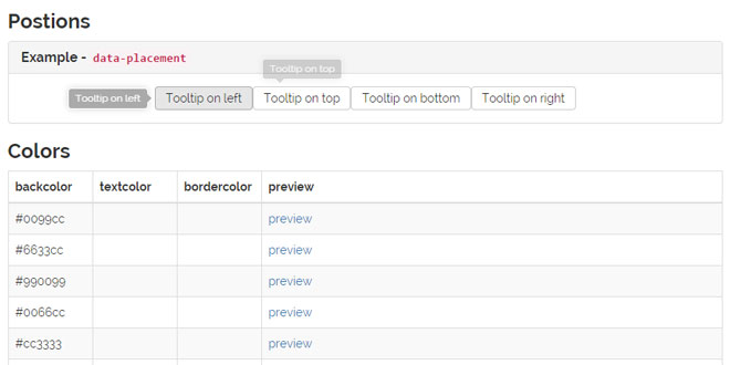
ggtooltip.js is a simple jQuery tooltip plugin extended from Twitter Bootstrap's tooltip plugin that support 4 positions, background color, font color and border color without using images.
FEATURES
-
4 Positions: top, right, bottom and left.
-
Unlimited background colors.
-
Unlimited font colors.
-
Different border color combinations based on background colors.
-
Supports different types of tooltip triggers such as click, hover, focus and manual.
-
Powered by HTML5, CSS3 and jQuery.
Source: demo.gigagit.com
1. INCLUDE CSS AND JS FILES
<link href="css/ggtooltip.css" rel="stylesheet" />
<script type="text/javascript" src="js/ggtooltip.js"></script>
2. HTML
<a href="#"
    data-placement="top"
    data-title="sample tooltip text">
    link text
</a>
3. JAVASCRIPT
$("a").ggtooltip();
4. OPTIONS
Options can be passed via data attributes or JavaScript. For data attributes, append the option name to data-, as in data-backcolor="".
|
Name |
type |
default |
description |
|
animation |
boolean |
true |
apply a CSS fade transition to the tooltip |
|
html |
boolean |
false |
Insert HTML into the tooltip. If false, jQuery's text method will be used to insert content into the DOM. Use text if you're worried about XSS attacks. |
|
placement |
string | function |
'top' |
how to position the tooltip - top | bottom | left | right | auto.
When "auto" is specified, it will dynamically reorient the tooltip. For example, if placement is "auto left", the tooltip will display to the left when possible, otherwise it will display right. |
|
selector |
string |
false |
If a selector is provided, tooltip objects will be delegated to the specified targets. |
|
title |
string | function |
'' |
default title value if title attribute isn't present |
|
backcolor |
string |
'#000000' |
Color name or Hex-code for setting the background color. |
|
textcolor |
string |
'#ffffff' |
Color name or Hex-code for setting the font color. |
|
bordercolor |
string |
'#ffffff' |
Color name or Hex-code for setting the border color. |
|
trigger |
string |
'hover focus' |
how tooltip is triggered - click | hover | focus | manual. You may pass multiple triggers; separate them with a space. |
|
delay |
number | object |
0 |
delay showing and hiding the tooltip (ms) - does not apply to manual trigger type
If a number is supplied, delay is applied to both hide/show
Object structure is: delay: { show: 500, hide: 100 }
|
 JS Tutorial


