- Overview
- Documents
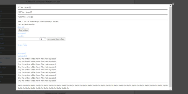
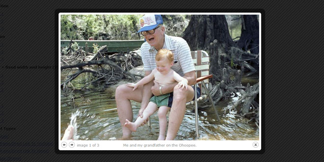
Boxy is a flexible, Facebook-style dialog box for jQuery with support for dragging and size tweening. It differs from other overlays I've seen by providing an object interface to control dialogs after they've been created. And for simple usage scenarios, boxy also provides a jQuery plugin for automatically hooking up links and forms, as well as anask() helper for presenting multiple choices to the user.
Here's an example, taken from the old feedback forms on my project pages:

Using the jQuery Plugin
To use the jQuery plugin, put $(selector).boxy(); in your document.ready, substituting "selector" as appropriate, e.g. "a[rel=boxy],form.with-confirmation". This will attach behaviours to matched elements as follows:
- Anchors with an href attribute containing # will take as their content the DOM element with the corresponding ID, adding the class boxy-content and making it visible in the process.
- Anchors with any other href will attempt to load their content with AJAX. Ideally, we'd have a same origin check and delegate cross-domain requests to an iframe. That one's on the to-do list.
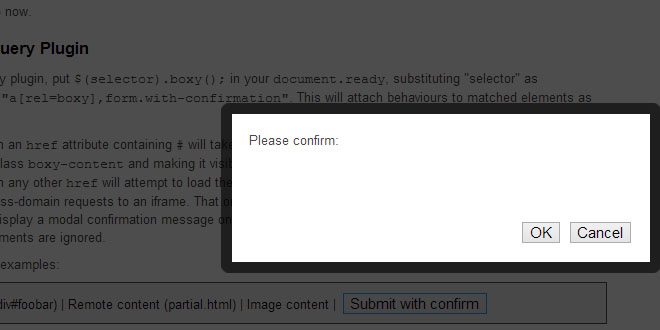
- Forms will display a modal confirmation message on submit.
- All other elements are ignored.
Try the following examples:
<script type='text/javascript'>
$(function() {
  $('.boxy').boxy();
});
</script>
Note that boxy automatically works out the size of your inner content region and positions itself appropriately; there's no need to explicitly set the dimensions of the wrapper.
The plugin method understands a single option; any other options are passed onto boxy's constructor (seeconstructor options, below), or for AJAX operations, Boxy.load.
| Option | Description | Default |
|---|---|---|
| message | Message displayed for form confirmation hooks. | "Please confirm:" |
Additionally, the title attribute of each matched anchor will be used as the title of its corresponding dialog.
Creating Instances Manually
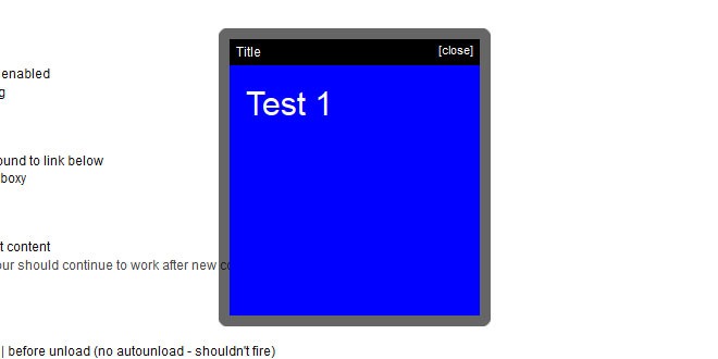
Using boxy in manual mode is easy - just create a new instance of Boxy, passing the inner content and a hash of any additional options. By default, dialogs will become visible immediately, centred in the viewport, with dragging enabled. All of these settings can be overridden by additional options passed to the constructor - see constructor options, below, for more details.
The content passed to the constructor can be any valid parameter to jQuery's $() function - a DOM element, an HTML fragment or another jQuery object. Whatever is provided will be set to display: block and have the class boxy-content added prior to its insertion within the dialog.
Mandatory examples follow, booya:
Creating new dialogs
- Create a new dialog - new Boxy("<p>Content</p>", {title: "Dialog"});
- Create a new dialog, undraggable - new Boxy("<p>Content</p>", {title: "Dialog", draggable: false});
- Create a new dialog, no default close button - new Boxy("<p>Content</p>", {title: "Dialog", closeable: false});
- Create a new dialog, absolute positioning - new Boxy("<p>Content</p>", {title: "Dialog", fixed: false});
- Create a new dialog, modal - new Boxy("<p>Content</p>", {title: "Dialog", modal: true});
- Create a new dialog, custom behaviours - new Boxy("<p>Content</p>", {behaviours: function(r) { $(r).hover(function() { $(this).css("background-color", "red"); }, function() { $(this).css("background-color", "white"); }); }});
Modifying existing dialogs
- Tween newest dialog up - someDialog.tween(400, 400);
- Tween newest dialog down - someDialog.tween(100, 100);
- Get title of newest dialog - someDialog.getTitle();
- Set title of newest dialog - someDialog.setTitle("new title");
Note that the title bar (and hence the default close button and drag actuator) will only appear if a title is specified. In the future this behaviour may change so that a title bar is always present unless specifically disabled.
Once you've created an instance, you can assign it to a variable and thereafter move, size, show and hide it at will via the provided API - documented below.
Asking Questions
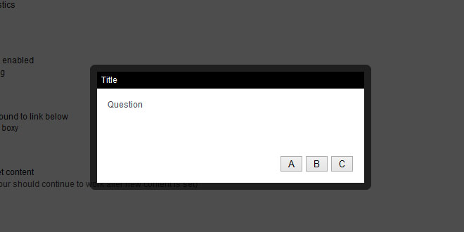
Using the Boxy.ask(), Boxy.alert() and Boxy.confirm() helpers it is possible to prompt the user to select from a varying number of choices and fire an optional callback on completion. Click on one of the links below for a demo and refer to the API documentation for more information.
- Ask - Boxy.ask() - user-defined options, selected option is passed to callback
- Alert - Boxy.alert() - callback always fired on dismissal
- Confirmation - Boxy.confirm() - callback only fired if user selects 'OK'
<script type='text/javascript'>
$(function() {
  $('#ask-actuator').click(function() {
    Boxy.ask("How are you feeling?", ["Great", "OK", "Not so good"], function(val) {
      alert("You chose: " + val);
    }, {title: "This is a question..."});
    return false;
  });
  $('#alert-actuator').click(function() {
    Boxy.alert("File not found", null, {title: 'Message'});
    return false;
  });
  $('#confirm-actuator').click(function() {
    Boxy.confirm("Please confirm:", function() { alert('Confirmed!'); }, {title: 'Message'});
    return false;
  });
});
</script>
API
- Boxy.load(url, options)
-
Load content from a URL and display in a Boxy dialog. The following options are supported:
- type - HTTP method, defaults to GET.
- cache - if true, cache content for successive calls. Equivalent to passing cache option to jQuery's ajax method. Default: false.
- filter - jQuery expression used to filter remote content.
(any additional options you specify will be passed to the Boxy constructor)
- Boxy.get(element)
- Returns the Boxy instance containing element, e.g. <a href="#" onclick="Boxy.get(this).hide();">Close dialog</a>.
- Boxy.ask(question, answers, callback, options)
- Displays a modal, non-closeable dialog allowing the user to select from a set of options. question is the message to be displayed to the user. answers is an array or hash of all possible responses. callback will receive the selected response; this will be the value or corresponding key depending on whether an array or hash of answers was provided. options is an optional set of additional options to be passed to the dialog's constructor.
- Boxy.alert(message, callback, options)
-
Displays a modal, non-closeable dialog displaying a message to the user.
Note: this method is not intended to replace the native window.alert() function provided by browsers as it does not have the capability to block program execution while the dialog is visible. - Boxy.confirm(message, callback, options)
-
Displays a modal, non-closeable dialog displaying a message with OK and Cancel buttons. Callback will only be fired if user selects OK.
Note: this method is not intended to replace the native window.confirm() function provided by browsers as it does not have the capability to block program execution while the dialog is visible. - Boxy.linkedTo(ele)
- Returns the Boxy instance which has been linked to DOM element ele via the actuator constructor option.
- Boxy.isModalVisible()
- Returns true if any modal dialog is currently visible, false otherwise.
- new Boxy(element, options)
- Constructor; create a new Boxy dialog. element is the dialog content; any valid parameter to jQuery's $() function is also valid here. options is a hash of configuration options, see the detailed documentation below.
- estimateSize()
- Estimate the size of the dialog box while invisible. Do not use this method if dialog is currently visible; use getSize()instead.
- getSize()
- Returns the size of the dialog as an array of [width, height].
- getContentSize()
- Returns the size of the dialog's content region - by default this is everything within the dialog's frame, excluding title bar.
- getPosition()
- Returns the co-ords of the dialog's top-left as an array of [x,y].
- getCenter()
- Returns the co-ords of the dialog's center as an array of [x,y].
- getInner()
- Returns a jQuery object wrapping the dialog's inner region - everything inside the frame, including the title bar. Chances are you want getContent(), below, instead.
- getContent()
- Returns a jQuery object wrapping the dialog's content region - everything inside the frame, excluding the title bar.
- setContent(newContent)
- Sets the dialog content; any valid parameter to $() is valid for newContent. Chainable.
- moveTo(x,y)
- Moves the dialog so that its top-left is at (x,y). Make either value null to center on a single co-ordinate. Chainable.
- centerAt(x,y)
- Moves the dialog so that its center is at (x,y). Chainable.
- center(axis)
- Moves the dialog so that it is centered in the viewport. Optional parameter axis can be 'x' or 'y' to center on a single axis only. Chainable.
- resize(w,h,after)
- Resizes the dialog to [w,h], firing optional callback after on completion. The callback will receive the Boxy instance as an argument. Chainable.
- tween(w,h,after)
- Tweens the dialog to [w,h], firing optional callback after on completion. The callback will receive the Boxy instance as an argument. Chainable.
- isVisible()
- Returns true if this dialog is currently visible, false otherwise.
- show()
- Show the dialog. Chainable.
- hide(after)
- Hide the dialog, firing optional callback after on completion. Chainable.
- toggle()
- Toggle visibility of the dialog. Chainable.
- hideAndUnload(after)
- Hide the dialog and then immediately unload. after callback will be fired before unloading. Chainable.
- unload()
- Remove this dialog from the DOM and sever its actuator link, if any. Once a dialog has been unloaded any further operations on it are undefined.
- toTop()
- Move this dialog above all others. Chainable.
- getTitle()
- Returns the title for this dialog as HTML.
- setTitle(t)
- Sets the title HTML of this dialog to t. Chainable.
Complete list of constructor options
| Option | Description | Default |
|---|---|---|
| title | Title to display in auto-generated title bar. | null |
| closeable | Whether a close-dialog actuator should be added to the auto-generated title bar. No effect if title is unspecified. | true |
| closeText | Text to use for close link in title bar, if enabled. | "[close]" |
| draggable | Whether this dialog should be draggable via the titlebar. No effect if title is unspecified. | true |
| clone | Should the dialog's content element and event handlers be cloned before being placed in the inner region? | false |
| actuator | DOM element (not jQuery object) which triggered this dialog. A link between the two will be set up allowing a reference to the dialog to be later retrieved from the element by doingBoxy.linkedTo(element). The link will be automatically severed when the dialog is unloaded. | null |
| center | Should the dialog be centred on screen? | true |
| fixed | Should we use fixed, rather than absolute, positioning? Dialogs with fixed positions will on-screen irrespective of scrolling. IE6 does not support fixed positioning and will always drop back to absolute. | true |
| show | Should the dialog be shown immediately? If false, you'll need to call dialog.show() manually. | true |
| modal | Should the dialog be modal? Modal dialogs "black out" the screen, preventing other elements from receiving events. | false |
| x | x (left) coordinate of dialog. Passing this option overridescenter. Pass null to center on this coordinate only. | 50 |
| y | y (top) coordinate of dialog. Passing this option overridescenter. Pass null to center on this coordinate only. | 50 |
| unloadOnHide | If true, this dialog will be unloaded (e.g. removed from the DOM) after it is hidden. | false |
| clickToFront | If true, clicking anywhere on this dialog (as opposed to the just the title bar) will cause it to come to the top. | false |
| behaviours | Function used to apply custom behaviours to dialog content. Invoked after each call to setContent(), and executes in the context of the Boxy object. Will receive a jQuery object wrapping the content region as a parameter. | function(r) {} |
| afterDrop | Callback invoked after this dialog has been dropped; executes in the context of the Boxy object. | function() {} |
| afterShow | Callback invoked after this dialog becomes visible; executes in the context of the Boxy object. Can be used to focus on form inputs. | function() {} |
| afterHide | Callback invoked after this dialog is hidden; executes in the context of the Boxy object. | function() {} |
| beforeUnload | Callback invoked before this dialog is unloaded; executes in the context of the Boxy object. | function() {} |
CSS Selectors
Boxy's appearance can be fully customized via CSS; here's a list of the selectors you're likely to be interested in.
- .boxy-wrapper .title-bar
- div wrapping the auto-generated title bar.
- .boxy-wrapper .title-bar h2
- Contents of the title bar.
- .boxy-wrapper .title-bar.dragging
- Title bar while with drag in progress.
- .boxy-wrapper .title-bar .close
- Default close-dialog actuator
- .boxy-inner
- Internal region, including title bar.
- .boxy-content
- Internal region, excluding title bar. This class will be automatically added to any element passed to Boxy's constructor.
- .boxy-wrapper .question
- Wraps question text for dialogs created via Boxy.ask().
- .boxy-wrapper .answers
- Wraps response buttons for dialogs created via Boxy.ask().
- .close
- Any elements with this class will be hooked up to close the dialog on click.
TODO
- Ability to pass display options via URL like Thickbox and Facebox, e.g. <a href="#foobar?modal=true" rel="boxy">Open dialog</a>
- Fade between "pages" on a dialog, like in OS X preference panes. I've written a tab plugin for this already, hopefully integration will be easy.
 JS Tutorial
