Download
Demo
- Overview
- Documents
User Rating: 0.3/5 ( 1 votes)
Your Rating:
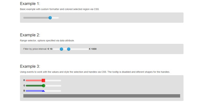
Bootstrap Slider is a customizable jQuery component to create vertical and horizontal slider. Also it can be use as a range slider.
Source: github.com
1. INCLUDE CSS AND JS FILES
<link href="bower_components/bootstrap/dist/css/bootstrap.min.css" rel="stylesheet">
<link href="css/bootstrap-slider.css" rel="stylesheet">
<script type='text/javascript' src="bower_components/jquery/dist/jquery.min.js"></script>
<script type='text/javascript' src="js/bootstrap-slider.js"></script>
2. HTML
<input id="ex1" data-slider-id='ex1Slider' type="text" data-slider-min="-5" data-slider-max="20" data-slider-step="1" data-slider-value="14"/>
3. JAVASCRIPT
$('#ex1').slider({
	formatter: function(value) {
		return 'Current value: ' + value;
	}
});
4. OPTIONS
Options can be passed either as a data (data-slider-foo) attribute, or as part of an object in the slider call. The only exception here is the formatter argument - that can not be passed as a data- attribute.
| Name | Type | Default | Description |
|---|---|---|---|
| id | string | '' | set the id of the slider element when it's created |
| min | float | 0 | minimum possible value |
| max | float | 10 | maximum possible value |
| step | float | 1 | increment step |
| precision | float | number of digits after the decimal ofstep value | The number of digits shown after the decimal. Defaults to the number of digits after the decimal of step value. |
| orientation | string | 'horizontal' | set the orientation. Accepts 'vertical' or 'horizontal' |
| value | float,array | 5 | initial value. Use array to have a range slider. |
| range | bool | false | make range slider. Optional if initial value is an array. If initial value is scalar, max will be used for second value. |
| selection | string | 'before' | selection placement. Accepts: 'before', 'after' or 'none'. In case of a range slider, the selection will be placed between the handles |
| tooltip | string | 'show' | whether to show the tooltip on drag, hide the tooltip, or always show the tooltip. Accepts: 'show', 'hide', or 'always' |
| tooltip_separator | string | ':' | tooltip separator |
| tooltip_split | bool | false | if false show one tootip if true show two tooltips one for each handler |
| handle | string | 'round' | handle shape. Accepts: 'round', 'square', 'triangle' or 'custom' |
| reversed | bool | false | whether or not the slider should be reversed |
| enabled | bool | true | whether or not the slider is initially enabled |
| formatter | function | returns the plain value | formatter callback. Return the value wanted to be displayed in the tooltip |
| natural_arrow_keys | bool | false | The natural order is used for the arrow keys. Arrow up select the upper slider value for vertical sliders, arrow right the righter slider value for a horizontal slider - no matter if the slider was reversed or not. By default the arrow keys are oriented by arrow up/right to the higher slider value, arrow down/left to the lower slider value. |
5. FUNCTIONS
NOTE: Optional parameters are italicized.
| Function | Parameters | Description |
|---|---|---|
| getValue | --- | Get the current value from the slider |
| setValue | newValue,triggerSlideEvent | Set a new value for the slider. If optional triggerSlideEvent parameter is true, the 'slide' event will be triggered. |
| destroy | --- | Properly clean up and remove the slider instance |
| disable | --- | Disables the slider and prevents the user from changing the value |
| enable | --- | Enables the slider |
| toggle | --- | Toggles the slider between enabled and disabled |
| isEnabled | --- | Returns true if enabled, false if disabled |
| setAttribute | attribute, value | Updates the slider's attributes |
| getAttribute | attribute | Get the slider's attributes |
| refresh | --- | Refreshes the current slider |
| on | eventType, callback | When the slider event eventType is triggered, the callback function will be invoked |
| relayout | --- | Renders the tooltip again, after initialization. Useful in situations when the slider and tooltip are initially hidden. |
6. EVENTS
| Event | Description | Value |
|---|---|---|
| slide | This event fires when the slider is dragged | The new slider value |
| slideStart | This event fires when dragging starts | The new slider value |
| slideStop | This event fires when the dragging stops or has been clicked on | The new slider value |
| change | This event fires when the slider value has changed | An object with 2 properties: "oldValue" and "newValue" |
| slideEnabled | This event fires when the slider is enabled | N/A |
| slideDisabled | This event fires when the slider is disabled | N/A |
 JS Tutorial


