- Overview
- Documents
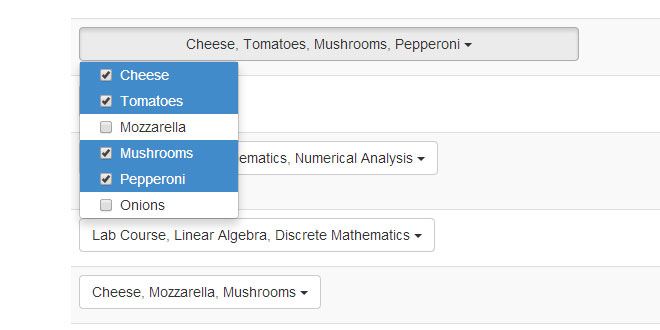
Bootstrap Multiselect is a JQuery based plugin to provide an intuitive user interface for using select inputs with the multiple attribute present. Instead of a select a bootstrap button will be shown as dropdown menu containing the single options as checkboxes.
Source: davidstutz.github.io
1. INCLUDE CSS AND JS FILES
<!-- Include Twitter Bootstrap and jQuery: -->
<link rel="stylesheet" href="css/bootstrap.min.css" type="text/css"/>
<script type="text/javascript" src="js/jquery.min.js"></script>
<script type="text/javascript" src="js/bootstrap.min.js"></script>

<!-- Include the plugin's CSS and JS: -->
<script type="text/javascript" src="js/bootstrap-multiselect.js"></script>
<link rel="stylesheet" href="css/bootstrap-multiselect.css" type="text/css"/>
2. HTML
<!-- Build your select: -->
<select class="multiselect" multiple="multiple">
	<option value="cheese">Cheese</option>
	<option value="tomatoes">Tomatoes</option>
	<option value="mozarella">Mozzarella</option>
	<option value="mushrooms">Mushrooms</option>
	<option value="pepperoni">Pepperoni</option>
	<option value="onions">Onions</option>
</select>
3. JAVASCRIPT
$(document).ready(function() {
    $('.multiselect').multiselect();
});
4. OPTIONS
| Option | Explanation |
|---|---|
| buttonText | A function returning the string displayed if options are selected. All currently selected options and the select are passed as argument. In addition HTML can be added to the button, for example the caret icon seen in the examples. |
| numberDisplayed | This option can be used to define the number of displayed option before the text defined in nSelectedText is used. This option may not be available when using a custombuttonText function. |
| nonSelectedText | A string that is displayed when no options are selected. |
| buttonTitle | Function defining the title of the button. Similar to thebuttonText option. |
| buttonClass | The class of the dropdown button. Default: btn. |
| buttonWidth |
The width of the dropdown button. Default: auto. Allowed formats:
|
| buttonContainer | The used container holding both the dropdown button and the dropdown menu. Default: <div class="btn-group" />. |
| label | Function to write the label of the item. |
| selectedClass | The class applied to the parent <li> of selected items. Default: active. |
| onChange | This event handler is triggered when the selected options are changed. |
| onDropdownShow |
This event handler is triggered when the dropdown is shown. Both, the onDropdownShow and the onDropdownHideoptions are not supported when using Twitter Bootstrap 2.3.x. |
| onDropdownHide |
This event handler is triggered when the dropdown is hidden. Both, the onDropdownShow and the onDropdownHideoptions are not supported when using Twitter Bootstrap 2.3.x. |
| onDropdownShown |
This event handler is triggered after the dropdown is shown. Both, the onDropdownShown and theonDropdownHidden options are not supported when using Twitter Bootstrap 2.3.x. |
| onDropdownHidden |
This event handler is triggered after the dropdown are hidden. Both, the onDropdownShown and theonDropdownHidden options are not supported when using Twitter Bootstrap 2.3.x. |
| maxHeight | Used for a long list of options this option defines the maximum height of the dropdown menu. If the size is exceeded a scrollbar will appear. |
| includeSelectAllOption | If set to true a 'Select all' option will be added. |
| includeSelectAllIfMoreThan | If includeSelectAllOption is set to true, the select all option will be added if more thanincludeSelectAllIfMoreThan options are present. By default this option is set to 0. |
| selectAllText | The label for the 'Select all' option. |
| selectAllValue | The value by which the select all option is identified. |
| enableFiltering | If set to true a search field will be added to filter the visible options. |
| filterBehavior | Either text, value or both. Determines whether the option's text, value or both is used for filtering. |
| enableCaseInsensitiveFiltering | The same as enableFiltering but with case insensitive filtering. |
| filterPlaceholder | The placeholder used in the search field if filtering is enabled. |
| dropRight | Will make the menu drop right if set to true. |
5. METHODS
|
.multiselect('destroy') This method is used to destroy the plugin on the given element - meaning unbinding the plugin. |
|
.multiselect('refresh') This method is used to refresh the checked checkboxes based on the currently selected options within the select. Click 'Select some options' so select some of the options (meaning added the selected attribute to some of the options). Then click refresh. The plugin will update the checkboxes accordingly. |
|
.multiselect('rebuild') Rebuilds the whole dropdown menu. All selected options will remain selected (if still existent!). |
|
.multiselect('select', value, triggerOnChange) Selects an option by its value. Works also using an array of values. If triggerOnChange is set to true, the onChange event is triggered. |
|
.multiselect('deselect', value) Deselect an option by its value. Works also using an array of values. If triggerOnChange is set to true, the onChange event is triggered. |
|
.multiselect('dataprovider', data) Provides data for building the select's options the following way: |
|
.multiselect('setOptions', options) Used to change configuration after initializing the multiselect. This may be useful in combination with .multiselect('rebuild'). |
|
.multiselect('disable') Disable both the underlying select and the dropdown button. |
|
.multiselect('enable') Enable both the underlying select and the dropdown button. |
 JS Tutorial


