Download
Demo
- Overview
- Documents
User Rating: 3.6/5 ( 5 votes)
Your Rating:
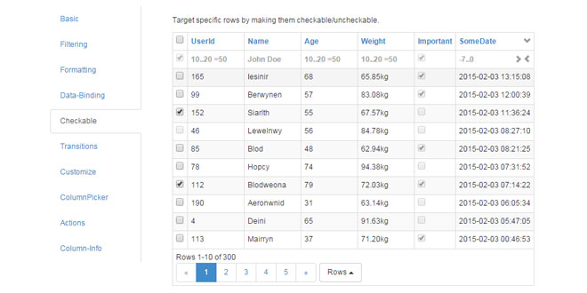
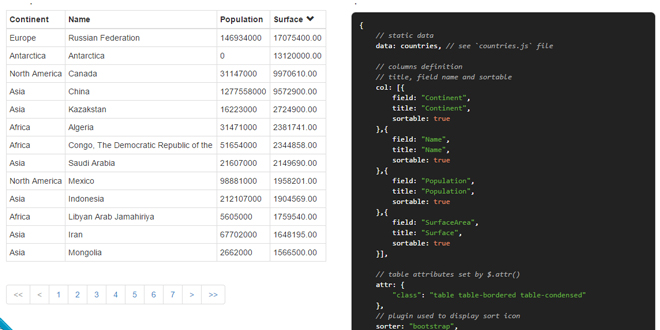
Watable is a swiss army jQuery table plugin with filter, format, paginate and sort your data with ease and lightning speed.
Source: wootapa-watable.appspot.com
1. INCLUDE CSS AND JS FILES
<link rel='stylesheet' href="http://netdna.bootstrapcdn.com/bootstrap/3.3.1/css/bootstrap.min.css" />
<link rel='stylesheet' href='watable.css'/>
<script src="http://ajax.googleapis.com/ajax/libs/jquery/1.11.2/jquery.js" type="text/javascript"></script>
<script src="http://netdna.bootstrapcdn.com/bootstrap/3.3.1/js/bootstrap.min.js" type="text/javascript"></script>
<script src="jquery.watable.js" type="text/javascript" charset="utf-8"></script>
2. HTML
<div id="example1" style="width:auto"></div>
3. JAVASCRIPT
$('#example1').WATable({
	data: generateSampleData(2)
});
//Generates some data.
function generateSampleData(limit) {
	//First define the columns
	var cols = {
		userId: {
			index: 1, //The order this column should appear in the table
			type: "number", //The type. Possible are string, number, bool, date(in milliseconds).
			friendly: "<span class='glyphicon glyphicon-user'></span>",  //Name that will be used in header. Can also be any html as shown here.
			format: "<a href='#' target='_blank'>{0}</a>",  //Used to format the data anything you want. Use {0} as placeholder for the actual data.
			unique: true,  //This is required if you want checkable rows, databinding or to use the rowClicked callback. Be certain the values are really unique or weird things will happen.
			sortOrder: "asc", //Data will initially be sorted by this column. Possible are "asc" or "desc"
			tooltip: "This column has an initial filter" //Show some additional info about column
			//filter: "1..400" //Set initial filter.
		},
		name: {
			index: 2,
			type: "string",
			friendly: "Name",
			cls: "blue, anotherClass", //apply some css classes
			tooltip: "This column has a custom placeholder and css classes", //Show some additional info about column
			placeHolder: "abc123" //Overrides default placeholder and placeholder specified in data types(row 34).
		},
		age: {
			index: 3,
			type: "number",
			friendly: "Age",
			sorting: true, //dont allow sorting
			tooltip: "This column has filtering and sorting turned off", //Show some additional info about column
			filter: false //Removes filter field for this column
		},
		weight: {
			index: 4,
			type: "number",
			decimals: 2, //Force decimal precision
			friendly: "Weight",
			placeHolder: "50..90",
			format: "{0}kg",
			tooltip: "This column has no tooltip for the filter", //Show some additional info about column
			filterTooltip: false //Turn off tooltip for this column
		},
		height: {
			index: 5,
			type: "number",
			friendly: "Height",
			hidden:true //Hides the column. Useful if you want this value later on but not visible to user. It can be made visible if columnPicker is enabled.
		},
		important: {
			index: 6,
			type: "bool",
			friendly: "Important"
		},
		someDate: {
			index: 7,
			type: "date", //Don't forget dates are expressed in milliseconds
			friendly: "SomeDate"
		},
		someDateDay: {
			index: 8,
			type: "date", //Don't forget dates are expressed in milliseconds
			dateFormat: "dddd", //Special date format
			friendly: "Day"
		}
	};
	/*
	  Create the rows (This step is of course normally done by your web server).
	  What's worth mentioning is the special row properties. See some examples below.
	  <column>Format allows you to override column format and have it formatted the way you want.
	  <column>Cls allows you to add css classes on the cell(td) element.
	  row-checkable allows you to prevent rows from being checkable.
	  row-checked allows you to pre-check a row.
	  row-cls allows you to add css classes to the row(tr) element.
	*/
	var rows = [];
	var i = 1;
	while(i <= limit)
	{
		//We leave some fields intentionally undefined, so you can see how sorting/filtering works with these.
		var row = {};
		row.userId           = i;
		row.name             = i % 100 == 0 ? undefined : elfName(); //Random name
		row.age              = Math.floor(Math.random() * 50) + 20; //Random age
		row.ageFormat        = row.age + (row.age > 50 ? " (senior)" : " (junior)"); //Special formatting
		row.weight           = (Math.floor(Math.random() * 40) + 50) + (Math.floor(Math.random() * 100) / 100); //Random weight
		row.weightCls        = row.weight < 70 ? 'green' : row.weight < 80 && row.weight >= 70 ? 'yellow' : 'red'; //Add css class to cell
		row.height           = Math.floor(Math.random() * 50) + 150; //Random height
		row.important        = i % 5 == 0 ? 1 : 0; //Random important
		row.someDate         = i % 4 == 0 ? undefined : Date.now() + (i*Math.floor(Math.random()*(60 * 60 * 24 * 100))); //Random date
		row.someDateDay      = row.someDate; //Use same date as above, but its column has different formatting
		row["row-checkable"] = i % 4 != 0; //disable checking for every 4th row
		row["row-checked"]   = i % 3 == 0; //pre check every 3rd row
		row["row-cls"]       = i % 3 == 0 ? "gray, anotherClass" : ""; //apply some row css classes for every 3rd row

		row.secret           = { "secret" : "foobar" }; //Add something else that you want later(ex in rowClicked event)
		rows.push(row);
		i++;
	}
	//Create the returning object. Besides cols and rows, you can also pass any other object you would need later on.
	var data = {
		cols: cols,
		rows: rows,
		otherStuff: {
			thatIMight: 1,
			needLater: true
		}
	};
	return data;
}
4. OPTIONS
Init Options
| Name | Type | Default | Required | Description |
|---|---|---|---|---|
| actions | json |
filter: false columnPicker: false |
No |
Adds a button you can add custom elements to, and/or toggle filter and columnPicker visibility. Object structure:
actions: {
  filter: true, //Toggle visibility
  columnPicker: true, //Toggle visibility
  custom: [
    $('<a href="#">someLink</a>'),
    $('<a href="#">anotherLink</a>')
  ]
}
|
| checkAllToggle | boolean | true | No | Enables the check-all toggle. |
| checkboxes | boolean | false | No | Enables rows to be checkable. This requires a column with the 'unique' property. |
| columnPicker | boolean | false | No | Enables the column picker. |
| data | object | No | Initial data (so you don't need to call setData if you have the data available) | |
| dataBind | boolean | false | No |
Updates table when data row changes are detected. If updated column is sorted/filtered on, the complete body is re-rendred, otherwise just the cell. Make sure to runPlatform.performMicrotaskCheckpoint();after modifying data to support browsers that does not yet support Object.observe. Using WATable with AngularJS? |
| debug | boolean | false | No | Prints some debugging info to the console. |
| filter | boolean | false | No | Enables filtering. |
| hidePagerOnEmpty | bool | false | No | Hides the pager when no rows. |
| pageSize | int | 10 | No | Initial pagesize |
| pageSizePadding | boolean | false | No | Pads with empty rows when pagesize is not met |
| pageSizes | array | 10,20,30,40,50,All | No |
Pagesizes that should be possible to choose from. Empty array removes button. |
| preFill | bool | false | No |
Initially fills the table with empty rows (as many as the pagesize). Useful while waiting for ajax request. |
| sortEmptyLast | boolean | true | No | Empty values will be shown last. |
| sorting | boolean | true | No | Enables sorting. |
| transition | string | 'scroll' | No |
Transition when paging. Possible are: bounce, fade, flip, rotate, scroll, slide |
| transitionDuration | float | 0.3 | No | Duration of transition in seconds. |
| types | json |
placeHolder: see demo filterTooltip: see demo utc: false format: 'yyyy-MM-dd HH:mm:ss' datePicker: true decimals: 2 (0 for int's) |
No |
Sets various properties for each datatype. Object structure:
types: {
  string: {
    placeHolder: "Jane Doe", //false for empty
    filterTooltip: "Type something..." //false to remove
  },
  number: {
    //placeHolder: (as string),
    //filterTooltip: (as string),
    decimals: 2 //Decimal precision for floats
  },
  date: {
    //placeHolder: (as string),
    //filterTooltip: (as string),
    utc: true, //Use without timezone
    format: 'yy/dd/MM',
    datePicker: false
  },
  bool: {
    //filterTooltip: (as string)
  }
}
|
| url | string | (empty) | No |
Path to server to collect data. If not set, data need to be set manually via method .setData. |
| urlData | json | (empty) | No |
Any data thats needed on serverside, ex:
{ reportId: 15 }
|
| urlPost | bool | false | No | Uses POST httpmethod instead of GET when calling webservice. |
Column Options
| Name | Type | Required | Description |
|---|---|---|---|
| cls | string | No | List of of CSS classes to apply to all cells, ex "red,green,blue" |
| dateFormat | string | No |
If date, the format to be used. This overrides option date type format. |
| decimals | int | No |
Sets and forces the decimal precision for all numbers. This overrides option number type decimals. |
| filter | string/bool | No | If string, sets as initial filter. false disables filtering. |
| filterTooltip | string/bool | No |
If string, text will be shown when hovering filter. false disable tooltip. This overrides default text as well as option type filterTooltips. |
| format | string | No |
If provided, all rows will be formatted with this. (use rowFormat if you need a different format for every row) Use {0} as placeholder for row value. Ex:
<a href="/somewhere/user/{0}" class="myClass">{0}</a>
|
| friendly | string | No | Text or html to be used in column header instead of column name. |
| hidden | bool | No |
Hides the column. Useful if you need the column but need to hide it to the user. Can be made visible with the column picker. |
| index | int | Yes | Position of the column in the table |
| placeholder | string/bool | No |
If string, sets as filter placeholder. false removes placeholder. This overrides default text as well as option type filterTooltips. |
| sortOrder | string | No | Initial sorting. Possible are "asc", "desc". |
| sorting | bool | No | False disables sorting. |
| tooltip | string | No | Text to be shown when hovering -icon. Use it to explain your column. |
| type | string | Yes |
Describes the content so sorting and filtering works properly. Possible are "string", "number", "bool" and "date"(in milliseconds). |
| unique | bool | No |
Necessary if you need the rowClicked event or checkable rows. Note! Make sure the values are really unique. |
Row Options
| Name | Type | Required | Description |
|---|---|---|---|
| <column>Format | string | No |
This works just as column format, but on a row level. Reach into this property by naming it as the column and appending "Format". Ex. row.age:
row.ageFormat = "<div class='comeClass'>{0} years</div>";
This overrides the column format. |
| <column>Cls | string | No |
List of CSS classes to apply to table cell, ex "red,green,blue". Reach into this property by naming it as the column and appending "Cls". Ex. row.age: row.ageCls = "red,green,blue"; |
| row-checkable | bool | No | If false, row can't be checked. |
| row-checked | bool | No | If true, row will be pre-checked. |
| row-cls | string | No | List of CSS classes to apply to table row, ex "red,green,blue" |
5. METHODS
.getData
Returns all data that was collected from server or via .setData method.
| Parameter | Type | Default | Description |
|---|---|---|---|
| checked | bool | false | If true, checked rows are returned. |
| filtered | bool | false | If true, filtered rows are returned. |
| rendered | bool | false | If true, rendered rows are returned. |
.getRow
Returns the row(and array index) related to the unique id.
| Parameter | Type | Default | Description |
|---|---|---|---|
| uniqueId | int/string | The uniqie id of the row. |
.option
Get/Set options. If value is left out, it will act as a getter.
| Parameter | Type | Default | Description |
|---|---|---|---|
| option | string | The option you want to get or set. | |
| value | anything | The new value you want to use. |
.setData
Sets columns and rows.
| Parameter | Type | Default | Description |
|---|---|---|---|
| data | json | See "Data Structure" tab | |
| skipCols | bool | false | If true, columns wont be overwritten. This is convenient when you simply want to refresh the data but keep the same columns as before. This means that filters wont be touched as well as any columns you might have added/removed with the column picker. |
| resetChecked | bool | true | If false, any previously checked rows wont be reset. |
.update
Collects new data from server. This has no effect if data was set via .setData method.
| Parameter | Type | Default | Description |
|---|---|---|---|
| callback | function | Triggered after data has been collected.. | |
| skipCols | bool | false | If true, columns wont be overwritten. This is convenient when you simply want to refresh the data but keep the same columns as before. This means that filters wont be touched as well as any columns you might have added/removed with the column picker. |
| resetChecked | bool | true | If false, any previously checked rows wont be reset. |
6. EVENTS
| Event | Arguments | Description |
|---|---|---|
| tableCreated(data) |
data.table - the html table this - the html table |
Fires immediately each time the table has been created. Use this event if you need to modify the table html. |
| rowClicked(data) |
data.event - the jQuery event data.row - the underlying json row data.column - the underlying json column data.checked - true if checked (Modifiable) this - the clicked element |
Fires when clicking a row. Use this event to get the underlying object for the row. (Tip! Prevent row from being checked by setting data.checked = false) Note.This requires a column with the 'unique' property. |
| columnClicked(data) |
data.event - the jQuery event data.column - the underlying json column data.descending - true if sorted descending this - the clicked element |
Fires when clicking a column. |
| pageChanged(data) |
data.event - the jQuery event data.page - the new page index this - the clicked element |
Fires when manually changing page. |
| pageSizeChanged(data) |
data.event - the jQuery event data.pageSize - the new pagesize this - the clicked element |
Fires when manually changing pagesize. |
 JS Tutorial


