- Overview
- Documents
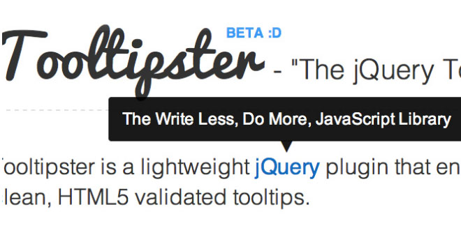
A powerful, flexible jQuery plugin enabling you to easily create semantic, modern A powerful, flexible jQuery plugin enabling you to easily create semantic, modern tooltips enhanced with the power of CSS.tooltips enhanced with the power of CSS.
Getting Started
1. Load jQuery and include Tooltipster's plugin files
After you download Tooltipster, move tooltipster.css and jquery.tooltipster.min.js to your root's CSS and JavaScript directories. Next, load jQuery and include Tooltipster's CSS and JavaScript files inside of your tags:
<head>
...

    <link rel="stylesheet" type="text/css" href="css/tooltipster.css" />

    <script type="text/javascript" src="http://code.jquery.com/jquery-1.7.0.min.js"></script>
    <script type="text/javascript" src="js/jquery.tooltipster.min.js"></script>

...
</head>
2. Set up your HTML
In order for Tooltipster to work, we first need to add the .tooltip class (or whatever class / means of selection you'd like to use) to whatever element we wish to have a tooltip. Next, we'll set the title attribute to whatever we'd like our tooltip to say. Here are a few examples:
Adding a tooltip to an image:
<img src="my-image.png" class="tooltip" title="This is my image's tooltip message!" />
Adding a tooltip to a link that already has a class:
<a href="http://calebjacob.com" class="ketchup tooltip" title="This is my link's tooltip message!">Link</a>
Adding a tooltip to a div:
<div class="tooltip" title="This is my div's tooltip message!">
    This div has a tooltip when you hover over it!
</div>
3. Activate Tooltipster
The last thing we have to do is activate the plugin. To do this, add the following script right before your closing </head> tag (using whatever selector you'd like - in this case we're using the .tooltip class):
<head>

    ...

    <script>
        $(document).ready(function() {
            $('.tooltip').tooltipster();
        });
    </script>
</head>
4. Taking It a Step Further
Using HTML tags inside your tooltips
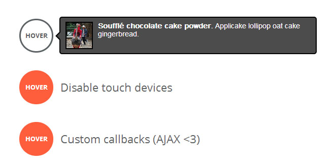
Tooltipster allows you to use any HTML markup you can think of inside your tooltips. This means you can insert things like images and text formatting tags. To achieve this, the recommended method is a little different : provide your content as a jQuery object in the script rather than in the title attribute :
<head>

    ...

    <script>
        $(document).ready(function() {
            $('#my-tooltip').tooltipster({
                content: $('<span><img src="my-image.png" /> <strong>This text is in bold case !</strong></span>')
            });
        });
    </script>
</head>
<body>

    <div id="my-tooltip">
        This div has a tooltip with HTML when you hover over it!
    </div>

</body>
Another (less recommended) way of achieving this is to put encoded HTML markup directly in your title attribute and set the 'contentAsHTML' option to 'true'. In all cases, make sure you have tight control over the content you wish to display in the tooltip, as unwanted <script> or <iframe> tags for example would be a serious security issue for your website.
<head>
...
<script>
$(document).ready(function() {
$('.tooltip').tooltipster({
contentAsHTML: true
});
});
</script>
</head>
<body>
<div class="tooltip" title="<img src="my-image.png" /> <strong> This text is in bold case !</strong>">
This div has a tooltip with HTML when you hover over it!
</div>
</body>
Customizing Your Tooltipster's Style
The style of your Tooltipsters can be easily changed by editing/overriding the default Tooltipster theme, located in the css/tooltipster.css file.
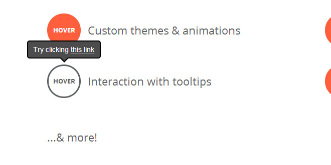
Tooltipster is also packaged with 4 alternative themes to choose from. They are demonstrated at the bottom of this page. To use a theme, just include its css file (located in the css/themes folder) in your page and specify its name in Tooltipster's settings :
$('.tooltip').tooltipster({
    theme: 'tooltipster-noir'
});
And of course, you also have the option to create a brand new theme to suit your needs. To do this, start with the example below and add your flair. When you are done, include and specify your theme just like you would for one of Tooltipster's existing themes.
/* This is how you would create a theme called "my-custom-theme": */

.my-custom-theme {
	border-radius: 5px;
	border: 2px solid #000;
	background: #4c4c4c;
	color: #fff;
}
/* Use this next selector to style things like font-size and line-height: */
.my-custom-theme .tooltipster-content {
	font-family: Arial, sans-serif;
	font-size: 14px;
	line-height: 16px;
	padding: 8px 10px;
}
Customizing Tooltipster's Functionality
Tooltipster's options gives you a wide range of variables to tweak your tooltip to your heart's content. To learn more about all of the options, read the Options section. Here's just a few of the things you can play with:
$('.tooltip').tooltipster({
   animation: 'fade',
   delay: 200,
   theme: 'tooltipster-default',
   touchDevices: false,
   trigger: 'hover'
});
The Tooltipster API was created to be as flexible and easy to use as possible (thanks to glebtv for the inspiration). The API allows you to create custom triggers, update tooltip content on the fly (whether the tooltip is currently open or not), destroy Tooltipster functionality if needed, and reposition tooltips for unique use cases.
Here is a quick look at all of the API methods:
Tooltipster gives you the ability to fire a custom synchronous or asynchronous function everytime before the tooltip launches (functionBefore) or just once upon instantiation (functionInit). One great use for this is to grab dynamic content for your tooltips via AJAX.
Here is an example of using functionBefore() asynchronously to replace a loading notification with our AJAX call. Once the content has been retrieved and updated, we'll take advantage of setting $.data() to keep our content cached for the next time the tooltip is opened:
However, maybe you just need to make one call and only need it to fire once instead of everytime the tooltip opens. This is where you could use functionInit(). This function will fire only once - right at the beginning of the instantiation process. You'll have the ability to do things like check the current content and set new content. Since the fancy API methods for returning and setting the value aren't instantiated yet, the way we go about this is a little different than functionBefore():
By default and according to the 'trigger' option, Tooltipster automatically shows tooltips upon users' mouse clicks or mouse hovering (or their touch-gesture equivalents). In addition to this, you may also manually open or close a tooltip at anytime with a simple javascript command.
To achieve this, Tooltipster has the 'show' and 'hide' methods. Both of them may receive an optional 'callback' parameter, which represents a function you'd like to call when the tooltip is done animating.
Here's an example of how you could launch a specific tooltip on page load and close it when any key on your keyboard is pressed. This will still preserve the default hover trigger.
You may also provide a function as the callback parameter of the show/hide methods. The callback functions are called in the context of the tooltipstered element. Please note that if the show/hide action is somehow cancelled before it has completed, the callback function will never be called.
It's easy as pie to update a tooltip's content - whether it's open or closed. Depending on your selector, you can update multiple tooltips at once or just one:
By default, Tooltipster will play a subtle animation when the content changes. To tweak the animation, check out the '.tooltipster-content-changing' class in your tooltipster.css file. It's important to note that only CSS transforms will be animated. To disable this animation, set updateAnimation to false.
Options
animation
fade, grow, swing, slide, fall
Determines how the tooltip will animate in and out. Feel free to modify or create custom transitions in the tooltipster.css file. In IE9 and 8, all animations default to a JavaScript generated, fade animation. Default: 'fade'
arrow
boolean
Adds the "speech bubble arrow" to the tooltip. Default: true
arrowColor
hex code / rgb
Select a specific color for the "speech bubble arrow". Default: will inherit the tooltip's background color
autoClose
boolean
If autoClose is set to false, the tooltip will never close unless you call the 'close' method yourself. Default: true
content
string, jQuery object
If set, this will override the content of the tooltip. Default: null
contentAsHTML
boolean
If the content of the tooltip is provided as a string, it is displayed as plain text by default. If this content should actually be interpreted as HTML, set this option to true. Default: false
contentCloning
boolean
If you provide a jQuery object to the 'content' option, this sets if it is a clone of this object that should actually be used. Default: true
delay
integer
Delay how long it takes (in milliseconds) for the tooltip to start animating in.Default: 200
fixedWidth
integer
Set a fixed width for the tooltip. The tooltip will always be a consistent width - no matter your content size. Default: 0 (auto width)
maxWidth
integer
Set a max width for the tooltip. If the tooltip ends up being smaller than the set max width, the tooltip's width will be set automatically. Default: 0 (no max width)
functionInit
function
Create a custom function to be fired only once at instantiation. If the function returns a value, this value will become the content of the tooltip. See the advanced section to learn more. Default: function(origin, content) {}
functionBefore
function
Create a custom function to be fired before the tooltip opens. This function may prevent or hold off the opening. See the advanced section to learn more. Default: function(origin, continueTooltip) { continueTooltip(); }
functionReady
function
Create a custom function to be fired when the tooltip and its contents have been added to the DOM. Default: function(origin, tooltip) {}
functionAfter
function
Create a custom function to be fired once the tooltip has been closed and removed from the DOM. Default: function(origin) {}
icon
string, jQuery object
If using the iconDesktop or iconTouch options, this sets the content for your icon. Default: '(?)'
iconCloning
boolean
If you provide a jQuery object to the 'icon' option, this sets if it is a clone of this object that should actually be used. Default: true
iconDesktop
boolean
Generate an icon next to your content that is responsible for activating the tooltip on non-touch devices. Default: false
iconTheme
CSS class
If using the iconDesktop or iconTouch options, this sets the class on the icon (used to style the icon). Default: 'tooltipster-icon'
iconTouch
boolean
Generate an icon next to your content that is responsible for activating the tooltip on touch devices (tablets, phones, etc). Default: false
interactive
boolean
Give users the possibility to interact with the tooltip. Unless autoClose is set to false, the tooltip will still close if the user moves away from or clicks out of the tooltip. Default: false
interactiveTolerance
integer
If the tooltip is interactive and activated by a hover event, set the amount of time (milliseconds) allowed for a user to hover off of the tooltip activator (origin) on to the tooltip itself - keeping the tooltip from closing. Default: 350
offsetX
integer
Offsets the tooltip (in pixels) farther left/right from the origin. Default: 0
offsetY
integer
Offsets the tooltip (in pixels) farther up/down from the origin. Default: 0
onlyOne
boolean
If true, only one tooltip will be allowed to be active at a time. Non-autoclosing tooltips will not be closed though. Default: false
position
right, left, top, top-right, top-left, bottom, bottom-right, bottom-left
Set the position of the tooltip. Default: 'top'
positionTracker
boolean
Will reposition the tooltip if the origin moves. As this option may have an impact on performance, we suggest you enable it only if you need to.Default: false
speed
integer
Set the speed of the animation. Default: 350
timer
integer
How long the tooltip should be allowed to live before closing. Default: 0 (disabled)
theme
CSS class
Set the theme used for your tooltip. Default: 'tooltipster-default'
touchDevices
boolean
If set to false, tooltips will not show on pure-touch devices, unless you open them yourself with the 'show' method. Touch gestures on devices which also have a mouse will still open the tooltips though. Default: true
trigger
hover, click, custom
Set how tooltips should be activated and closed. See the advanced section to learn how to build custom triggers. Default: 'hover'
updateAnimation
boolean
If a tooltip is open while its content is updated, play a subtle animation when the content changes. Default: true
Advanced
The awesomesauce Tooltipster API
// set default options for all future tooltip instantiations
$.fn.tooltipster('setDefaults', {
  position: 'bottom'
});

// show a tooltip (the 'callback' argument is optional)
$(...).tooltipster('show', callback);

// hide a tooltip (the 'callback' argument is optional)
$(...).tooltipster('hide', callback);

// temporarily disable a tooltip from being able to open
$(...).tooltipster('disable');

// if a tooltip was disabled from opening, reenable its previous functionality
$(...).tooltipster('enable');

// hide and destroy tooltip functionality
$(...).tooltipster('destroy');

// return a tooltip's current content (if selector contains multiple origins, only the value of the first will be returned)
$(...).tooltipster('content');

// update tooltip content
$(...).tooltipster('content', myNewContent);

// reposition and resize the tooltip
$(...).tooltipster('reposition');

// return the HTML root element of the tooltip
$(...).tooltipster('elementTooltip');

// return the HTML root element of the icon if there is one, 'undefined' otherwise
$(...).tooltipster('elementIcon');
Using AJAX to generate your tooltip content
$('.tooltip').tooltipster({
    content: 'Loading...',
    functionBefore: function(origin, continueTooltip) {

        // we'll make this function asynchronous and allow the tooltip to go ahead and show the loading notification while fetching our data
        continueTooltip();

        // next, we want to check if our data has already been cached
        if (origin.data('ajax') !== 'cached') {
            $.ajax({
                type: 'POST',
                url: 'example.php',
                success: function(data) {
                    // update our tooltip content with our returned data and cache it
                    origin.tooltipster('content', data).data('ajax', 'cached');
                }
            });
        }
    }
});
$('.tooltip').tooltipster({
    functionInit: function(origin, content) {

        if (content === 'This is bad content') {

            // when the request has finished loading, we will change the tooltip's content
            $.ajax({
                type: 'POST',
                url: 'example.php',
                success: function(data) {
                    origin.tooltipster('content', 'New content has been loaded : ' + data);
                }
            });

            // this returned string will overwrite the content of the tooltip for the time being
            return 'Wait while we load new content...';
        }
        else {
            // return nothing : the initialization continues normally with its content unchanged.
        }
    }
});
Manually show and hide a tooltip
<span class="tooltip" id="example" title="My tooltip content">Example</span>
$(document).ready(function() {

   // first on page load, initiate the Tooltipster plugin
   $('.tooltip').tooltipster();

   // then immediately show the tooltip
   $('#example').tooltipster('show');

   // as soon as a key is pressed on the keyboard, hide the tooltip.
   $(window).keypress(function() {
      $('#example').tooltipster('hide');
   });
});
$(document).ready(function() {

   $('.tooltip').tooltipster();

   $('#example').tooltipster('show', function() {
       alert('The tooltip is now fully open. The content is: ' + this.tooltipster('content'));
   });

   $(window).keypress(function() {
      $('#example').tooltipster('hide', function() {
         alert('The tooltip is now fully closed');
      });
   });
});
Updating a tooltip's content
$('#my-special-tooltip').tooltipster('content', 'My new content');
 JS Tutorial
