- Overview
- Documents
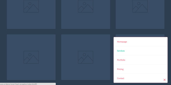
Smart Fixed Navigation is a fixed navigation that allows your users to access the menu at any time while they are experiencing your website. It's smaller than a full-width fixed header, and replaces the back-to-top button with a smarter UX solution.

Source: codyhouse.co
1. HTML
The structure is straightforward: the navigation and its “trigger” are inside the same #cd-nav div. The <span> inside the .cd-nav-trigger anchor tag will be used to create the menu icon with CSS only.
<header><!-- ... --></header>
<div id="cd-nav">
    <a href="#0" class="cd-nav-trigger">Menu<span></span></a>

    <nav id="cd-main-nav">
        <ul>
            <li><a href="#0">Homepage</a></li>
            <li><a href="#0">Services</a></li>
            <li><a href="#0">Portfolio</a></li>
            <li><a href="#0">Pricing</a></li>
            <li><a href="#0">Contact</a></li>
        </ul>
    </nav>
</div>
<main><!-- content here --></main>
2. CSS
Since we coded this nugget starting from mobile, we set a position: fixed for the unordered list inside the navigation #cd-nav. We want it to be at the bottom right for touch devices, super easy to access even if you’re holding the phone with one hand. When the user taps on the trigger .cd-nav-trigger we give the class .is-visible to the unordered list, that changes the CSS3 Scale value from 0 to 1 – with a CSS3 transitionto smooth the transformation.
#cd-nav ul {
  /* mobile first */
  position: fixed;
  width: 90%;
  max-width: 400px;
  right: 5%;
  bottom: 20px;
  visibility: hidden;
  overflow: hidden;
  z-index: 1;

  transform: scale(0);
  transform-origin: 100% 100%;
  transition: transform 0.3s, visibility 0s 0.3s;
}

#cd-nav ul.is-visible {
  visibility: visible;
  transform: scale(1);
  transition: transform 0.3s, visibility 0s 0s;
}

.cd-nav-trigger {
  position: fixed;
  bottom: 20px;
  right: 5%;
  width: 44px;
  height: 44px;

  /* image replacement */
  overflow: hidden;
  text-indent: 100%;
  white-space: nowrap;
  z-index: 2;
}
When the viewport is larger than 1170px, we change the navigation position from Fixed to Absolute and we move it to the top. As the user scrolls down, we use jQuery to add the class .is-fixed to the #cd-nav, thus moving the entire navigation back to the bottom right – same effect as on touch devices.
@media only screen and (min-width: 1170px) {
  #cd-nav ul {
    /* the navigation moves to the top */
    position: absolute;
    width: auto;
    max-width: none;
    bottom: auto;
    top: 36px;
    visibility: visible;
    transform: scale(1);
    transition: all 0s;
  }

  #cd-nav.is-fixed ul {
    position: fixed;
    width: 90%;
    max-width: 400px;
    bottom: 20px;
    top: auto;
    visibility: hidden;
    transform: scale(0);
  }
}
3. JAVASCRIPT
We defined the offset variable to toggle the .is-fixed class from the #cd-nav.
// browser window scroll (in pixels) after which the "menu" link is shown
var offset = 300;
The function checkMenu() takes care of the main navigation behaviour while scrolling:
var navigationContainer = $('#cd-nav'),
    mainNavigation = navigationContainer.find('#cd-main-nav ul');

$(window).scroll(function(){
    checkMenu();
});

function checkMenu() {

    if( $(window).scrollTop() > offset && !navigationContainer.hasClass('is-fixed')) {
        //add .is-fixed class to #cd-nav
        //wait for the animation to end
        //add the .has-transitions class to main navigation (used to bring back transitions)
    } else if ($(window).scrollTop() <= offset) {

        //check if the menu is open when scrolling up - for browser that supports transition
        if( mainNavigation.hasClass('is-visible')  && !$('html').hasClass('no-csstransitions') ) {
            //close the menu
            //wait for the transition to end
            //remove the .is-fixed class from the #cd-nav and the .has-transitions class from main navigation
        }

        //check if the menu is open when scrolling up - fallback if transitions are not supported
        else if( mainNavigation.hasClass('is-visible')  && $('html').hasClass('no-csstransitions') ) {
            //no need to wait for the end of transition - close the menu and remove the .is-fixed class from the #cd-nav
        }

        //scrolling up with menu closed
        else {
            //remove the .is-fixed class from the #cd-nav and the .has-transitions class from main navigation
        }
    }
}
 JS Tutorial


