Download
User Rating: 0/5 ( 0 votes)
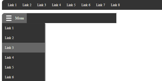
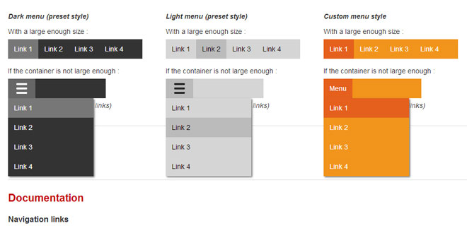
Responsive Simple Nav is a super small customizable responsive Navigation for jQuery & Zepto
Features
-
Super small (2KB) = super fast
-
Calculates automatic breakpoint
-
Possible to define manual breakpoint is easy
-
Define dropdown (togglespeed) speed for own taste
-
Easy to define the markup output for your dropdown button
-
Possible to 'tab' through = accessibility friendly
-
Makes you happy because it gives you what you need (and not more)
Source: github.com
1. INCLUDE CSS AND JS FILES
<link rel="stylesheet" href="css/nav.css">
<!--- don't forget to use jQuery or Zepto.js -->
<script src="http://ajax.googleapis.com/ajax/libs/jquery/1.11.1/jquery.min.js"></script>
<!--- Insert Script -->
<script src="js/navbar.min.js"></script>
2. HTML
<nav>
<!--- Put class 'navbar' to your list -->
<ul class="navbar">
<li><a href="#">Link 1</a></li>
<li><a href="#">Link 2</a></li>
<li><a href="#">Link 3</a></li>
<li><a href="#">Link 4</a></li>
<li><a href="#">Link 5</a></li>
<li><a href="#">Link 6</a></li>
<li><a href="#">Link 7</a></li>
<li><a href="#">Link 8</a></li>
</ul>
</nav>
3. JAVASCRIPT
$('.navbar').navbar({
dropDownLabel: '<span class="icon"></span>',
breakPoint: 0, // define manual breakpoint - set it to 0 means no manual breakpoint
toggleSpeed: 320 // call your togglespeed here -- set it to 0 to turn it off
});