- Overview
- Documents
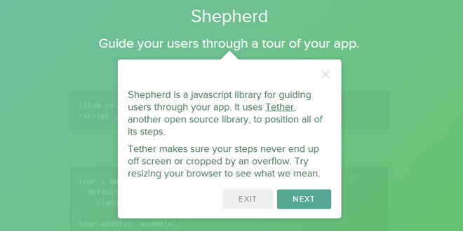
Shepherd is a independent javascript library that guide your users through a tour of your app.
Source: github.hubspot.com
1. INCLUDE CSS AND JS FILES
<link rel="stylesheet" href="shepherd-theme-arrows.css" />
<script src="shepherd.min.js"></script>
2. HTML
<div class="shepherd-theme-arrows">Example 1</div>
<div class="hero-example">Example 2</div>
3. JAVASCRIPT
//Create a new Tour instance for your tour
tour = new Shepherd.Tour
  defaults:
    classes: 'shepherd-theme-arrows'

//Next, add your steps
tour.addStep 'example',
  title: 'Example Shepherd'
  text: 'Creating a Shepherd is easy too! Just create ...'
  attachTo: '.hero-example bottom'
  advanceOn: '.docs-link click'

//To start the tour, just call start on your Tour instance
tour.start();
4. API
Global Shepherd Object
Shepherd exposes a single object onto the window, Shepherd.
That global object fires several events to let you link up actions with events occuring in any tour:
Methods
-
Shepherd.on(eventName, handler, [context]): Bind an event
-
Shepherd.off(eventName, [handler]): Unbind an event
-
Shepherd.once(eventName, handler, [context]): Bind just the next instance of an event
Events
The global Shepherd fires the following events whenever a Tour instance fires them. It adds to the object passed to the event handlers a tour key pointing to the instance which fired the event:
-
complete
-
cancel
-
hide
-
show
-
start
-
active
-
inactive
Current Tour
The global Shepherd includes a property which is always set to the currently active tour, or null if there is no active tour:
-
Shepherd.activeTour
Tour Instances
Creation
You create a Tour object for each tour you'd like to create.
Tour's constructor accepts a hash of options:
myTour = new Shepherd.Tour({ options })
-
steps: An array of Step instances to initialize the tour with
-
defaults: Default options for Steps created through addStep
Tour Methods
-
addStep(id, options): Creates a new Step object with options. If you'd like you can also just pass an options hash which includes id as a key. If the options hash doesn't include an id, one will be generated. You can also pass an existing Step instance rather than options, but note that Shepherd does not support a Step being attached to multiple Tours.
-
getById(id): Return a step with a specific id
-
next(): Advance to the next step, in the order they were added
-
back(): Show the previous step, in the order they were added
-
cancel(): Trigger cancel on the current step, hiding it without advancing
-
hide(): Hide the current step
-
show([id]): Show the step specified by id (if it's a string), or index (if it's a number) provided. Defaults to the first step.
-
start(): Show the first step and begin the tour
-
getCurrentStep(): Returns the currently shown step
-
on(eventName, handler, [context]): Bind an event
-
off(eventName, [handler]): Unbind an event
-
once(eventName, handler, [context]): Bind just the next instance of an event
Tour Events
-
complete: Triggered when the last step is advanced
-
cancel
-
hide
-
show: Triggered with a hash of the step and the previous step
-
start
Steps are instances of the Step object. They are generally created by the Tour::addStep method, which returns theStep instance its created.
Steps
Step Options
-
text: The text in the body of the step. It can either be an HTML string, or an array of strings, each of which will become a <p> paragraph.
-
title: The steps title. It becomes an h3 at the top of the step.
-
attachTo: What element the step should be attached to on the page. It can either be a string of the form"element on", or an object with those properties. For example: ".some #element left", or {element: '.some #element', on: 'left'}. If you use the object syntax, element can also be a DOM element. If you don't specify an attachTo the element will appear in the middle of the screen.
-
classes: Extra classes to add to the step. shepherd-theme-arrows will give you our theme.
-
buttons: An array of buttons to add to the step. By default we add a Next button which triggers next(), set this to false to disable. Each button in the array is an object of the format:
-
text: The HTML text of the button
-
classes: Extra classes to apply to the <a>
-
action: A function executed when the button is clicked on
-
events: A hash of events to bind onto the button, for example {'mouseover': function(){}}. Adding a click event to events when you already have an action specified is not supported.
-
-
advanceOn: An action on the page which should advance shepherd to the next step. It can be of the form"selector event", or an object with those properies. For example: ".some-element click", or {selector: '.some-element', event: 'click'}. It doesn't have to be an event inside the tour, it can be any event fired on any element on the page. You can also always manually advance the Tour by calling myTour.next().
-
showCancelLink: Should a cancel "✕" be shown in the header of the step?
-
scrollTo: Should the element be scrolled to when this step is shown?
-
tetherOptions: Extra options to pass to tether
Step Methods
-
show(): Show this step
-
hide(): Hide this step
-
cancel(): Hide this step and trigger the cancel event
-
complete(): Hide this step and trigger the complete event
-
scrollTo(): Scroll to this step's element
-
isOpen(): Returns true if the step is currently shown
-
destroy(): Remove the element
-
on(eventName, handler, [context]): Bind an event
-
off(eventName, [handler]): Unbind an event
-
once(eventName, handler, [context]): Bind just the next instance of an event
Step Events
-
show
-
hide
-
complete
-
cancel
-
destroy
Please note that complete and cancel are only ever triggered if you call the associated methods in your code.
 JS Tutorial


