Download
User Rating: 3.6/5 ( 1 votes)
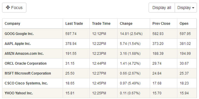
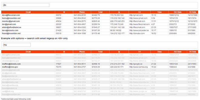
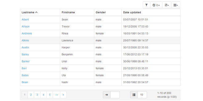
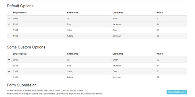
RWD Table Patterns is an experimental awesome solution for responsive tables with complex data. It's a fork based on Filament Group's repo with a more complete solutions and some new features.
Features:
Made for Twitter Bootstrap
Designed to be used with Bootstrap 3. If you don't want to use bootstrap, just fork the repo and customize it to your needs!
Mobile first & PE
Built with mobile first and progressive enhancement in mind. Also built with love and with the help of a fair amount of coffee.
Graceful JS fallback
In browsers without JavaScript, the tables will still be scrollable. I.e. there's still some responsiveness.
Easy to use
You only need to add one JS-file, one CSS-file and some minimal setup to make the tables responsive.
Dependencies: jQuery and Twitter Bootstrap 3.
Source: gergeo.se
1. INCLUDE CSS AND JS FILES
<!-- Latest compiled and minified Bootstrap CSS -->
<link rel="stylesheet" href="http://netdna.bootstrapcdn.com/bootstrap/3.1.1/css/bootstrap.min.css">
<link rel="stylesheet" href="css/rwd-table.min.css">

<script src="http://ajax.googleapis.com/ajax/libs/jquery/1.11.0/jquery.min.js"></script>
<!-- Latest compiled and minified Bootstrap JavaScript -->
<script src="http://netdna.bootstrapcdn.com/bootstrap/3.1.1/js/bootstrap.min.js"></script>
<script type="text/javascript" src="js/rwd-table.js"></script>
2. HTML
<div class="table-responsive" data-pattern="priority-columns">
	<table class="table table-small-font table-bordered table-striped">
		<thead>
			<tr>
				<th>Company</th>
				<th data-priority="1">Last Trade</th>
				<th data-priority="3">Trade Time</th>
				<th data-priority="1">Change</th>
				<th data-priority="3">Prev Close</th>
				<th data-priority="3">Open</th>
				<th data-priority="6">Bid</th>
				<th data-priority="6">Ask</th>
				<th data-priority="6">1y Target Est</th>
				<th data-priority="6">Lorem</th>
				<th data-priority="6">Ipsum</th>
			</tr>
		</thead>
		<tbody>
			<tr>
				<th>GOOG <span class="co-name">Google Inc.</span></th>
				<td>597.74</td>
				<td>12:12PM</td>
				<td>14.81 (2.54%)</td>
				<td>582.93</td>
				<td>597.95</td>
				<td>597.73 x 100</td>
				<td>597.91 x 300</td>
				<td>731.10</td>
				<td colspan="2">Spanning cell</td>
			</tr>

			...

		</tbody>
	</table>
</div>
-
Add the classes .table to the tables and wrap them in .table-responsive, as usual when using Bootstrap.
-
If the table has complex data and many columns you can give it the class .table-small-font (highly recommended).
-
The table can also utilize Twitter Bootstrap's table classes, such as .table-striped and .table-bordered.
Initialize via data attributes
You can initalize the table without writing any JavaScript, just like Bootstrap. Just add the attribute data-pattern="priority-columns" to the .table-responsive div.
Setup your table with data-priority attributes for each <th>
|
Attribute |
Description/Breakpoint |
|
data-priority="" |
Always visible and not hideable from dropdown |
|
data-priority="1" |
Always visible (but hidable from dropdown) |
|
data-priority="2" |
Visible when (min-width: 480px) |
|
data-priority="3" |
(min-width: 640px) |
|
data-priority="4" |
(min-width: 800px) |
|
data-priority="5" |
(min-width: 960px) |
|
data-priority="6" |
(min-width: 1120px) |
HTML Classes
For better IE support, you need to have IE classes. Replace <html> with:
<!--[if lt IE 7 ]> <html lang="en" class="no-js lt-ie10 lt-ie9 lt-ie8 lt-ie7"> <![endif]-->
<!--[if IE 7 ]>    <html lang="en" class="no-js lt-ie10 lt-ie9 lt-ie8"> <![endif]-->
<!--[if IE 8 ]>    <html lang="en" class="no-js lt-ie10 lt-ie9"> <![endif]-->
<!--[if IE 9 ]>    <html lang="en" class="no-js lt-ie10"> <![endif]-->
<!--[if (gt IE 9)|!(IE)]><!--> <html lang="en" class="no-js"> <!--<![endif]-->
3. JAVASCRIPT
$(function() {
      $('.table-responsive').responsiveTable({options});
});
4. OPTIONS
Options can be passed via data attributes or JavaScript. For data attributes, append the option name to data- with hyphens instead of camelCase, as in data-add-focus-btn="".
|
Name |
type |
default |
description |
|
pattern |
string |
'priority-columns' |
What responsive table pattern to use. For now, 'priority-columns' is the only pattern available.
Tips: When initalizing via JavaScript, add data-pattern="" to responsive tables you wan't to exclude.
|
|
stickyTableHeader |
boolean |
true |
Makes the table header persistent. |
|
fixedNavbar |
string |
'.navbar-fixed-top' |
Is there a fixed navbar? The sticky table header needs to know about it! The option is the selector used to find the navbar. Don't worry about the default value if you don't have a fixed navbar.
Example: '#navbar'
|
|
addDisplayAllBtn |
boolean |
true |
Add 'Display all' button to the toolbar above the table. |
|
addFocusBtn |
boolean |
true |
Add 'Focus' toggle button to the toolbar above the table. |
|
focusBtnIcon |
string |
'glyphicon glyphicon-screenshot' |
Icon for the focus btn specified with classes. |
 JS Tutorial


