- Overview
- Documents
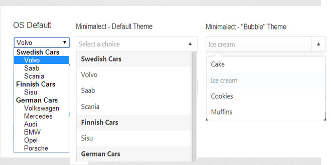
Minimalect is a select replacement for jQuery. It offers keyboard navigation, choice filtering and even supports themes.
Features:
- Replace select elements with a nicer styled control
- Support for optgroups
- Filtering choices by typing
- Keyboard navigation
- Support for themes
Usage
Include jquery.minimalect.min.js after you load jQuery (1.7 or newer). Then simply do;
$("select").minimalect();
Remember to also include the stylesheet (SCSS and minified CSS available);
<link rel="stylesheet" type="text/css" href="minimalect.min.css" media="screen" />
The default style is very understated, so it's easy to modify to better suit your needs. By default, no graphics are used; the arrow symbols are Unicode characters. Please be advised that not all typefaces on all devices support this, and depending on your target device, you may want to replace it with pre-rendered graphics.
Available options
You can pass an object as a parameter for the .minimalect() call, to override the default settings.
You may edit all the CSS classnames that Minimalect uses so that they don't collide with ones you already use, as well as the user-facing messages for customization or internationalization.
Settings
- theme — the currently used theme. Applied as a class to the main div element. Default: (empty)
Messages
- placeholder — the default text displayed whenever no choice has been selected. Default: Select a choice
- empty — message displayed to the user when no choice matched his filter search term. Default: No results matched your keyword.
Classes
- class_container — classname for the main div element. Default: minict_wrapper
- class_group — classname for a list item that represents an optgroup label. Default: minict_group
- class_empty — classname for the "No results" message when filtering produces no results. Default:minict_empty
- class_active — classname that is applied to the main div element whenever the dropdown is visible. Default: active
- class_selected — classname applied to the list item in the dropdown that is currently selected. Default:selected
- class_hidden — classname applied to list items in the dropdown that do not match the filter. Default:hidden
- class_highlighted — classname applied to the list item that is currently highlighted when the user uses keyboard navigation. Default: highlighted
- class_first — classname that corresponds to the first visible list item in the dropdown, including optgroup labels and the "No results" message. Helpful when rounding corners in CSS. Default: minict_first
- class_last — classname that corresponds to the last visible list item in the dropdown, including optgroup labels and the "No results" message. Helpful when rounding corners in CSS. Default: minict_last
Callbacks
- beforeinit — Called immediately when the plugin is called, before any initialization work begins.
- afterinit — Called after Minimalect has been fully initialized.
-
onchange — Called whenever the user selects an option in the list.
- value; the value of the choice selected.
- text; the user-facing text of the choice selected.
- onopen — Called when the dropdown list is displayed.
- onclose — Called when the dropdown list is closed (either by clicking away, or by selecting an option).
-
onfilter — Called every time the list is filtered (basically every time the user types a letter into the filter box).
- match; a boolean parameter, true if there was matches, false if no matches are found.
Programmatically changing the selected choice
If you wish to change the current value of the select, you can simply make your changes to the original element like you would normally and then trigger the change event. Minimalect will take it from there. Like so;
$("#myselect").val("newvalue").change();
 JS Tutorial


