- Overview
- Documents
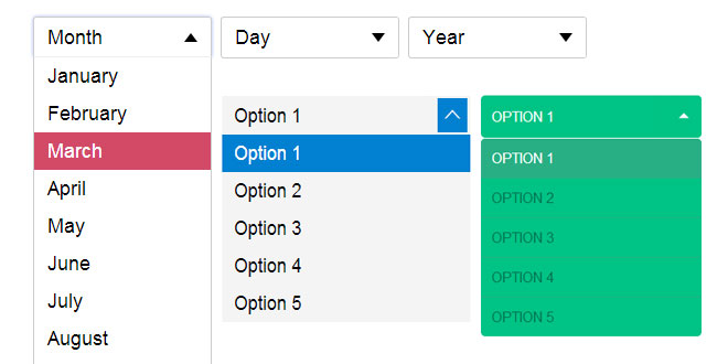
EasyDropDown is a jQuery plugin that effortlessly turns humble <select> elements …into styleable drop-down menus for use in forms or general UI/navigatio
Essential features:
- Clean, semantic markup
- Form & validation compatibilty
- Full keyboard control with textual search
- Inner-scroll for long lists
- Degradation to native UI on touch devices
- Fully functional IE8+
Source: http://patrickkunka.github.io/easydropdown/
How To Use It
To use, simply include the jquery.easydropdown.min.js script in your page and give your <select> tags the class dropdown:
<select class="dropdown">
	<option value="1">Option 1</option>
	<option value="2">Option 2</option>
	<option value="3">Option 3</option>
	<option value="4">Option 4</option>
</select>
If you are using labels within the <select> element, identify them with the class label:
<select class="dropdown">
	<option value="" class="label">Month</option>
	<option value="1">January</option>
	<option value="2">February</option>
	<option value="3">March</option>
	...
</select>
To build your dropdown with an arbitrary option pre-selected, simply give it the selected attribute as you normally would:
<select class="dropdown">
	<option value="" class="label">Month</option>
	<option value="1">January</option>
	<option value="2" selected>February</option>
	<option value="3">March</option>
	...
</select>
Similarly, a dropdown may be disabled with the disabledattribute:
<select class="dropdown" disabled>
	<option value="" class="label">Month</option>
	<option value="1">January</option>
	<option value="2">February</option>
	<option value="3">March</option>
	...
</select>
No custom JS required!
How To Style It
Either create your own styles to match your design and branding, or use one of our ready made themes. We recommend starting with the default theme and customizing it.
Each drop-down has the following basic markup structure that you can target with your CSS:
<div class="dropdown">
	<span class="old">
		<select>...</select>
	</span>
	<span class="selected">Option 1</span>
	<span class="carat"></span>
	<div>
		<ul>
			<li>Option 1</li>
			<li>Option 2</li>
			<li>Option 3</li>
			<li>Option 4</li>
		</ul>
	</div>
</div>
The following classes are added/removed dynamically:
-
.focus (container)
On input focus -
.open (container)
On menu open -
.scrollable (container)
When in scroll mode (see cutOff) -
.bottom (container)
On scroll bottom-out -
.touch (container)
When in native touch UI mode (see nativeTouch) -
.disabled (container)
When disabled -
.focus (menu item)
On hover or keyboard focus -
.active (menu item)
Selected menu item
Advanced Usage
Alternatively, by not using the class 'dropdown' you can instantiate your dropdowns manually in your javascript, with custom settings.
$(function(){
	var $selects = $('select');

	$selects.easyDropDown({
		cutOff: 10,
		wrapperClass: 'my-dropdown-class',
		onChange: function(selected){
			// do something
		}
	});
});
You may also define your customizable settings directly in your HTML via a JSON Object in the data-settings attribute:
<select class="dropdown"
	data-settings='{"cutOff":6}'>
	<option value="1">Option 1</option>
	<option value="2">Option 2</option>
	..
</select>
The "onchange" attribute may be applied as normal:
<select class="dropdown" onchange="alert(this.value)">
	<option value="1">Option 1</option>
	<option value="2">Option 2</option>
	..
</select>
Customizable Settings
-
cutOff (integer)
The maximum number of items to show before scrolling (defaultfalse). -
wrapperClass (string)
The class of the parent wrapper element, used to target styling (default 'dropdown'). -
onChange (function)
A custom function to call when an item is selected. Useful for non-form input uses. An object containing the selected item's value and title is passed as an argument. -
nativeTouch (boolean)
Fallback to native UI on touch-enabled devices (default true).
Methods
-
.easyDropDown('disable')
Disable the dropdown. -
.easyDropDown('enable')
Enable the dropdown. -
.easyDropDown('destroy')
Remove all generated elements and unbind all handlers. -
.easyDropDown('select', index/value)
Programmatically select option by index (integer) or value (string). -
.val()
Get selected value.
 JS Tutorial


