User Rating: 0/5 ( 0 votes)
jquery widget polygonal Graph is a jQuery widget that drows a polygonal graphic using canvas tag of HTML5.

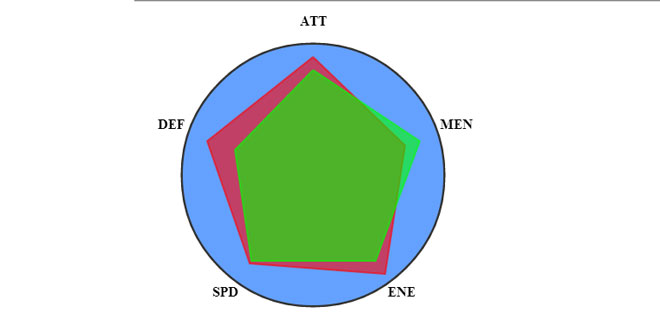
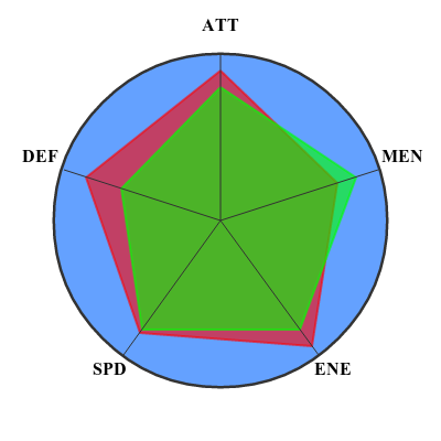
If you have some data included in a range and you want to represent it, you can do it using PolygonalGraphwidget! Each data is rapresented by a point on the circle. If a data is small it will be close to the center, vice versa if the data is near to the max value it will be close to the circumference. This graphic is very intuitive, eg to rapresent and compare characteristics of footballers (attack, defence, speed, ...) or even characters of an RPG (life, magic points, agility, ...), etc...
Source: github.com
1. INCLUDE JS FILES
<script type="text/javascript" src="jquery/jquery-1.11.1.min.js"></script>
<script type="text/javascript" src="jquery/jquery-ui-1.11.0.min.js"></script>
<script type="text/javascript" src="polygonalGraphWidget.js"></script>
2. HTML
<canvas id="myCanvas" width="400" height="400"></canvas>
3. JAVASCRIPT
var labels = new Array('ATT', 'DEF', 'SPD', 'ENE', 'MEN');  // labels that will be displayed
var data = new Array(90, 74, 73, 64, 66);                   // the data you want to show in the graphic
var myVar = $("#myCanvas").polygonalGraphWidget(
		{
			labels: labels,
			data: data
		}
);
In the script above we simply create two arrays, labels and data, with the same number of elements. They must contain at least three elements. data will contains number between 0 and max_val (99 by default). Than we pass these arrays to a widget named "polygonalGraphWidget" that is anchored to the canvas element identified by the id myCanvas. This two parameters are REQUIRED!
data can be an array of arrays too. Every array must have the same number of element than labels.
4. OPTIONS
- max_val: 99                                            // max value reference
- textFont: "bold 16px Times New Roman"                  // font of labels
- textColor: "#000"                                      // color of lables
- circleLineWidth: 5                                     // circle line width in px
- circleRadius: 150                                      // circle radius in px
- circleLineColor: "#333"                                // circle line color
- circleBackgroundColor: "rgba(100, 161, 265, 1)"        // circle background color
- graph_colors: [                                        // graph line colors (they will be cycled)
    "rgba(255, 0, 0, 0.6)"
    "rgba(0, 255, 0, 0.6)"
    "rgba(0, 0, 255, 0.6)"
    ]
- phase_start: (Math.PI / 2),                            // initial phase in radians (it establishes where the first point will be placed on the circumference)
- margin: 15                                             // margin in px of lables from circumference
- grid: true                                             // show grid (true=yes, false=no)
 JS Tutorial
