- Overview
- Documents
Valideasy is a jQuery plugin that never write complex JS script again to handle your form validation rules! With Valideasy, everything's done via HTML attributes added to your form fields.
- No JS Required
Specify how a field should validate by simply adding classes and html attributes to it. No complicated JavaScript code to configure basic validation rules.
- Custom Errors
Valideasy allows you to completly customize how error messages should be displayed. And again, everything's done with simple html attributes!
- Cross Browser
Valideasy is compatible with all modern browsers, starting from IE7.
Source: kaayru.github.io
1. INCLUDE JS FILES
<script src="js/vendor/jquery-1.10.1.min.js"></script>
<script src="js/jquery-valideasy-2.2.2.js"></script>
2. HTML
<form role="form" class="basic-example">
	<input class="required" id="name" title="Name" type="text" value="Name" />
	<select class="required" id="gender" title="Select...">
		<option selected="selected" value="0">Select…</option>
		<option value="monsieur">Mr.</option>
		<option value="madame">Mrs.</option>
	</select>
        <p class="alert alert-success"></p>
</form>
- Validation rules are specified in the class attribute of the field
- Default value of the field must be specified both in the value attribute and in the title attribute
- In single mode, every field must be accompagnied with an element with the ID {fieldId}_{errorElementId} and class .error-wrapper. Any error message triggered by this field will be inserted in that element.
- In unified mode, an element with the ID {errorElementId} and class .error-wrapper should be placed somewhere in the page. The first error message triggered by a field in the form will be placed in that element.
3. JAVASCRIPT
$('form.basic-example').submit(function(){
	var formIsValid = $(this).valideasy();

	if(formIsValid) {
		$(this).find('.alert-success').fadeIn();
	} else {
		$(this).find('.alert-success').fadeOut();
	}

	return false;
});
4. OPTIONS
For most forms, you won't need extra configuration for Valideasy to work properly. In some cases though, you might need to change the default parameters to meet your specific needs. There are two ways to set parameters:
- As data- attribute in the <form> element.
- As argments when instantiating Valideasy in your JS file.
Let's take an example with the mode parameter (described below), you can set it either in your form element:
<form data-valideasy-mode="unified">
Or when instantiating the plugin:
$(this).valideasy({
  mode: 'unified'
});
Here is the full (but short) list of available parameters, along with their default values. To use them as data- attributes, simply prefix with data-valideasy-
Note Parameters expecting functions cannot be used as data- attributes.
defaults = {
  mode: 'single',
  errorElementId: 'errors',
  disableFieldStyle: false,
  stepByStep: false,
  scrollToFirstError: false,
  singleFieldValidation: false,
  onValidateBefore: function() { return; },
  onValidateAfter: function() { return; },
}
mode
How error messages are displayed.
- single: each message is located near its field
- unified: all messages at the same place, one at a time
errorElementId
Indicates the ID of the field(s) supposed to display error messages.
- in single mode, the error message will be inserted in the element with ID {field_id}{errorElementId}. For example: nameerrors
- in unified mode, all the error messages will be inserted in the same element, with specified ID {errorElementId}.
disableFieldStyle
Set to true to stop adding the .error class to fields with errors
stepByStep
Set to true to stop validation at first error
scrollToFirstError
Set to true to auto scroll to the first error field at the end of the validation process
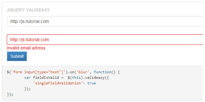
singleFieldValidation
Set to true to only perform validation on one field, instead of on the entire form.
For this to work, Valideasy must be instantiated on a field element.
Hooks
As of version 2.2.1, you can hook to pre and post validation events to perform certain tasks. Available hooks are :
-
onValidateBefore
Triggered right before the validation process begins. This hook receives two parameters: the form element being validated, and the array of the plugin options. -
onValidateAfter
Triggered right after the validation process ends. This hook receives three parameters: the form element being validated, the array of the plugin options, and the validation status.
5. RULES
Required
  <input class="required" id="name" title="Name" type="text" value="Name" />

  <select class="required" id="gender" title="Select...">
    <option selected="selected" value="0">Select…</option>
    <option value="monsieur">Mr.</option>
    <option value="madame">Mrs.</option>
  </select>
Important For this rule to work, the default value or option MUST be placed in the title attribute.
<input class="email" id="email" title="Your Email" type="text" value="Your Email" />
Telephone
Accepts spaces, dashes and points
<input class="phone" id="phone" title="Your Phone Number" type="text" value="Your Phone Number" />
Number
Accepts spaces, dashes and points
<input class="number" id="price" title="Price" type="text" value="Price" />
Integer
Only digit.
<input class="integer" id="price" title="Price" type="text" value="Price" />
URL
<input class="url" id="Website" title="Website" type="text" value="Website" />
Zipcode
<input class="zip" id="postcode" title="Postcode" type="text" value="Postcode" />
Password Verification
<input type="password" id="password" name="password" class="required" />

<input type="password" id="passwordcheck" name="passwordcheck" class="passwordcheck" data-error-passwordcheck="password" />
At least one field required
Allows to specifiy that, in a set of fields, at least one is required. All of the fields in the set must have the same data-error-grouprequired attribute.
The data-error-fieldid attribute is used to specify in which element the error message should be inserted.
<input class="grouprequired" id="areamin" title="Mininum Area" type="text" value="Minimum Area" data-error-grouprequired="area" data-error-fieldid="area_errors" />
<input class="grouprequired" id="areamax" title="Maximum Area" type="text" value="Maximum Area" data-error-grouprequired="area" data-error-fieldid="area_errors" />
<p id="area_errors" class="error-wrapper"></p>
Values comparison : lower than ou greater than
Allows to specify that the value of the field must be lower or greater than the value of another field. To indicate the other field, use the data-error-{lowerthan or greaterthan}attribute.
The data-error-lowerthan attribute is used to specify in which element the error message should be inserted.
<input class="lowerthan" id="minprice" title="Minimum Price" type="text" value="Minimum Price" data-error-lowerthan="pricemax" data-error-fieldid="price_errors" />
<input id="pricemax" title="Maximum Price" type="text" value="Maximum Price" />
<p id="price_errors" class="error-wrapper"></p>
6. ERROR HANDLING
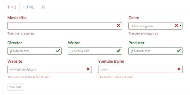
When a field fails at validating a rule, the .error class is added to it, and will be remove on the next click on the field.
Default Error Messages
Each validation rule comes with a default error message:
- required : The field {field title} is required.
- email: Invalid email adress.
- phone: Invalid phone number.
- url: Invalid URL.
- number: The field {field title} must be numeric.
- integer: The field {field title} must be numeric.
- zip: Invalid postcode.
- grouprequired: At least one field required.
- lowerthan: {field 1 title} must be lower than {field 2 title}.
- greaterthan: {field 1 title} must be greater than {field 2 title}.
Customize Error Messages
Two ways to customize error messages :
- Modify the "field title" used in the message: To change the field name used in the default message, use the data-error-fieldname attribute.
<input class="required" id="name" title="Your name" type="text" value="Your name" data-error-fieldname="Name" />
- Specify a whole new message: To completly change the error message associated to a validation rule of a field, add an attribute data-error-message-{rule} containing the desired message.
<input class="required" id="name" title="Your name" type="text" value="Your name" data-error-message-required="This field is really required. Fill it! or get lost..." />
 JS Tutorial


