Download
User Rating: 4.8/5 ( 2 votes)
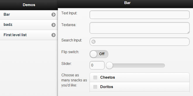
This is a plugin for jQuery Mobile that detects your device's browser width and renders pages accordingly - e.g. splitview for desktop and tablets, and standard jqm for mobile phones.
Features
-
auto-detection: automatically decides how to render for the browser you are using.
-
independent panel scrolling
-
orientation and resize aware - renders the side panel in a popover fashion when in portrait mode
-
context awareness - can be programmed so that opening a page on the side panel also opens a page on the main panel
-
deep-link (and history) awareness - linking to a specific page in the main panel works, and hitting on the back and forward button on your browser also works (only for the main panel pages)
-
panel specific links - links on the side panel can affect pages in the main panel, or in the side panel itself.
1. INCLUDE STYLES AND SCRIPT
<meta name="viewport" content="width=device-width, initial-scale=1">
<link rel="stylesheet" href="stylesheets/jquery.mobile-1.0b2.min.css" />
<link rel="stylesheet" href="../../compiled/jquery.mobile-1.0b2pre.css" />
<link rel="stylesheet" href="jquery.mobile.splitview.css" />
<link rel="stylesheet"  href="jquery.mobile.scrollview.css" />
<link rel="stylesheet"  href="jquery.mobile.grids.collapsible.css" />
<script type="text/javascript" src="jquery-1.6.2.js"></script>
<script type="text/javascript" src="jquery.mobile.splitview.js"></script>
<script type="text/javascript" src="../../compiled/jquery.mobile-1.0b2pre.js"></script>
<script type="text/javascript" src="jquery.easing.1.3.js"></script>
<script type="text/javascript" src="jquery.mobile.scrollview.js"></script>
2. HTML
<div data-role="panel" data-id="menu">
	<!-- Start of first page -->
	<div data-role="page" id="foo">

		<div data-role="header">
			<h1>Foo</h1>
		</div><!-- /header -->

		<div data-role="content">
			<p>I'm first in the source order so I'm shown as the page.</p>
			<p>View internal page called <a href="#bar">bar</a></p>
		</div><!-- /content -->

		<div data-role="footer">
			<h4>Page Footer</h4>
		</div><!-- /footer -->
	</div><!-- /page -->
	<!-- other side panel pages here -->
</div>
<div data-role="panel" data-id="main">
	<!-- Start of second page -->
	<div data-role="page" id="bar">

		<div data-role="header">
			<h1>Bar</h1>
		</div><!-- /header -->

		<div data-role="content">
			<p>I'm first in the source order so I'm shown as the page.</p>
			<p><a href="#foo">Back to foo</a></p>
		</div><!-- /content -->

		<div data-role="footer">
			<h4>Page Footer</h4>
		</div><!-- /footer -->
	</div><!-- /page -->
	<!-- other main panel pages here -->
</div>
Splitview Links
splitview links work just like the links in jQuery Mobile. the only difference is, you can define the panel you want the page that link points to load into using the 'data-panel' attribute. for example:
<a href="some_other_page" data-panel="main">
this method also loads ajax pages.
Panel settings
there are two settings for panel divs:
-
data-hash - takes the following values: true(default), false, and crumbs this attribute tells splitview to track history for the panel or not (true and false), or to set a 'crumb' (crumbs) button at the top left portion of the header for each page.
-
data-context - takes a jQuery selector value, or a hash of the following: url, panel, refresh. data-context tells splitview to load another page whose link can be found in the active page by the jQuery selector value, or a page which is pointed to by the hash. example:
<div data-role="panel" data-id="menu" data-hash="crumbs" data-context="a#default">
OR
<div data-role="panel" data-id="menu" data-hash="crumbs" data-context='{"url":"#bar", "panel":"main", "refresh":false}'>
NOTE: this attribute, if used on a page, overrides panel data-context attributes. example:
<div data-role="page" data-context="a#default">
 JS Tutorial


