- Overview
- Documents
JCoverflip Features
jCoverflip has been developed to enable fast and granular customization of the look and feel and feature set.
Ready to Use
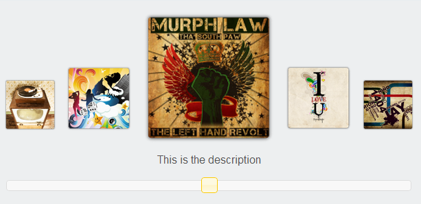
- Drag or click functionality to showcase featured content items on demand by the user.
- Ability to showcase both images and content associated with an item.
- Module integration with Drupal or Standalone version.
Themeable User Interface
The default installation uses a clean style that can be updated with ease. All aspects of jCoverflip are customizable through the API, including:
- Colors.
- Fonts and Styles.
- Animation speed.
- Number of items included in jCoverflip.
Installation
Requirements
jCoverflip depends upon:
- jQuery version 1.3 or later
- jQuery UI 1.7.2 (only the core of jQuery UI is required and the themes are not used)
Installation
- Install jQuery 1.3+ and jQuery UI 1.7.2
- Download jCoverflip
-
Add the styles to your site:
.ui-jcoverflip {
position: relative;
}
.ui-jcoverflip--item {
position: absolute;
display: block;
} -
Include jCoverflip script after jQuery and jQuery UI in the <head> of your HTML document:
<script type="text/javascript" src="jquery.js"></script>
<script type="text/javascript" src="jquery.ui.js"></script>
<script type="text/javascript" src="jquery.jcoverflip.js"></script>
Getting started
Now you can use it like other jQuery UI widgets. After installing jQuery, jQuery UI, and jCoverflip, just call .jcoverflip() on the parent element to create it.
<script>
  $(function(){
    $('#flip').jcoverflip();

  });
</script>
</head>...
<body>...

<ul id="flip">
    <li><a href="..."><img ...><span class="title">My title</span></a></li>
    <li><a href="..."><img ...><span  class="title">Another title</span></a></li>
    ...
  </ul>
Advance customization
jCoverflip provides a robust API to customize the animation and methods to use in creating your own controls.
Options
| Name | Description |
|---|---|
| items | The jQuery element selector: string, jQuery, DOM Element, [DOM Element] |
| beforeCSS | A function to customize the styling and animation for items to the left of the current. |
| afterCSS | A function to customize the styling and animation for items to the right of the current. |
| currentCSS | A function to customize the styling and animation for the current item. |
| current |
The item to be current. |
| time |
The time, in milliseconds, to animate when switching from item to item. |
| titles.create |
A function to generate a title element for the items. (Paired with titles.destroy) |
| titles.destroy | A function to remove the title element for the items when the object is being destroyed. (Paired with titles.create) |
| titleAnimationIn |
A callback function to animate the title in. |
| TitleAnimationOut |
A callback function to animate the title out. |
| controls.create |
A callback to add controls, such as a scrollbar, to the jCoverflip widget. (Paired with controls.destroy) |
| controls.destroy | A callback to remove the controls when the object is destroyed. (Paired with controls.create) |
Methods
| Call | Description |
|---|---|
| next( [by=1], [wrapAround=true], [callback], [originalEvent={}]) |
Move to the next item.
|
| previous( [by=1], [wrapAround=true], [callback], [originalEvent={}]) |
Move to the previous item.
|
| last([callback], [originalEvent={}]) |
Move the current to the end.
|
| first([callback], [originalEvent={}]) |
Move the current to the start.
|
| current([newCurrent, [originalEvent]]) |
Get the current item index if no parameters are passed. If newCurrent is passed, then it will move the current item to the index. |
| length |
Get the length of the number of items. |
Events
| Name | Description |
|---|---|
| change |
Triggers when the current item changes. |
| start |
Triggers when starting to change the current item. |
| stop |
Triggers when stopping to change the current item. |
| next | Triggers when the next method is called. |
| previous | Triggers when the previous method is called. |
| first | Triggers when the first method is called. |
| last | Triggers when the last method is called. |
 JS Tutorial


