Download
User Rating: 0/5 ( 0 votes)
What is Blueberry?
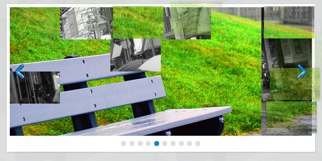
Blueberry is an experimental opensource jQuery image slider plugin which has been written specifically to work with fluid/responsive web layouts.
A brief history
With the popularity of smart phones and tablet devices responsive/fluid web layouts have become an important part of modern web design.
Working on a new project I decided to use the 1140px grid from cssgrid.net. The design I was working on included a large image slider on the front page. As I set about choosing a jQuery plugin to use, I started to realise that very few are compatible with responsive/flexible layouts (at least not without some hacking) as most require a fixed width.
So, I decided to start writing a basic plugin with the aim of making it suitable for responsive web design.
The goal
The hope is that I can at least nudge developers of more popular slider plugins to think about responsive web design, and make their plugins compatible.
In the mean time, I aim to continue to develop this plugin (time permitting), squashing some of the bugs and implementing more advanced features.
Check out the contribute section to find out how you can help.
How to use Blueberry
-
By default the slider will assume the width of it's parent element, this can be tweaked with CSS min/max-width.
-
All images should be of equal dimensions. The slider will assume the height & width of the first image.
-
The blueberry function must be called inside $(window).load() to avoid a bug in webkit browsers (see markup below).
-
Don't forget to include the blueberry.css style sheet. This sets the base styles that are required for the slider to work.
-
You can add the .crop class too the ul.slides element to crop the images rather than resizing them, try it!
-
When themeing avoid applying any padding or margin to the ul.slides element. The safest option is to wrap it in another <div> and style that instead.
Markup
jQuery
$(window).load(function() {
	$('.blueberry').blueberry();
});
HTML
<div class="blueberry">
  <ul class="slides">
    <li><img src="img/slide1.jpg" /></li>
    <li><img src="img/slide2.jpg" /></li>
    <li><img src="img/slide3.jpg" /></li>
    <li><img src="img/slide4.jpg" /></li>
  </ul>
<!-- Optional, see options below -->
  <ul class="pager">
    <li><a href="#"><span></span></a></li>
    <li><a href="#"><span></span></a></li>
    <li><a href="#"><span></span></a></li>
    <li><a href="#"><span></span></a></li>
  </ul>
<!-- Optional, see options below -->
</div>
Options
|
Key |
Default |
Description |
|
interval |
5000 |
Sets the time between slide transitions, in milliseconds. |
|
duration |
500 |
Sets the speed of the fade transition, in milliseconds. |
|
lineheight |
1 |
Sets the line height, in px, the '.slides' element should use. The '.slides' element height will always be a multiple of this. |
|
hoverpause |
false |
If 'true' the slides will pause when the cursor is hovering over them. |
|
pager |
true |
If 'true' a pager will be automatically generated based on the number of slides. If set to 'false', or if a '.pager' element already exists a pager will not be generated. You can create your own custom pager using the syntax above, but replacing the <span> elements with anything you desire e.g. thumbnail images. |
|
keynav |
true |
If 'true' you can navigate the slides using the back/forward/spacebar keys on your keyboard. You might want to set this to false if you have multiple sliders on a single page, otherwise they will all rotate on keypress. |
 JS Tutorial


