Download
Demo
- Overview
- Documents
User Rating: 4.7/5 ( 2 votes)
Your Rating:
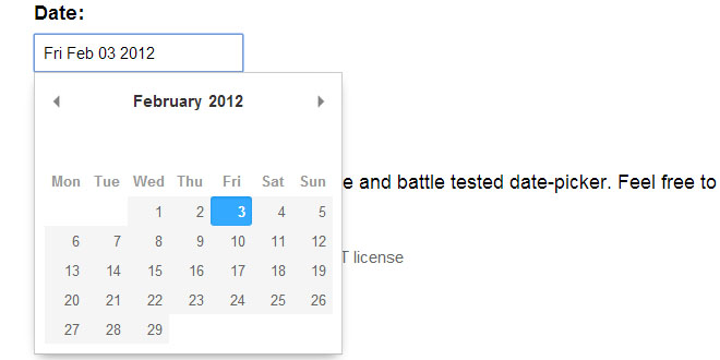
An ultra-simple, customizable, light-weight date picker plug-in for jQuery at just over 7KB compressed or 25KB uncompressed.
Features
- Stylize current date, selected date, special dates and individual days of the week
- Set data on special dates (that is returned on callback when selected)
- Repeatable date ranges, individual dates and special dates
- Restrict selection to range of dates, individual dates, years, months and days of the week
- Restricting forward / backwards month navigation
- Automatically jump to respective month on selection (if it is the next or previous month)
- Offset days of the week (e.g. make Wednesday the first day of the week)
- Jump to specific month or year through select drop-down
- Customizable month names and days of week names
- Callbacks for when date is selected and when calendar is about to show or hide
- Individual styles per date picker on the same page
- Render directly below input control (by default) or specify a custom element to render into
Usage
Step #1 — Include the glDatePicker stylesheet(s)
glDatePicker supports inclusions of multiple style-sheets, all on the same page. This allows you to have multiple date pickers with different styles assigned to each date picker. To use the default style, includeglDatePicker.default.css
<!DOCTYPE html>
<html>
<head>
    <link href="styles/glDatePicker.default.css" rel="stylesheet" type="text/css">
</head>
If you want, you can even create your own styles, by making a copy of glDatePicker.default.css and altering the styles within the file (be sure to rename from gldp-default to gldp-xxxxxx where xxxxxx is the name for your style).
Step #2 — Create your input control(s)
Create your input control that will trigger the date picker to become active when it receives focus or the user clicks on it.
<body>
    <input type="text" id="mydate" />
Optionally, if you want the date picker to appear in a specific div element, give your input control a uniquegldp-id attribute and reference that id value in your element's gldp-el attribute.
The example below shows a custom element where the date picker will be rendered.
The example below shows a custom element where the date picker will be rendered.
<body>
    <input type="text" id="mydate" gldp-id="mydate" />
    <div gldp-el="mydate"
         style="width:400px; height:300px; position:absolute; top:70px; left:100px;">
    </div>
Step #3 — Include jQuery and glDatePicker scripts and attach the input
Include jQuery script followed by the glDatePicker script. Then attach glDatePicker to your control(s).
IMPORTANT TIP: You can attach glDatePicker inside
IMPORTANT TIP: You can attach glDatePicker inside
$(function() {...}); or inside $(document).ready(function() {...}); however depending on your site's layout, the calendar may not position correctly. For most situations, consider attaching in $(window).load
    <script src="//ajax.googleapis.com/ajax/libs/jquery/1.8.3/jquery.min.js"></script>
    <script src="glDatePicker.min.js"></script>

    <script type="text/javascript">
        $(window).load(function()
        {
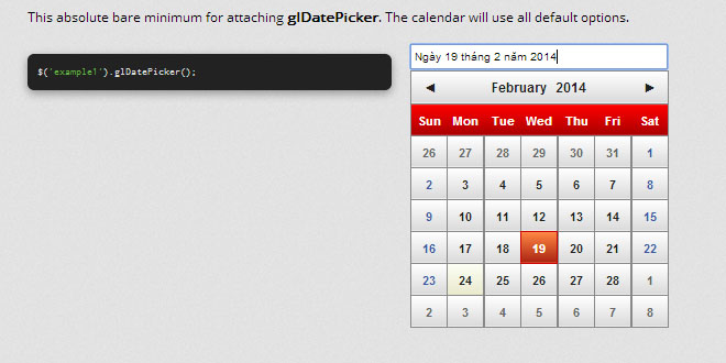
            $('input').glDatePicker();
        });
    </script>
</body>
</html>
Reference
When attaching your input, you can pass true to the second call to the glDatePicker constructor to get an instance of glDatePicker returned. You can also do this while chaining with options:
// Doing it in a single pass
var myDatePicker = $('#example1').glDatePicker(
{
    showAlways: true,
    selectableDOW: [0, 2, 3]
}).glDatePicker(true);

// Or you can do it with multiple calls
$('example1').glDatePicker(
{
    showAlways: true,
    selectableDOW: [0, 2, 3]
});

var myDatePicker = $('example1').glDatePicker(true);
Getting a variable to glDatePicker will now allow you to call public functions and even change options on the fly, as shown in some examples below:
// This example updates some options (calling render will re-generate the calendar)
$.extend(myDatePicker.options,
{
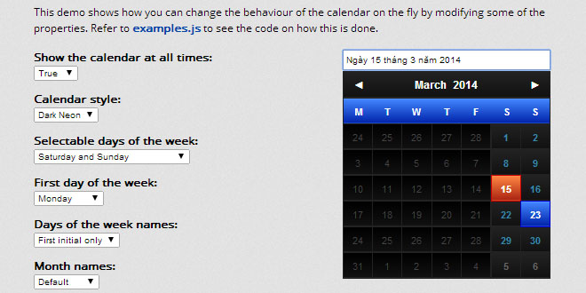
    cssName: 'darkneon',
    allowMonthSelect: false,
    allowYearSelect: false
});
myDatePicker.render();

// If the calendar is not set to showAlways=true, you can force it to show by calling the show() function
myDatePicker.show();
Below is a list of properties that can be passed to glDatePicker to alter its behaviour.
Refer to the comments above the properties to understand what they do. Default values are shown.
Refer to the comments above the properties to understand what they do. Default values are shown.
$('input').glDatePicker(
{
    // Style to use for the calendar.  This name must match the name used in
    // the stylesheet, using the class naming convention "gldp-cssName".
    cssName: 'default',

    // The z-index for the calendar control.
    zIndex: 1000,

    // Thickness of border (in pixels)
    borderSize: 1,

    // The number of pixels to offset the calendar's position on the page.
    calendarOffset: { x: 0, y: 1 },

    // Set to true if you want the calendar to be visible at all times.
    // NOTE: If your target element is hidden, the calendar will be hidden as well.
    showAlways: false,

    // Hide the calendar when a date is selected (only if showAlways is set to false).
    hideOnClick: true,

    // Allow selection of months by clicking on the month in the title.
    allowMonthSelect: true,

    // Allow selection of years by clicking on the year in the title.
    allowYearSelect: true,

    // The date that will be treated as 'today'.
    todayDate: new Date(),

    // The date that will appear selected when the calendar renders.
    // By default it will be set to todayDate.
    selectedDate: null,

    // Arrows used for the Previous and Next month buttons on the title.
    // Set these to blank to hide the arrows completely.
    prevArrow: '\u25c4',
    nextArrow: '\u25ba',

    // A collection of dates that can be selectable by the user.
    // The dates can be a one-time selection or made repeatable by setting
    // the repeatYear or repeatMonth flag to true.
    // By default repeatYear and repeatMonth are false.
    //
    // This example creates 4-individual dates that can be selected;
    // The first date will repeat every year, the second date will repeat every
    // month and year, the third date will repeat every month and the fourth date
    // will only be selectable one-time and not repeat:
    //
    //    selectableDates: [
    //        { date: new Date(0, 8, 5), repeatYear: true },
    //        { date: new Date(0, 0, 14), repeatMonth: true, repeatYear: true },
    //        { date: new Date(2013, 0, 24), repeatMonth: true },
    //        { date: new Date(2013, 11, 25) },
    //    ]
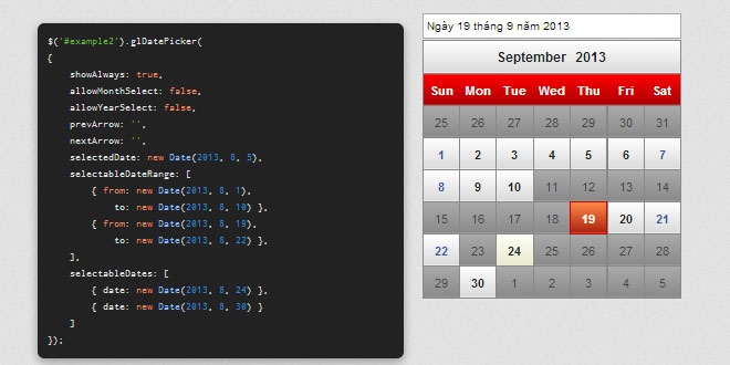
    selectableDates: null,

    // A collection of date ranges that are selectable by the user.
    // The ranges can be made to repeat by setting repeatYear to true
    // (repeatMonth is not supported).
    //
    // This example will create 3-sets of selectable date ranges with
    // specific from and to ranges.  The 4th and 5th ranges don't specify
    // the "to" date in which case the "to" date will be the maximum days for
    // the month specified in "from".  The 4th and 5th ranges also repeat every year:
    //
    //     selectableDateRange: [
    //         { from: new Date(2013, 1, 1), to: newDate (2013, 2, 1) },
    //         { from: new Date(2013, 4, 1), to: newDate (2013, 8, 1) },
    //         { from: new Date(2013, 7, 10), to: newDate (2013, 9, 10) },
    //         { from: new Date(0, 8, 10), repeatYear: true }
    //         { from: new Date(0, 9, 1), repeatYear: true }
    //     ]
    selectableDateRange: null,

    // Mark certain dates as special dates.  Similar to selectableDates, this
    // property supports both repeatYear and repeatMonth flags.
    // Each special date can be styled using custom style names and can have
    // data attached to it that will be returned in the onClick callback.
    // The data field can be any custom (JSON style) object.
    //
    // This example creates two (repeatable by year) dates with special data in them.
    // The first date also assigns a special class (which you will have to define).
    //    specialDates: [
    //        {
    //            date: new Date(0, 8, 5),
    //            data: { message: 'Happy Birthday!' },
    //            repeatYear: true,
    //            cssClass: 'special-bday'
    //        },
    //        {
    //            date: new Date(2013, 0, 8),
    //            data: { message: 'Meeting every day 8 of the month' },
    //            repeatMonth: true
    //        }
    //    ]
    specialDates: null,

    // List of months that can be selectable, including when the user clicks
    // on the title to select from the dropdown.
    // This example only makes two months visible; September and December:
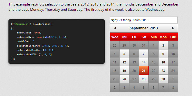
    //    selectableMonths: [8, 11]
    selectableMonths : null,

    // List of selectable years.  If not provided, will default to 5-years
    // back and forward.
    // This example only allows selection of dates that have year 2012, 2013, 2015
    //    selectableYears: [2012, 2013, 2015]
    selectableYears: null,

    // List of selectable days of the week.  0 is Sunday, 1 is Monday, and so on.
    // This example allows only Sunday, Tuesday, Thursday:
    //    selectableDOW: [0, 2, 4]
    selectableDOW : null,

    // Names of the month that will be shown in the title.
    // Will default to long-form names:
    //     January, February, March, April, May, June, July,
    //     August, September, October, November, December
    monthNames: null,

    // Names of the days of the Week that will be shown below the title.
    // Will default to short-form names:
    //     Sun, Mon, Tue, Wed, Thu, Fri, Sat
    dowNames: null,

    // The day of the week to start the calendar on.  0 is Sunday, 1 is Monday and so on.
    dowOffset: 0,

    // Callback that will trigger when the user clicks a selectable date.
    // Parameters that are passed to the callback:
    //     el : The input element the date picker is bound to
    //   cell : The cell on the calendar that triggered this event
    //   date : The date associated with the cell
    //   data : Special data associated with the cell (if available, otherwise, null)
    onClick: (function(el, cell, date, data) {
        el.val(date.toLocaleDateString());
    }),

    // Callback that will trigger when the user hovers over a selectable date.
    // This callback receives the same set of parameters as onClick.
    onHover: function(el, cell, date, data) {},

    // Callback that will trigger when the calendar needs to show.
    // You can use this callback to animate the opening of the calendar.
    onShow: function(calendar) { calendar.show(); },

    // Callback that will trigger when the calendar needs to hide.
    // You can use this callback to animate the hiding of the calendar.
    onHide: function(calendar) { calendar.hide(); }
});
 JS Tutorial
