Download
Demo
- Overview
- Documents
User Rating: 3.3/5 ( 12 votes)
Your Rating:
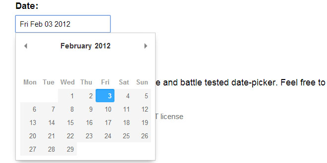
A refreshing JavaScript Datepicker
- Lightweight (less than 5kb minified and gzipped)
- No dependencies (but plays well with Moment.js
- Modular CSS classes for easy styling
Usage
Pikaday can be bound to an input field:
<input type="text" id="datepicker">
Add the JavaScript to the end of your document:
<script src="pikaday.js"></script>
<script>
    var picker = new Pikaday({ field: document.getElementById('datepicker') });
</script>
If you're using jQuery make sure to pass only the first element:
var picker = new Pikaday({ field: $('#datepicker')[0] });
If the Pikaday instance is not bound to a field you can append the element anywhere:
var field = document.getElementById('datepicker');
var picker = new Pikaday({
    onSelect: function(date) {
        field.value = picker.toString();
    }
});
field.parentNode.insertBefore(picker.el, field.nextSibling);
For advanced formatting load Moment.js prior to Pikaday:
See the moment.js example for a full version.
<input type="text" id="datepicker" value="9 Oct 2014">

<script src="moment.js"></script>
<script src="pikaday.js"></script>
<script>
    var picker = new Pikaday({
        field: document.getElementById('datepicker'),
        format: 'D MMM YYYY',
        onSelect: function() {
            console.log(this.getMoment().format('Do MMMM YYYY'));
        }
    });
</script>
Configuration
As the examples demonstrate above Pikaday has many useful options:
- field bind the datepicker to a form field
- trigger use a different element to trigger opening the datepicker, see trigger example (default to field)
- bound automatically show/hide the datepicker on field focus (default true if field is set)
- position preferred position of the datepicker relative to the form field, e.g.: top right, bottom rightNote: automatic adjustment may occur to avoid datepicker from being displayed outside the viewport, seepositions example (default to 'bottom left')
- format the default output format for .toString() and field value (requires Moment.js for custom formatting)
- defaultDate the initial date to view when first opened
- setDefaultDate make the defaultDate the initial selected value
- firstDay first day of the week (0: Sunday, 1: Monday, etc)
- minDate the minimum/earliest date that can be selected (this should be a native Date object - e.g. new Date() or moment().toDate())
- maxDate the maximum/latest date that can be selected (this should be a native Date object - e.g. new Date() or moment().toDate())
- yearRange number of years either side (e.g. 10) or array of upper/lower range (e.g. [1900,2015])
- isRTL reverse the calendar for right-to-left languages
- i18n language defaults for month and weekday names (see internationalization below)
- yearSuffix additional text to append to the year in the title
- showMonthAfterYear render the month after year in the title (default false)
- onSelect callback function for when a date is selected
- onOpen callback function for when the picker becomes visible
- onClose callback function for when the picker is hidden
- onDraw callback function for when the picker draws a new month
jQuery Plugin
The normal version of Pikaday does not require jQuery, however there is a jQuery plugin if that floats your boat (see plugins/pikaday.jquery.js in the repository). This version requires jQuery, naturally, and can be used like other plugins:
See the jQuery example for a full version.
<script src="//ajax.googleapis.com/ajax/libs/jquery/1.9.1/jquery.min.js"></script>
<script src="pikaday.js"></script>
<script src="plugins/pikaday.jquery.js"></script>
<script>

// activate datepickers for all elements with a class of `datepicker`
$('.datepicker').pikaday({ firstDay: 1 });

// chain a few methods for the first datepicker, jQuery style!
$('.datepicker').eq(0).pikaday('show').pikaday('gotoYear', 2042);

</script>
 JS Tutorial


