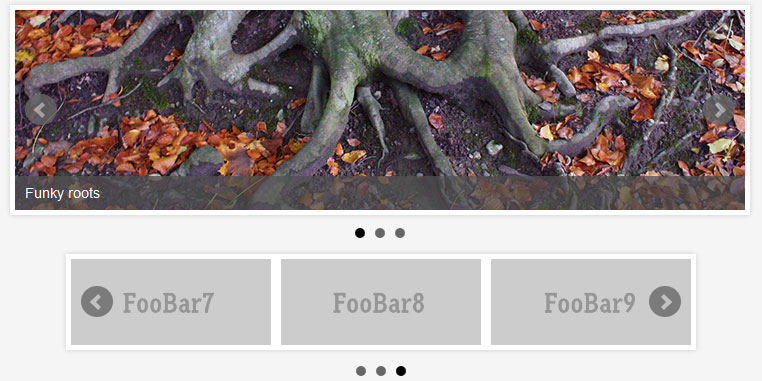
- Overview
- Documents
- Demos
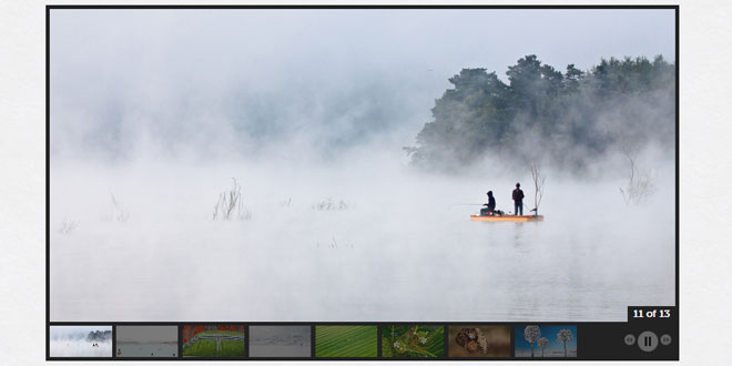
Photo gallery jQuery plugins are everywhere you turn. Not a week goes by without some web design blog featuring a list of jQuery galleries, carousels, sliders and slideshows. GalleryView is my attempt to write a single plugin capable of creating a wide variety of gallery types.
My goal with GalleryView is to provide an extensive set of options to the user. Not only will the user be able to adjust photo and thumbnail sizes, and transition speeds, but he will also have the ability to choose from a selection of element positions, transition styles and other features.
INSTRUCTIONS FOR USE
---------------------------------
1) Place galleryview-x.x folder somewhere in your website directory structure (you can rename this folder if desired)
2) Include script tags for the desired version of the script (uncompressed, packed) and for the included jQuery Timers and Easing plugin files
3) Include a reference to the jquery.galleryview-x.x.css stylesheet in your document
4) Create an unordered list in your HTML with the content you wish to be displayed in your gallery (see below for more information on markup options
5) Edit the id of the first rule in jquery.galleryview-3.0.css to match the id given to your unordered list
6) Call the GalleryView plugin with the function call below:

	$('#id_of_list').galleryView()

	To override default option values, include them in object literal format in the call to the plugin, like so:

	$('#id_of_list').galleryView({
		panel_width: 800,
		panel_height: 600,
		frame_width: 120,
		frame_height: 90
	});

	Refer to the uncompressed javascript to see a full list of options, their effects on the plugin and their default values.


HTML MARKUP REQUIREMENTS
---------------------------------
Below, I will show you the markup required to produce various types of galleries. After the first example,
I will exclude the UL wrapper and only show the HTML necessary for a single panel and/or frame.

1) 	Basic slideshow (no added features)
		<ul id="gallery">
			<li><img src="../gv/path/to/image1.jpg" alt="image1" /></li>
			<li><img src="../gv/path/to/image2.jpg" alt="image2" /></li>
			<li><img src="../gv/path/to/image3.jpg" alt="image3" /></li>
			<li><img src="../gv/path/to/image4.jpg" alt="image4" /></li>
		</ul>

	This is the simplest gallery one can have. By default, the filmstrip will appear below the panels. The number of frames visible will be
	determined by the size of the panels. If there is enough space in the gallery to fit all the filmstrip frames, the filmstrip will be centered
	within the gallery. If there are too many frames, the additional frames will be hidden from view initially, appearing as the filmstrip slides
	to the left with each transition. Panel and frame dimensions are set via plugin options, as is the location of the filmstrip. It can be set
	to appear below, above, or to either side of the panels.

2) 	Slideshow with custom thumbnails

		<li>
			<img src="../gv/path/to/image.jpg" data-frame="../gv/path/to/thumb.jpg" alt="image" />
		</li>

	By adding a data-frame attribute with a relative or absolute path to a separate image, GalleryView will use it to populate the thumbnail. This
	can be helpful when using large panel images and small thumbnails to avoid degradation due to scaling.

3)	Slideshow with panel overlays

		<li>
			<img src="../gv/path/to/image.jpg" alt="image" title="Pretty Picture" data-description="Some more information about the photo" />
		</li>

	For this gallery, the contents of the title and data-description attributes will display on top of the panel image, its position determined by the
	'overlay_position' option. The color of the overlays are  set in the included CSS file.

CREATING/USING CUSTOM NAVIGATION THEMES
---------------------------------
GalleryView comes with two themes by default:
	- dark
	- light

The dark themes contain dark navigation buttons and are best used in galleries with light backgrounds. The light themes contain light
colored images and are best for galleries with dark backgrounds. Both themes also contain oversized panel navigation buttons to demonstrate
GalleryView's ability to use any kind of navigation images you may want to use

To create your own navigation theme, first create the following images:
	- next.png
	- prev.png
	- play.png
	- pause.png
	- panel-nav-next.png
	- panel-nav-prev.png

The images can be of any file type. Then, update the galleryView CSS file with the paths to your new navigation images.
Development
GalleryView is in active development, and new features are being implemented on a regular basis. Below is a list of currently implemented options, as well as a list of options I plan on implementing as development continues.
Implemented Options
| option | type | default value | description |
|---|---|---|---|
| transition_speed | int | 1000 | the duration of photo transition animations in milliseconds. |
| transition_interval | int | 4000 | the delay between automated slideshow transitions in milliseconds. |
| easing | string | 'swing' | the easing method used in photo and thumbnail animations. any custom easing method may be used. |
| show_panels | boolean | true | flag to toggle display of main photo panel. set to false to create a carousel-style gallery. (not fully implemented) |
| show_panel_nav | boolean | true | flag to toggle display of next and previous buttons in the gallery panel. |
| enable_overlays | boolean | false | flag to toggle display of informational image overlays. |
| panel_width | int | 800 | width of image panel in pixels. |
| panel_height | int | 400 | height of image panel in pixels. |
| panel_animation | string | 'fade' | the animation method used for panel image transitions. Options are 'fade', 'crossfade', 'slide' |
| panel_scale | string | 'crop' | the scaling method for panel images. Options are 'crop', 'fit'. |
| overlay_position | string | 'bottom' | the positioning of informational panel overlays. Options are 'bottom', 'top' |
| pan_images | boolean | false | flag to toggle drag-based panning of oversized panel images. |
| pan_style | string | 'drag' | panning method used. 'drag' = user clicks and drags image to pan, 'track' = image automatically pans based on mouse position |
| start_frame | int | 1 | index indicating which image to display when gallery loads |
| show_filmstrip | boolean | true | flag to toggle display of navigation filmstrip. |
| show_filmstrip_nav | boolean | true | flag to toggle display of filmstrip-based navigation buttons. |
| enable_slideshow | boolean | true | flag to toggle play/pause button and ability to start/stop slideshow |
| autoplay | boolean | false | flag to automatically start slideshow when gallery loads |
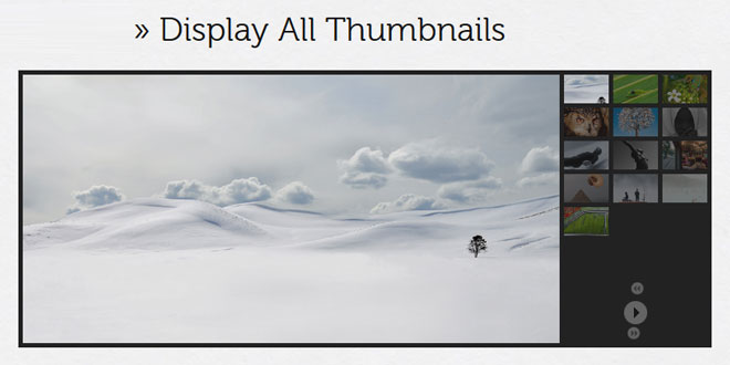
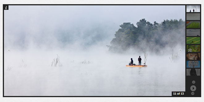
| filmstrip_position | string | 'bottom' | location of filmstrip in relation to panel. Options are 'top', 'left', 'bottom', 'right'. |
| frame_width | int | 70 | width of filmstrip frames in pixels. |
| frame_height | int | 40 | height of filmstrip frames in pixels. |
| frame_opacity | float | 0.4 | the default opacity of filmstrip frames (range 0.0 - 1.0) |
| frame_scale | string | 'crop' | the scaling method for frame images. Options are 'crop', 'fit'. |
| frame_gap | int | 5 | distance between frames in pixels. |
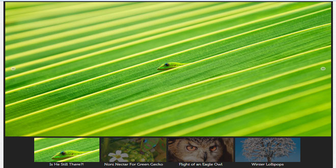
| show_captions | boolean | false | flag to toggle display of frame captions (populated by image's title attribute). |
| show_infobar | boolean | true | flag to toggle display of image counter bar. |
| infobar_opacity | float | 1.0 | the default opacity of infobar (range 0.0 - 1.0) |
Future Options
| option | intended function |
|---|---|
| overlay_opacity | To allow the creation of translucent overlays by setting the opacity of the overlay's container. |
| pan_style | To provide the option of multiple panning methods, including the current 'drag' method as well as a 'track' method where the image pans as the mouse moves within the gallery. |
| pan_smoothness | To allow the user to control the speed and smoothness of 'track' style panning. |
| start_image | To allow the user to load the gallery on an arbitrary image. |
| filmstrip_size | Define number of images visible in filmstrip-only, carouself style galleries. |
 JS Tutorial
