- Overview
- Documents
A tutorial on how to create a simple category slider with a minimal design using CSS animations and jQuery. The idea is to slide the items sequentially depending on the slide direction.
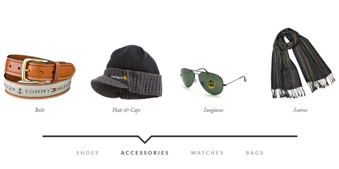
For today’s tutorial we want to show you how to create a simple item slider with CSS animations and some jQuery. The idea was inspired by the Aplle product slider where several little items fly in with a bouncing animation. We wanted to translate this concept to a modern-looking alternative for a minimal online store design where the items represent different categories. Categories as use-case fit quite well because of the limited nature of this type of slider. For more items to be shown, this is certainly a far-from-optimal solution. If the amount of items is limited this might give an interesting little touch to the experience.
THE MARKUP
For the HTML we will use a division that wraps some unordered lists that will contain the items and a navigation with the category links. Each list item will have a link that contains an image and a h4 heading.
<div id="mi-slider" class="mi-slider">
    <ul>
        <li><a href="#"><img src="images/1.jpg" alt="img01"><h4>Boots</h4></a></li>
        <li><a href="#"><img src="images/2.jpg" alt="img02"><h4>Oxfords</h4></a></li>
        <li><a href="#"><img src="images/3.jpg" alt="img03"><h4>Loafers</h4></a></li>
        <li><a href="#"><img src="images/4.jpg" alt="img04"><h4>Sneakers</h4></a></li>
    </ul>
    <ul>
        <li><a href="#"><img src="images/5.jpg" alt="img05"><h4>Belts</h4></a></li>
        <li><a href="#"><img src="images/6.jpg" alt="img06"><h4>Hats & Caps</h4></a></li>
        <li><a href="#"><img src="images/7.jpg" alt="img07"><h4>Sunglasses</h4></a></li>
        <li><a href="#"><img src="images/8.jpg" alt="img08"><h4>Scarves</h4></a></li>
    </ul>
    <ul>
        <li><a href="#"><img src="images/9.jpg" alt="img09"><h4>Casual</h4></a></li>
        <li><a href="#"><img src="images/10.jpg" alt="img10"><h4>Luxury</h4></a></li>
        <li><a href="#"><img src="images/11.jpg" alt="img11"><h4>Sport</h4></a></li>
    </ul>
    <ul>
        <li><a href="#"><img src="images/12.jpg" alt="img12"><h4>Carry-Ons</h4></a></li>
        <li><a href="#"><img src="images/13.jpg" alt="img13"><h4>Duffel Bags</h4></a></li>
        <li><a href="#"><img src="images/14.jpg" alt="img14"><h4>Laptop Bags</h4></a></li>
        <li><a href="#"><img src="images/15.jpg" alt="img15"><h4>Briefcases</h4></a></li>
    </ul>
    <nav>
        <a href="#">Shoes</a>
        <a href="#">Accessories</a>
        <a href="#">Watches</a>
        <a href="#">Bags</a>
    </nav>
</div>
Let’s take a look at the style.
THE CSS
Note that the CSS will not contain any vendor prefixes, but you will find them in the files.
What we want to do is the following: initially we just want the first item list to show while all the other lis will be translated to the right, outside of the viewport. When we click on a navigation link the items will either slide in from the right or from the left, depending on which current position we are at and what the newly selected category is.
Let’s first style the wrapper, which is the division with the class mi-slider. It will have a predefined height which we need in order to set the position of the uls correctly:
.mi-slider {
    position: relative;
    margin-top: 30px;
    height: 490px;
}
The ul will be positioned absolutely which means that all the lists will be on top of each other. Remember, we only want to translate the list items, not the lists themselves. We set the pointer-events to none because we want to be able to click on the current list’s links:
.mi-slider ul {
    list-style-type: none;
    position: absolute;
    width: 100%;
    left: 0;
    bottom: 140px;
    overflow: hidden;
    text-align: center;
    pointer-events: none;
}
The pointer events of the current list should be reset, so that the containing links are clickable:
.mi-slider ul.mi-current {
    pointer-events: auto;
}
When JavaScript is disabled, we don’t want anything to look broken (we use Modernizr):
.no-js .mi-slider ul {
    position: relative;
    left: auto;
    bottom: auto;
    margin: 0;
    overflow: visible;
}
In order to center all the list items, we have given the ul a text-align of center and now we’ll give the list items an inline-block display with a width of 20%. This width makes sure that our items fit into the list and keeps it fluid.
By default, all the list items will be translated to the right. We use 600% here because it’s a large enought value to move them out of the viewport. We’ll also add a little transition for the opacity:
.mi-slider ul li {
    display: inline-block;
    padding: 20px;
    width: 20%;
    max-width: 300px;
    transform: translateX(600%);
    transition: opacity 0.2s linear;
}
Whithout JS we don’t want them to translate:
.no-js .mi-slider ul li {
    transform: translateX(0);
}
Let’s style the content of the list items. Note how we set the max-width of the images to 100%. This will ensure that the layout does not break but the images will resize according to their wrapper which is our li with a percentage-based width:
.mi-slider ul li a,
.mi-slider ul li img {
    display: block;
    margin: 0 auto;
}
.mi-slider ul li a {
    outline: none;
    cursor: pointer;
}
.mi-slider ul li img {
    max-width: 100%;
    border: none;
}
.mi-slider ul li h4 {
    display: inline-block;
    font-family: Baskerville, "Baskerville Old Face", "Hoefler Text", Garamond, "Times New Roman", serif;
    font-style: italic;
    font-weight: 400;
    font-size: 18px;
    padding: 20px 10px 0;
}
On hover, we’ll animate the opacity of the list item:
.mi-slider ul li:hover {
    opacity: 0.7;
}
The navigation needs to have a top value because the lists are positioned absolutely. We’ll center the navigation by giving lateral auto margins and we’ll set a maximum width of 800px:
.mi-slider nav {
    position: relative;
    top: 400px;
    text-align: center;
    max-width: 800px;
    margin: 0 auto;
    border-top: 5px solid #333;
}
We don’t want to show the navigation at all when there is no JavaScript enabled:
.no-js nav {
    display: none;
}
The navigation links will have a generous padding and we’ll give them a transition for hover:
.mi-slider nav a {
    display: inline-block;
    text-transform: uppercase;
    letter-spacing: 5px;
    padding: 40px 30px 30px 34px;
    position: relative;
    color: #888;
    outline: none;
    transition: color 0.2s linear;
}
.mi-slider nav a:hover,
.mi-slider nav a.mi-selected {
    color: #000;
}
The mi-selected class, just like the mi-current class for the lists, we’ll set using JavaScript.
Now, let’s add that little arrow on the top. We’ll use the pseudo-classes :before and :after to create two triangles with borders:
.mi-slider nav a.mi-selected:after,
.mi-slider nav a.mi-selected:before {
    content: '';
    position: absolute;
    top: -5px;
    border: solid transparent;
    height: 0;
    width: 0;
    position: absolute;
    pointer-events: none;
}
.mi-slider nav a.mi-selected:after {
    border-color: transparent;
    border-top-color: #fff;
    border-width: 20px;
    left: 50%;
    margin-left: -20px;
}
.mi-slider nav a.mi-selected:before {
    border-color: transparent;
    border-top-color: #333;
    border-width: 27px;
    left: 50%;
    margin-left: -27px;
}
Let get to the juicy bits, the animations. The first animation that we want to happen, is the scaling up of the items of the first list. The scaleUp animation will also include the items being translated to 0 because we want them to be in the viewport:
.mi-slider ul:first-child li,
.no-js .mi-slider ul li {
    animation: scaleUp 350ms ease-in-out both;
}
@keyframes scaleUp {
    0% { transform: translateX(0) scale(0); }
    100% { transform: translateX(0) scale(1); }
}
Let’s add a different delay to each list item so that they appear sequentially:
.mi-slider ul:first-child li:first-child {
    animation-delay: 90ms;
}
.mi-slider ul:first-child li:nth-child(2) {
    animation-delay: 180ms;
}
.mi-slider ul:first-child li:nth-child(3) {
    animation-delay: 270ms;
}
.mi-slider ul:first-child li:nth-child(4) {
    animation-delay: 360ms;
}
For our example we will just have a maximum of four items, so we’ll only define four delays. If we would have more items, we would include more delays.
For the sliding animations we will have four cases: two for the sliding in of new items and two for the sliding out of the current items, depending on the direction. So we’ll define four classes for the lists which we will add with JavaScript:
/* moveFromRight */
.mi-slider ul.mi-moveFromRight li {
    animation: moveFromRight 350ms ease-in-out both;
}
/* moveFromLeft */
.mi-slider ul.mi-moveFromLeft li {
    animation: moveFromLeft 350ms ease-in-out both;
}
/* moveToRight */
.mi-slider ul.mi-moveToRight li {
    animation: moveToRight 350ms ease-in-out both;
}
/* moveToLeft */
.mi-slider ul.mi-moveToLeft li {
    animation: moveToLeft 350ms ease-in-out both;
}
Now we need to set the according animation delays which will also depend on the direction. For example, the first item will slide in with no delay if it’s coming form the right side and also when it slides out to the left. The same will be true for the last item:
.mi-slider ul.mi-moveToLeft li:first-child,
.mi-slider ul.mi-moveFromRight li:first-child,
.mi-slider ul.mi-moveToRight li:nth-child(4),
.mi-slider ul.mi-moveFromLeft li:nth-child(4) {
    animation-delay: 0ms;
}
The increased delays will be set accordingly:
.mi-slider ul.mi-moveToLeft li:nth-child(2),
.mi-slider ul.mi-moveFromRight li:nth-child(2),
.mi-slider ul.mi-moveToRight li:nth-child(3),
.mi-slider ul.mi-moveFromLeft li:nth-child(3) {
    -webkit-animation-delay: 90ms;
    animation-delay: 90ms;
}
.mi-slider ul.mi-moveToLeft li:nth-child(3),
.mi-slider ul.mi-moveFromRight li:nth-child(3),
.mi-slider ul.mi-moveToRight li:nth-child(2),
.mi-slider ul.mi-moveFromLeft li:nth-child(2) {
    -webkit-animation-delay: 180ms;
    animation-delay: 180ms;
}
.mi-slider ul.mi-moveToLeft li:nth-child(4),
.mi-slider ul.mi-moveFromRight li:nth-child(4),
.mi-slider ul.mi-moveToRight li:first-child,
.mi-slider ul.mi-moveFromLeft li:first-child  {
    -webkit-animation-delay: 270ms;
    animation-delay: 270ms;
}
And now let’s define the animations itself. For example, moving from the right will mean that we will set the translateX value to 600% and move to 0. Moving from the left, we’ll set the initial position to -600% so that the items are on the left side outside of the viewport. And so on:
@keyframes moveFromRight {
    0% { transform: translateX(600%); }
    100% { transform: translateX(0); }
}
@keyframes moveFromLeft {
    0% { transform: translateX(-600%); }
    100% { transform: translateX(0); }
}
@keyframes moveToRight {
    0% { transform: translateX(0%); }
    100% { transform: translateX(600%); }
}
@keyframes moveToLeft {
    0% { transform: translateX(0%); }
    100% { transform: translateX(-600%); }
}
Last, but not least, let’s use some media queries to adjust the slider content for smaller screens.
We’ll start with adjusting the navigation so that it does not break when the screen is too small:
@media screen and (max-width: 910px){
    .mi-slider nav {
        max-width: 90%;
    }
    .mi-slider nav a {
        font-size: 12px;
        padding: 40px 10px 30px 14px;
    }
}
Since we set a fixed height to the slider, we want to make sure it adapts:
@media screen and (max-width: 740px){
    .mi-slider {
        height: 300px;
    }
    .mi-slider nav {
        top: 220px;
    }
}
For really small screens, we don’t simply want to make everything super tiny, but instead we want to make the navigation easy for touch devices. So we’ll simply show all the categories. We’ll set all the styles in a way that nothing is hidden and all the lists are displayed under each other:
@media screen and (max-width: 490px){
    .mi-slider {
        text-align: center;
        height: auto;
    }
    .mi-slider ul {
        position: relative;
        display: inline;
        bottom: auto;
        pointer-events: auto;
    }
    .mi-slider ul li {
        animation: none !important;
        transform: translateX(0) !important;
        padding: 10px 3px;
        min-width: 140px;
    }
    .mi-slider nav {
        display: none;
    }
}
And that’s all the style. Now let’s control some things with jQuery.
THE JAVASCRIPT
Let’s create a simple jQuery plugin for our slider. Most of the work is done in the CSS where we have defined all the animations. The plugin will mainly focus on adding and removing classes and control the current category being shown. For browsers that don’t support animations we will fall back to a simple show/hide approach.
Let’s start by caching some elements and initialize some variables:
_init : function( options ) {
    // the categories (ul)
    this.$categories = this.$el.children( 'ul' );
    // the navigation
    this.$navcategories = this.$el.find( 'nav > a' );
    var animEndEventNames = {
        'WebkitAnimation' : 'webkitAnimationEnd',
        'OAnimation' : 'oAnimationEnd',
        'msAnimation' : 'MSAnimationEnd',
        'animation' : 'animationend'
    };
    // animation end event name
    this.animEndEventName = animEndEventNames[ Modernizr.prefixed( 'animation' ) ];
    // animations and transforms support
    this.support = Modernizr.csstransforms && Modernizr.cssanimations;
    // if currently animating
    this.isAnimating = false;
    // current category
    this.current = 0;
    var $currcat = this.$categories.eq( 0 );
    if( !this.support ) {
        this.$categories.hide();
        $currcat.show();
    }
    else {
        $currcat.addClass( 'mi-current' );
    }
    // current nav category
    this.$navcategories.eq( 0 ).addClass( 'mi-selected' );
    // initialize the events
    this._initEvents();
}
We will bind the click event to the navigation category links under the slider. We assume that the index of each one corresponds to the index of the respective category (the ul). When a category link is clicked the items of the current category fly out, and the ones of the new category fly in one by one (remember, we defined the animation delays in the CSS).
_initEvents : function() {
    var self = this;
    this.$navcategories.on( 'click.catslider', function() {
        self.showCategory( $( this ).index() );
        return false;
    } );
    // reset on window resize..
    $( window ).on( 'resize', function() {
        self.$categories.removeClass().eq( 0 ).addClass( 'mi-current' );
        self.$navcategories.eq( self.current ).removeClass( 'mi-selected' ).end().eq( 0 ).addClass( 'mi-selected' );
        self.current = 0;
    } );
}
showCategory : function( catidx ) {
    if( catidx === this.current || this.isAnimating ) {
        return false;
    }
    this.isAnimating = true;
    // update selected navigation
    this.$navcategories.eq( this.current ).removeClass( 'mi-selected' ).end().eq( catidx ).addClass( 'mi-selected' );
    var dir = catidx > this.current ? 'right' : 'left',
        toClass = dir === 'right' ? 'mi-moveToLeft' : 'mi-moveToRight',
        fromClass = dir === 'right' ? 'mi-moveFromRight' : 'mi-moveFromLeft',
        // current category
        $currcat = this.$categories.eq( this.current ),
        // new category
        $newcat = this.$categories.eq( catidx ),
        $newcatchild = $newcat.children(),
        lastEnter = dir === 'right' ? $newcatchild.length - 1 : 0,
        self = this;
    if( this.support ) {
        $currcat.removeClass().addClass( toClass );

        setTimeout( function() {
            $newcat.removeClass().addClass( fromClass );
            $newcatchild.eq( lastEnter ).on( self.animEndEventName, function() {
                $( this ).off( self.animEndEventName );
                $newcat.addClass( 'mi-current' );
                self.current = catidx;
                var $this = $( this );
                // solve chrome bug
                self.forceRedraw( $this.get(0) );
                self.isAnimating = false;
            } );
        }, $newcatchild.length * 90 );
    }
    else {
        $currcat.hide();
        $newcat.show();
        this.current = catidx;
        this.isAnimating = false;
    }
}
 JS Tutorial


