Download
Demo
- Overview
- Documents
User Rating: 0/5 ( 0 votes)
Your Rating:
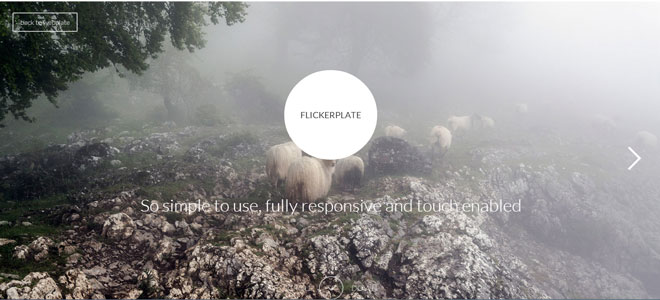
Flickerplate is a cool jQuery plugin that lets you flick through content. So simple to use, fully responsive and touch enabled and hard to believe that it's only 12kb in size
Source: getwebplate.com
1. INCLUDE CSS AND JS FILES
<!--Required javascript-->
<script src="js/min/jquery-v1.10.2.min.js"></script>
<script src="js/min/modernizr-custom-v2.7.1.min.js"></script>
<script src="js/min/jquery-finger-v0.1.0.min.js"></script>

<!--Flickerplate-->
<script src="js/min/flickerplate.min.js"></script>
<link href="css/flickerplate.css" rel="stylesheet" type="text/css">
2. HTML
<div class="flicker-example">
    <ul>
        <li>
            <div class="flick-title">Title 1</div>
            <div class="flick-sub-text">Description text 1</div>
        </li>
        <li>
            <div class="flick-title">Title 2</div>
            <div class="flick-sub-text">Description text 2</div>
        </li>
        <li>
            <div class="flick-title">Title 3</div>
            <div class="flick-sub-text">Description text 3</div>
        </li>
    </ul>
</div>
3. JAVASCRIPT
$('.flicker-example').flicker();
4. OPTIONS
Flickerplate is configurable through a variety of ways. You can either setup the options through the Javascript call or you can set the options via data attributes on the actual element. Some options can even be set globally and on each list item.
| Name | Default | JS | Data | Explanation |
|---|---|---|---|---|
| Arrows | true | arrows | arrows | Arrows are used to navigate back and forth between the flicks. |
| Arrows Constraint | false | arrows_constraint | arrows-constraint | When you get to the end of the flicks pressing the next arrow will navigate you to the beginning again should you have a false constraint. The same applies to the previous arrow. |
| Auto Flick | true | auto_flick | auto-flick | Sets the flick to run automatically. A manual flick resets the delay. |
| Auto Flick Delay | 10 | auto_flick_delay | auto-flick-delay | Set the delay (in seconds) between each auto flick. |
| Background Image | background | Set a background image for a particular list item. The image will cover the entire element and is set on a list item level only. | ||
| Block Text | true | block_text | block-text | Will class the title and sub text classes of each list item to show a background colour for easy reading. Can be applied to the containing class for a global effect or to each list item separately. |
| Dot Alignment | center | dot_alignment | dot-alignment | Set the horizontal alignment of the dots to either left, center or right. |
| Dot Navigation | true | dot_navigation | dot-navigation | Dot navigation is used to indicate and navigate between the flicks. |
| Flick Animation | transition-slide | flick_animation | flick-animation | Choose the animation type you want to use for each flick. The options are transition-slide, transform-slide, jquery-slide, scroller-slide. Transform is used on mobile devices by default. |
| Flick Position | 1 | flick_position | flick-position | Set the starting flick. |
| Theme | light | theme | theme | Currently two options, light and dark. This will set the font colour, block text colour, arrows and dots to either dark or light. Can be applied to the containing class for a global effect or to each list item seperately. |
5. EXAMPLES
JAVASCRIPT EXAMPLE
$(document).ready(function(){
    $('.flicker-example').flicker({
        arrows : true,
        arrows_constraint : false,
        auto_flick : true,
        auto_flick_delay : 10,
        block_text : true,
        dot_alignment : 'center',
        dot_navigation : true,
        flick_animation : 'transition-slide',
        flick_position : 1,
        theme : 'light'
    });
});
DATA ATTRIBUTE EXAMPLE
<div class="flicker-example" data-auto-flick-delay="6" data-dot-alignment="left" data-theme="light">
    <ul>
        <li data-block-text="false">
            <div class="flick-title">Title 1</div>
            <div class="flick-sub-text">Text line 1</div>
        </li>
        <li data-theme="dark">
            <div class="flick-title">Title 2</div>
            <div class="flick-sub-text">Text line 2</div>
        </li>
        <li data-background="images/some-background.png">
            <div class="flick-title">Title 3</div>
            <div class="flick-sub-text">Text line 3</div>
        </li>
    </ul>
</div>
 JS Tutorial


