- Overview
- Documents
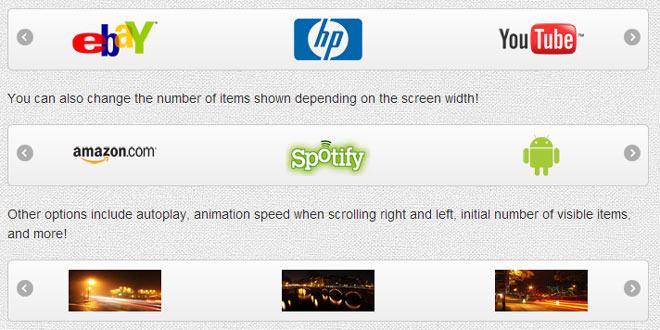
As long as there has been jQuery there have been image carousels created with jQuery. The famous jCarousel has been out since 2006, the same year the first version of jQuery was released. However, with the explosion of users now using their mobile devices for their internet browsing — on iPhones, iPads, and the like — it becomes necessary for jQuery plugins to support a good user experience on these devices. Enter Flexisel, the responsive image carousel with options specifically available for adapting the carousel for mobile and tablet devices.
All you have to do is call flexisel on your unordered list containing images. Call it on the $(window).load event (as opposed to the $(document).ready event) so that Flexisel can calculate the width of the images and figure out how to space them out properly. For example...
$(window).load(function() {
  $("#myCarousel").flexisel();
});
Below is how you'd call it passing in all the options....
$(window).load(function() {
  $("#myCarousel").flexisel({
    visibleItems: 4,
    animationSpeed: 200,
    autoPlay: false,
    autoPlaySpeed: 3000,
    pauseOnHover: true,
    clone:false,
    enableResponsiveBreakpoints: true,
    responsiveBreakpoints: {
      portrait: {
        changePoint:480,
        visibleItems: 1
      },
      landscape: {
        changePoint:640,
        visibleItems: 2
      },
      tablet: {
        changePoint:768,
        visibleItems: 3
      }
    }
  });
});
Options
Below is a listing of some basic options you can set...
| Option | Value | Default Value | Description | Example |
|---|---|---|---|---|
| visibleItems | Integer | 4 | Sets the initial number of visible items in the carousel | visibleItems: 5 |
| animationSpeed | Integer (in Milliseconds) | 200 | Sets the "speed" of the animation when the carousel navigates right or left. | animationSpeed: 1000 |
| autoPlay | Boolean | false | Sets whether or not the carousel automatically scrolls items on a timer | autoPlay: true |
| autoPlaySpeed | Integer (in milliseconds) | 3000 | Sets the interval by which items scroll when autoplaying. Note that the autoPlay value has to be set to true for this value to be applicable | autoPlaySpeed: 5000 |
| pauseOnHover | Boolean | true | Sets whether or not to pause the carousel on hover if playing. Note that the autoPlay value has to be set to true for this to be applicable | pauseOnHover: false |
| enableResponsiveBreakpoints | Boolean | false | Sets whether or not to enable responsive breakpoints | enableResponsiveBreakpoints: true |
| clone | Boolean | true | Clone the elements (carousel slider) | clone: false |
Responsive Breakpoints
This is an object that specifies responsive breakpoints. In order for this to be enabled the enableResponsiveBreakpoints setting must be set to true. You can name your objects whatever you want (the default names provided are "portrait," "landscape," and "tablet") and you can have as many or as few as you want (so you could add to or delete any of the defaults), but each one needs to have a "changePoint" and a "visibleItems" property. Those properties are required. The responsiveBreakpoints object sets the threshold of where the screen width falls below a certain width. So for example, the example default portrait responsive breakpoint will be applied to the carousel when the screen width is less than the changePoint value set for portrait. The number of items shown in this state will be whatever value is set for visibleItems. Usually, because the portrait responsive event is used to show portrait views on mobile phones, 1 is a good value to set here.
For example...
 responsiveBreakpoints: {
    portrait: {
      changePoint:480,
      visibleItems: 1
    },
    landscape: {
      changePoint:640,
      visibleItems: 2
    },
    tablet: {
      changePoint:768,
      visibleItems: 3
    }
}
The landscape responsive breakpoint will be applied when the screen width is greater than the width of the portrait changePoint value, but less that the width of the tablet changePoint value. Likewise, when the screen width falls below the tablet changePoint, the number of visibleItems set for the tablet event will be shown. And remember you can pass as many or as few of these as you like in and you can name them whatever you want. So, for example, if you wanted to just have things only show 1 item on all views below a certain width you could pass in something like the following...
 responsiveBreakpoints: {
    mobile: {
      changePoint:768,
      visibleItems: 1
    }
}
And then this will be the only point at which Flexisel changes.
 JS Tutorial


