- Overview
- Documents
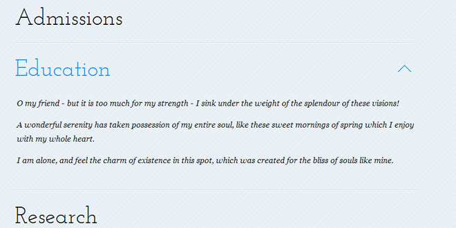
we'll be creating a simple responsive accordion that, when opened, will slide to the top of the viewport and reveal the content by fading it in. The idea is to avoid that the user has to scroll the content area into place. We'll also add some nice CSS3 transitions for the arrow to appear and to rotate when we click on an item. The accordion will be flexible, meaning that it will have a liquid width adjusting to the screen size.
THE MARKUP
The HTML structure will consist of a wrapper with the class and ID st-accordion and an unordered list. The list items will have a link element which will serve as the item title and a content area that is initially hidden. The span with the class st-arrow will be the little indicator on the right side that we will make appear when we hover over its parent, the link element.
<div id="st-accordion" class="st-accordion">
    <ul>
        <li>
            <a href="#">
                Item Title
                <span class="st-arrow">Open or Close</span>
            </a>
            <div class="st-content">
                <p>Some content</p>
            </div>
        </li>
        <li> ... </li>
    </ul>
</div>
Let’s take a look at the style.
THE CSS
First, we will style the main wrapper. We will give it a width of 100 because we want it to adjust to the width of its surrounding wrapper. If you don’t have one, just use a suitable percentage here (if you want it to be liquid). The surrounding wrapper in the demo has a maximal width of 800 pixels and a width of 90%.
The st-accordion will have a minimal width of 270 pixels:
.st-accordion{
    width:100%;
    min-width:270px;
    margin: 0 auto;
}
Assuming that we have some kind of reset css that will remove paddings and margins from unordered lists etc., we define the style for each list element. We’ll set an initial height of 100 pixels which is basically the height of the link element and the overflow will be hidden, so we won’t see the content. When we open the item, we’ll animate its height in order to reveal the content. The borders that we are giving to the element will create a nice engraved separation between the items.
.st-accordion ul li{
    height: 100px;
    border-bottom: 1px solid #c7deef;
    border-top:1px solid #fff;
    overflow: hidden;
}
The first item should not have a top border:
|
1
2
3
|
.st-accordion ul li:first-child{
border-top:none;
}
|
We’ll add a color transition to the link element which will create a nice effect on hover. The line-height should be the same like the initial height of the list element:
.st-accordion ul li > a{
    font-family: 'Josefin Slab',Georgia, serif;
    text-shadow: 1px 1px 1px #fff;
    font-size: 46px;
    display: block;
    position: relative;
    line-height: 100px;
    outline:none;
    -webkit-transition:  color 0.2s ease-in-out;
    -moz-transition:  color 0.2s ease-in-out;
    -o-transition:  color 0.2s ease-in-out;
    -ms-transition:  color 0.2s ease-in-out;
    transition:  color 0.2s ease-in-out;
}
.st-accordion ul li > a:hover{
    color: #1693eb;
}
The span for the arrow will be positioned absolutely and we’ll hide it by setting it outside of the link element and giving it an opacity of 0. The transition will be the item moving from the right and fading in:
.st-accordion ul li > a span{
    background: transparent url(../images/down.png) no-repeat center center;
    text-indent:-9000px;
    width: 26px;
    height: 14px;
    position: absolute;
    top: 50%;
    right: -26px;
    margin-top: -7px;
    opacity:0;
    -webkit-transition:  all 0.2s ease-in-out;
    -moz-transition:  all 0.2s ease-in-out;
    -o-transition:  all 0.2s ease-in-out;
    -ms-transition:  all 0.2s ease-in-out;
    transition:  all 0.2s ease-in-out;
}
.st-accordion ul li > a:hover span{
    opacity:1;
    right: 10px;
}
When we open an item, we will give it the class st-open and the link element will stay with the hover color. The span will be rotated to that the arrow stays pointing up and in sight:
.st-accordion ul li.st-open > a{
    color: #1693eb;
}
.st-accordion ul li.st-open > a span{
    -webkit-transform:rotate(180deg);
    -moz-transform:rotate(180deg);
    transform:rotate(180deg);
    right:10px;
    opacity:1;
}
Let’s style the content and its elements:
.st-content{
    padding: 5px 0px 30px 0px;
}
.st-content p{
    font-size:  16px;
    font-family:  Georgia, serif;
    font-style: italic;
    line-height:  28px;
    padding: 0px 4px 15px 4px;
}
.st-content img{
    width:125px;
    border-right:1px solid #fff;
    border-bottom:1px solid #fff;
}
With a media query we will make sure that the font size of the item title will be smaller:
@media screen and (max-width: 320px){
    .st-accordion ul li > a{
        font-size:36px;
    }
}
And that’s all the style! Let’s move on to the JavaScript.
THE JAVASCRIPT
Let’s look at the most important parts of this plugin. We’ll start by the default options:
$.Accordion.defaults        = {
    // index of opened item. -1 means all are closed by default.
    open            : -1,
    // if set to true, only one item can be opened.
    // Once one item is opened, any other that is
    // opened will be closed first
    oneOpenedItem   : false,
    // speed of the open / close item animation
    speed           : 600,
    // easing of the open / close item animation
    easing          : 'easeInOutExpo',
    // speed of the scroll to action animation
    scrollSpeed     : 900,
    // easing of the scroll to action animation
    scrollEasing    : 'easeInOutExpo'
};
We initialize our plugin by calling the init function:
_init               : function( options ) {

        this.options        = $.extend( true, {}, $.Accordion.defaults, options );

        // validate options
        this._validate();

        // current is the index of the opened item
        this.current        = this.options.open;

        // hide the contents so we can fade it in afterwards
        this.$items.find('div.st-content').hide();

        // save original height and top of each item
        this._saveDimValues();

        // if we want a default opened item...
        if( this.current != -1 )
            this._toggleItem( this.$items.eq( this.current ) );

        // initialize the events
        this._initEvents();

    },
The _saveDimValues function saves the original height and top of an item so that we know where we have to scroll when we open an item.
If we’ve set an item to be opened by default, we will call _toggleItem.
Then we initialize the events.
The _toggleItem function takes care of the two cases when clicking an item. Either we have the item already open, i.e. it has the class st-open, or it is closed. If it’s open, we’ll set the current to -1 and fade out the content while setting the item’s height to its original one. If the item we are clicking is closed, we’ll set the index of that item to be the current one, animate the height to fit the content and fade in the content. Then we scroll the window to the point that the clicked item stays at the top by calling the _scrollfunction:
_toggleItem         : function( $item ) {

    var $content = $item.find('div.st-content');

    ( $item.hasClass( 'st-open' ) )

        ? ( this.current = -1, $content.stop(true, true).fadeOut( this.options.speed ), $item.removeClass( 'st-open' ).stop().animate({
            height  : $item.data( 'originalHeight' )
        }, this.options.speed, this.options.easing ) )

        : ( this.current = $item.index(), $content.stop(true, true).fadeIn( this.options.speed ), $item.addClass( 'st-open' ).stop().animate({
            height  : $item.data( 'originalHeight' ) + $content.outerHeight( true )
        }, this.options.speed, this.options.easing ), this._scroll( this ) )

},
In the _initEvents function we initialize two events, clicking on an item and the window resize. When we click on an item we either open or close it calling the _toggleItem function and if we’ve set the optiononeOpenedItem to true, we first close any opened item before opening the current one.
When the window gets resized we need to reset the original item values and the content’s height. We’ll also want to scroll the item to the top again.
_initEvents         : function() {

    var instance    = this;

    // open / close item
    this.$items.find('a:first').bind('click.accordion', function( event ) {

        var $item           = $(this).parent();

        // close any opened item if oneOpenedItem is true
        if( instance.options.oneOpenedItem && instance._isOpened() && instance.current!== $item.index() ) {

            instance._toggleItem( instance.$items.eq( instance.current ) );

        }

        // open / close item
        instance._toggleItem( $item );

        return false;

    });

    $(window).bind('smartresize.accordion', function( event ) {

        // reset original item values
        instance._saveDimValues();

        // reset the content's height of any item that is currently opened
        instance.$el.find('li.st-open').each( function() {

            var $this   = $(this);
            $this.css( 'height', $this.data( 'originalHeight' ) + $this.find('div.st-content').outerHeight( true ) );

        });

        // scroll to current
        if( instance._isOpened() )
        instance._scroll();

    });

},
These were the most important functions for this accordion.
I hope you like this simple accordion and find it useful!
 JS Tutorial


