- Overview
- Documents
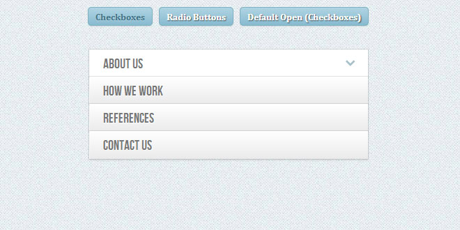
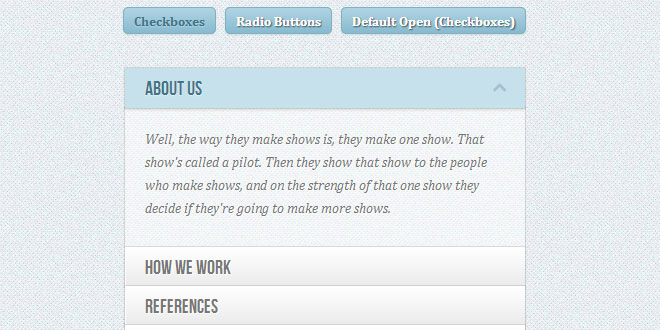
Today we’ll experiment some more with the adjacent and general sibling combinator and the :checked pseudo-class. Using hidden inputs and labels, we will create an accordion that will animate the content areas on opening and closing.
There are many variations of CSS-only accordions around, most of which are implemented using the target pseudo-class. The problem with using target is that we can’t really close the content areas again or have multiple sections open at the same time. By using hidden checkboxes, we can control the opening and closing. Alternatively, we can also use radio buttons if only one section should be open at a time.
HE MARKUP
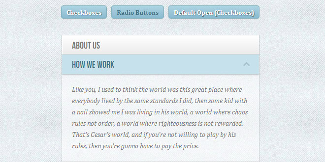
We will be going through an example that uses checkboxes where one content section is open by default (the input needs to be ‘checked’). Everything will be wrapped in a container with the class ac-container. For each item, we will have a checkbox, a label and an article which is the content section of that item:
<section class="ac-container">
    <div>
        <input id="ac-1" name="accordion-1" type="checkbox" />
        <label for="ac-1">About us</label>
        <article class="ac-small">
            <p>Some content... </p>
        </article>
    </div>
    <div>
        <input id="ac-2" name="accordion-1" type="checkbox" checked />
        <label for="ac-2">How we work</label>
        <article class="ac-medium">
            <p>Some content... </p>
        </article>
    </div>
    <div><!--...--></div>
</section>
Note that we need to give each input an ID which we will then use in the for attribute of the label. We need this in order to check the checkbox when clicking on the label.
Each article will have a class that will help us determine to which height we it to expand to. (Optimally, we could use ‘auto’ as the expanded height value, but unfortunately it will not animate like that.)
Let’s have a look at the style.
THE CSS
I will omit all the vendor prefixes, but you will, of course, find them in the files.
Let’s define a width for the accordion and center it:
.ac-container{
    width: 400px;
    margin: 10px auto 30px auto;
}
Next, we’ll make the labels appear as clickable buttons by giving them some slick background gradient. With multiple box shadows, we’ll create a subtle border and an inset effect. We’ll also set the z-index to 20, to make sure it will be on top of the content section:
.ac-container label{
    font-family: 'BebasNeueRegular', 'Arial Narrow', Arial, sans-serif;
    padding: 5px 20px;
    position: relative;
    z-index: 20;
    display: block;
    height: 30px;
    cursor: pointer;
    color: #777;
    text-shadow: 1px 1px 1px rgba(255,255,255,0.8);
    line-height: 33px;
    font-size: 19px;
    background: linear-gradient(top, #ffffff 1%,#eaeaea 100%);
    box-shadow:
        0px 0px 0px 1px rgba(155,155,155,0.3),
        1px 0px 0px 0px rgba(255,255,255,0.9) inset,
        0px 2px 2px rgba(0,0,0,0.1);
}
On hover, we’ll make the label white:
.ac-container label:hover{
    background: #fff;
}
When we click on a label, the checkbox get’s checked and when that happens we want the respective label to have the following “selected” style:
.ac-container input:checked + label,
.ac-container input:checked + label:hover{
    background: #c6e1ec;
    color: #3d7489;
    text-shadow: 0px 1px 1px rgba(255,255,255, 0.6);
    box-shadow:
        0px 0px 0px 1px rgba(155,155,155,0.3),
        0px 2px 2px rgba(0,0,0,0.1);
}
As you can see, we are using the adjacent sibling combinator to select the label since it is directly preceded by the checkbox input.
Let’s add a little arrow icon on hover. For that we’ll simply use the pseudo-class “after” so that we don’t add unecessary markup:
.ac-container label:hover:after,
.ac-container input:checked + label:hover:after{
    content: '';
    position: absolute;
    width: 24px;
    height: 24px;
    right: 13px;
    top: 7px;
    background: transparent url(../images/arrow_down.png) no-repeat center center;
}
For the “selected” item, we want to show the up-pointing arrow:
.ac-container input:checked + label:hover:after{
    background-image: url(../images/arrow_up.png);
}
And since we don’t want the inputs to show, we’ll hide them:
.ac-container input{
    display: none;
}
The content area will have an initial height of 0px and any overflow will be hidden. We’ll add a transition for the height and for the box shadow. The transition that we are adding here will act upon “closing” the item. We define another transition for the selected item. So, we can basically control the two behaviors by doing this. As you can see, we will make the closing a bit faster than the opening.
.ac-container article{
    background: rgba(255, 255, 255, 0.5);
    margin-top: -1px;
    overflow: hidden;
    height: 0px;
    position: relative;
    z-index: 10;
    transition:
        height 0.3s ease-in-out,
        box-shadow 0.6s linear;
}
.ac-container input:checked ~ article{
    transition:
        height 0.5s ease-in-out,
        box-shadow 0.1s linear;
    box-shadow: 0px 0px 0px 1px rgba(155,155,155,0.3);
}
Let’s style the content a bit:
.ac-container article p{
    font-style: italic;
    color: #777;
    line-height: 23px;
    font-size: 14px;
    padding: 20px;
    text-shadow: 1px 1px 1px rgba(255,255,255,0.8);
}
Now we define the three classes for the different heights. These are the heights that an item’s content will animate to:
.ac-container input:checked ~ article.ac-small{
    height: 140px;
}
.ac-container input:checked ~ article.ac-medium{
    height: 180px;
}
.ac-container input:checked ~ article.ac-large{
    height: 230px;
}
As already mentioned, “auto” height would of course be the best option here, but since we can’t animate to that, we need to set some heights for the transition.
Please note that in some mobile browsers, clicking on a label might not trigger the checking or focusing of the associated input.
 JS Tutorial
