- Overview
- Documents
Excolo Slider
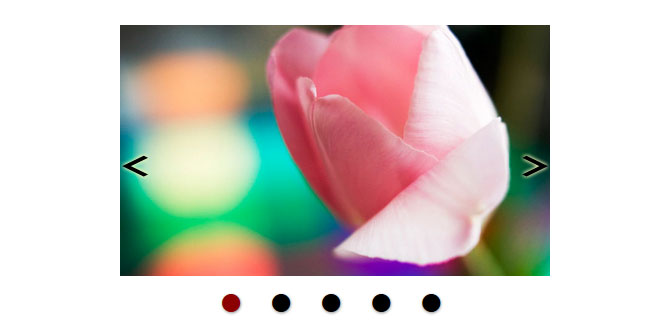
A simple jquery sliding plugin, supporting responsive design and touch.
Under development. I'll post future features and enhancements, in the issue tracker.
Should you find bugs or want to suggest a feature, feel free to post it in an issue on the GitHub project page. :-)
Features:
- AutoPlay Slideshow
- Mouse slide navigation
- Prev/next button navigation
- HTML5 data-attribute captions
- Pagination
- Repeat when last slide is reached
- Play the slideshow backwards
- Auto adjust size initially and on browser resize, for responsive designs
- Touch enabled (limited to a few browsers)
- Can be molded into beauty using CSS
Most of these features can be configured and turned off, when setting up the slider.
Installation
First you download the plugin by following one of the links in the sidebar, or by visiting Excolo-Slider on Github.
Another option is to install our NuGet package using this command:
|
1
|
PM> Install-Package Excolo-Slider
|
If you didn't use NuGet you'll have to insert the plugin files in the folders of your choice on your server. The files you'll need to insert is:
query-1.9.1.min.js
jquery.excoloSlider.min.js
jquery.excoloSlider.css
These can be inserted in whatever folder you wish.
If you use the previous/next navigation or pagination, you should also insert the image files:
|
1
2
3
|
prev.png
next.png
pagericon.png
|
The plugin looks for these images in the folder called Images relative to the page where the plugin is used. The name and location of these image files can be changed using the plugin options presented further down this page, under Configuration.
In the header of your website, you insert the references to jquery and the slider plugin:
<script src="javascripts/jquery-1.9.1.min.js"></script>
<script src="javascripts/jquery.excoloSlider.min.js"></script>
<link href="stylesheets/jquery.excoloSlider.css" rel="stylesheet">
Here I've placed the files in the javascripts and stylesheets folder, but you can just reference using the folder you chose to insert the files into. If you used NuGet, the javascript files are placed in the folder Scripts, the stylesheet is placed in the folder Content and the images is placed in the folder Images.
The HTML code for the slides is simply a div container, with any child objects being the slides:
<div id="slider">
    <img src="images/image1.jpg">
    <img src="images/image2.jpg">
    <img src="images/image3.jpg">
    <img src="images/image4.jpg" data-plugin-slide-caption="I am a caption <b>and I can contain HTML.</b>">
    <img src="images/image5.jpg">
    <img src="images/image6.jpg">
    <img src="images/image7.jpg">
    <img src="images/image8.jpg">
</div>
Notice how you can use the HTML5 data-attribute data-plugin-slide-caption to create a caption text for each slide. These captions allow HTML and can be fully styled using css
Then to initialize the slider plugin with default settings you insert the script:
$(function () {
    $("#slider").excoloSlider();
});
...and that's about all there is to it.
In the next section you can see how to configure the slider to your needs.
Configuration
You have a few options when configuring your slider.
One option is to provide the settings as a parameter when initializing the slider:
$(function () {
    $("#slider").excoloSlider({
        mouseNav: false,
        interval: 5000, // = 5 seconds
        playReverse: true
    });
});
Another option is to provide the settings using the data attribute in the slide container:
$(function () {
    $("#slider").excoloSlider();
});
<div id="slider" data-plugin-options="{ "mouseNav":false,
                                        "interval":"5000",
                                        "playReverse":true}">
    <img src="images/image1.jpg">
    <img src="images/image2.jpg">
    <img src="images/image3.jpg">
    ...
</div>
Options
| Option: | Default: | Description: |
|---|---|---|
| width | 800 | The width of the slider. If autoSize is set to true, then the width is used to calculate the width/height ratio. |
| height | 530 | The height of the slider. If autoSize is set to true, then the height is used to calculate the width/height ratio. |
| autoSize | true | When set to true, the slider expands to fill it's container, and resizes if the container changes resize - e.g. if the windows is resized or the slider is shown on a smaller screen (e.g. a mobile device). Turning this option off, will remove the responsiveness of the slider. |
| touchNav | true | Enables you to turn off or on, the touch navigation events. Some touch devices uses mouse events for touch gestures, so turning touchNav off might not disable touch on all devices. See option mouseNav, to solve this. |
| mouseNav | true | Enables you to turn off or on, the mouse navigation, disabling sliding when dragging the slider left or right. Some touch devices uses mouse events for touch gestures, so turning this off might disable touch on some devices as well. |
| prevnextNav | true | Enables you to turn off or on the previous/next button navigation. When on, the plugin generates the necessary html within the slider object. |
| prevnextAutoHide | true | Decides whether the previous/next buttons should hide whenever the mouse pointer leaves the slider area. It is recommended to turn this off for touch devices (this might be done automatically in a future version). |
| pagerNav | true | Enables you to turn off or on, the slide pagination. When turned on, the plugin generates a list where each element corresponds to a slide and by clicking an element, the associated slide is shown. |
| startSlide | 1 | Defines which slide to start with when the slider is initialized. If playReverse is true and startSlide is 1, then the slider starts with the last slide instead of the first. |
| autoPlay | true | If set to true the slider automatically starts playing the slideshow when initialized, by cycling the slides. |
| delay | 0 | Defines the delay in milliseconds (1000ms = 1 second) before the sliders starts cycling when the slideshow starts playing. |
| interval | 3000 | Defines the time in milliseconds (1000ms = 1 second) between each slide action when the slideshow is playing. |
| repeat | true | When set to true the slider continues with the first slide, once the last slide is reached when the slideshow is playing. |
| playReverse | false | When set to true the slider will slide in the opposite direction when the slideshow is playing. |
| hoverPause | true | If to true the slidshow will pause playing, when hovering the mouse over the slider. |
| captionAutoHide | false | Decides whether the HTML5 caption text should hide whenever the mouse pointer leaves the slider area. The effect is similar to the prev/next navigation autohide and they will show/hide simultaniously on hover. |
| animationCssTransitions | true | Defines whether to use CSS3 transitions rather than jquery animations when transitioning slides. CSS3 transitions are recommended, as they usually perform much smoother. |
| animationDuration | 500 | Defines the time in milliseconds (1000ms = 1 second) that it takes the animation to finish a transition. By lowering this the slide will appear to slide faster. This should not be larger than the interval and preferably not higher than 2000ms, unless you have a lot of slides. Higher values might introduce flickering if interval is number of slides is low. |
| animationTimingFunction | "linear" | Defines the CSS3 transition animation timing function. This change the appearance of the animation, e.g. the slide could be made to move slower towards the end of the animation. |
| prevButtonClass | "slide-prev" | Defines the CSS class for the previous button, used for styling the navigation button. |
| nextButtonClass | "slide-next" | Defines the CSS class for the next button, used for styling the navigation button. |
| prevButtonImage | "images/prev.png" | The relative path to the previous button icon. |
| nextButtonImage | "images/next.png" | The relative path to the next button icon. |
| activeSlideClass | "es-active" | Defines the CSS class of the slide currently active. |
| slideCaptionClass | "es-caption" | Defines the CSS class of the caption div element used for caption text within a slide. |
| pagerClass | "es-pager" | Defines the CSS class of the pagination ul element used for containing the page/slide links. |
| pagerImage | "Images/pagericon.png" | The relative path to the image used for the pager bullets. The default image is of size 16x32px and contains both the standard bullet and the hover/active bullet. The hover and active bullet effect is done by changing background location. |
 JS Tutorial


