- Overview
- Documents
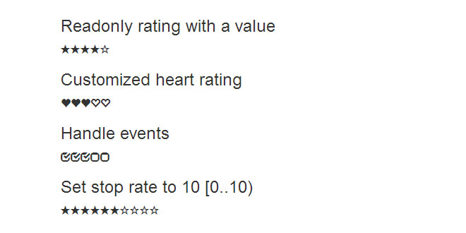
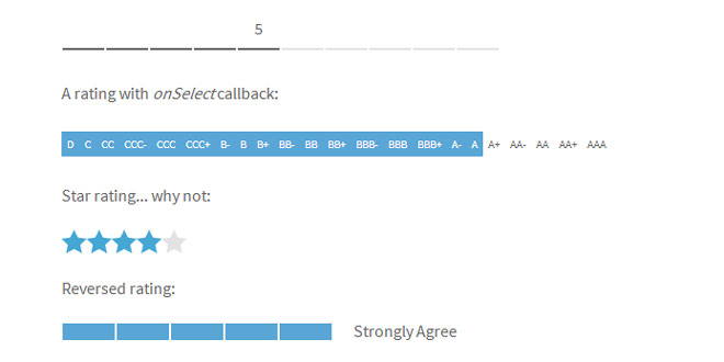
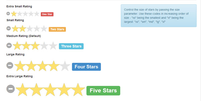
Bootstrap Rating is a jQuery plugin that creates a rating control that uses Bootstrap glyphicons for rating symbols.
buyutucu pompa Spanish Fly
Source: github.com
1. INCLUDE CSS AND JS FILES
<link href="dist/css/bootstrap.css" rel="stylesheet">
<script type="text/javascript" src="dist/js/jquery-1.10.2.js"></script>
<script type="text/javascript" src="bootstrap-rating.js"></script>
2. HTML
<input type="hidden" class="rating"/>
3. JAVASCRIPT
$('input').rating();
4. ADVANCED
Behind the rating control
Bootstrap Rating uses an input to keep the rating value. But the relationship between the behind the scenes input control and the rating control goes a little further. This input is the associated control. They are tied together.
You can disable the rating control simply disabling its associated input control:
<input type="hidden" class="rating" disabled="disabled"/>
Make it read only:
<input type="hidden" class="rating" readonly="readonly"/>
Set its initial value:
<input type="hidden" class="rating" value="2"/>
Or attach events:
$('input').on('change', function () {
  alert('Rating: ' + $(this).val());
});
The default rating symbols can be replaced with another ones. Just add the desired glyphicon for the filled and empty states:
<input type="hidden" class="rating" data-filled="glyphicon glyphicon-heart" data-empty="glyphicon glyphicon-heart-empty"/>
Again, you can explicitly initialize the plugin passing the glyphicons as parameters:
$('input').rating({
  filled: 'glyphicon glyphicon-heart',
  empty: 'glyphicon glyphicon-heart-empty'
});
If you want to change the default glyphicons for all the rating controls, you only need to override the plugin default values:
$.fn.rating.defaults.filled = 'glyphicon glyphicon-heart';
$.fn.rating.defaults.empty = 'glyphicon glyphicon-heart-empty';
This needs only be called once, but remember to make these assignments before the rating controls are created.
Though this control idea is to use glyphicons provided by Bootstrap, any custom symbol can be used. Even not font based ones:
.symbol {
  display: inline-block;
  border-radius: 50%;
  border: 5px double white;
  width: 30px;
  height: 30px;
}

.symbol-empty {
  background-color: #ccc;
}

.symbol-filled {
  background-color: black;
}

<input type="hidden" class="rating" data-filled="symbol symbol-filled" data-empty="symbol symbol-empty"/>
It means that the rating control is not tightly tied to Bootstrap and you can use it without Bootstrap.
The default range is [0..5), or in plain text, starting at 0 and stopping before 5.
It can be overriden by means of two data attributes, data-start for the start rate value and data-stop for the stop/end one. If you want to define a range [1..10):
<input type="hidden" class="rating" data-start="1" data-stop="10"/>
Also you can explicitly initialize the plugin passing the start and stop values as parameters:
$('input').rating({
  start: 1,
  stop: 10
});
If what you need is to change the default start and stop values for all the rating controls, just override the plugin defaults:
$.fn.rating.defaults.start = 1;
$.fn.rating.defaults.stop = 10;
The rating range spans all the integers from start to stop, incremented or decremented by a step. The default step is 1.
Use data-step attribute to change the stepping:
<input type="hidden" class="rating" data-stop="10" data-step="2"/>
Or the explicit initialization:
$('input').rating({
  stop: 10,
  step: 2
});
Also, as usual, you can change the default step globally:
$.fn.rating.defaults.step = 2
My Python background wouldn't forgive me not supporting negative stepping:
<input type="hidden" class="rating" data-stop="-10" data-step="-2"/>
 JS Tutorial


