- Overview
- Documents
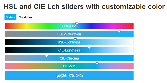
Bootstrap Color Picker Sliders is a Bootstrap 3 optimized advanced responsive color selector with color swatches and support for human perceived lightness. Works in all modern browsers and on touch devices. Bootstrap 3 optimized responsive color selector with HSV, HSL, RGB and CIE-Lch selectors and color swatches.
Source: virtuosoft.eu
1. INCLUDE CSS AND JS FILES
<link href="//cdnjs.cloudflare.com/ajax/libs/twitter-bootstrap/3.2.0/css/bootstrap.min.css" rel="stylesheet" type="text/css" media="all">
<link href="//cdnjs.cloudflare.com/ajax/libs/prettify/r298/prettify.min.css" rel="stylesheet" type="text/css" media="all">
<link href="src/bootstrap.colorpickersliders.css" rel="stylesheet" type="text/css" media="all">

<script src="//cdnjs.cloudflare.com/ajax/libs/jquery/1.11.1/jquery.min.js"></script>
<script src="//cdnjs.cloudflare.com/ajax/libs/twitter-bootstrap/3.2.0/js/bootstrap.min.js"></script>
<script src="//cdnjs.cloudflare.com/ajax/libs/prettify/r298/run_prettify.min.js"></script>
<script src="//cdnjs.cloudflare.com/ajax/libs/tinycolor/0.11.1/tinycolor.min.js"></script>
<script src="src/bootstrap.colorpickersliders.js"></script>
2. HTML
<div id="hsvflat"></div>
3. JAVASCRIPT
 $("#hsvflat").ColorPickerSliders({
        color: "rgb(36, 170, 242)",
        flat: true,
        sliders: false,
        swatches: false,
        hsvpanel: true
});
4. OPTIONS
| OPTION | DESCRIPTION |
|---|---|
| color | This is the initial color if there is no valid (any CSS formatted) color value on the connected input element. Can be in any format that Tiny Color supports. |
| size |
'sm': Small sized popover. 'default': Default popover size. 'large': Large popover. |
| placement |
Popover placement direction. Can be 'auto' | 'top' | 'left' | 'bottom' | 'right'. When 'auto' is specified, it will dynamically reorient the popover. For example, if placement is 'auto left', the tooltip will display to the left when possible, otherwise it will display right. |
| preventtouchkeyboardonshow | true: Makes the input readonly to prevent touch keyboard to show up on focus, needs a second click to become editable. |
| title | '': Popover title. |
| hsvpanel | false: Enable/disable HSV color selector panel. |
| sliders | true: Enable/disable the sliders. |
| grouping | true: Enable/disable grouping of the HSV panel, Sliders and Swatches section. |
| trigger |
'focus': The popover will be visible on focus or on click. 'manual': No auto trigger of popover on focus/click. Must trigger colorpickersliders.show andcolorpickersliders.hide events to show/hide the popover. |
| flat |
false: The color picker is rendered in a popup, which is shown on focus of the connected element. true: The color picker is rendered right after the connected element, and is always visible. |
| previewformat | This is the color format on the preview slider (if visible). Can be rgb, hsl or hex. Note that hex format can not represent the opacity value. |
| swatches |
array: Array of CSS colors (can be CSS color names as well). false: The swatches are disabled. |
| customswatches |
string: Name of the custom swatches group. Color pickers with the same customswatches name share the same swatch colors, so if you add a new color to one of the color pickers, then all the color pickers swatches will be updated on the page which has the same customswatches name. false: The custom swatches are disabled, so only the predefined swatches can be used. |
| connectedinput | selector or jQuery object: The connected input elements value will be automatically updated in sync with the color picker. The color format which the color is represented i the input can be set via the data-color-format property. It can be any of hex, hsl or rgb. If it is hex, then the opacity will be discarded. |
| updateinterval | Update interval of the sliders while dragging (ms). The default is 30. |
| previewontriggerelement |
true: Preview of the color on the connected element's background. false: No preview on the connected element. |
| previewcontrasttreshold | 30: If previewontriggerelement is enabled, then if the lightness is below of this value, the element's text color will be white. Otherwise the text is black. |
| erroneousciecolormarkers |
true: Unconvertable CIE colors are marked with an exclamation mark on the CIE sliders level marker. false: No exclamation mark on the markers. |
| invalidcolorsopacity | 1: Opacity of the invalid (unconvertable) area of the CIE sliders. |
| finercierangeedges |
true: Sharper, more accurate edges of the valid CIE ranges on the sliders. false: Smoother edges of the valid CIE ranges on the sliders. |
| order |
An object which defines which sliders appear and in which order. Possible properties: opacity, hsl, rgb, cie, preview. |
| labels |
An object which defines the labels of the sliders. rgbgreen, rgbblue, cielightness, ciechroma, ciehue, opacity, preview. |
| onchange | function(container, color): This function is triggered when the color is changed with the sliders or via a connected input. The color parameter holds the actual color object in the following formats: rgb object, hsl object, cie lch object, Tiny Color object. |
| titleswatchesadd | string: Title of the add color to swatches button. |
| titleswatchesreset | string: Title of the reset swatches button. |
5. EVENTS
Example usage: $("#colorpicker").trigger("colorpickersliders.updateColor", "red"));
The following events can be triggered on the element which the color picker is initialized on.
| EVENT | DESCRIPTION |
|---|---|
| colorpickersliders.updateColor | function(newcolor): Sets a new color for the color picker. |
| colorpickersliders.show | function(): Shows the popover. |
| colorpickersliders.hide | function(): Hiddens the popover. |
 JS Tutorial


