- Overview
- Documents
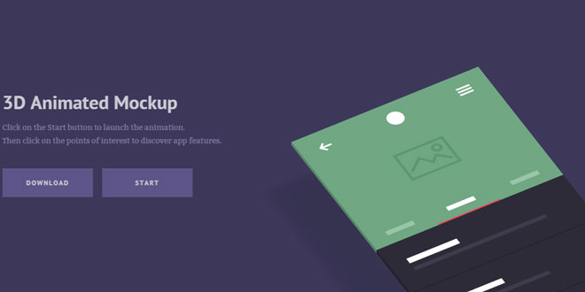
3D Animated Mockup is a simple template to showcase your application features through a smooth 3d animation, powered by CSS and jQuery.
With CSS 3D transformations supported by most modern browsers nowadays, we can enrich our web projects with powerful animations, and be confident most users will enjoy the full experience. Today’s template is just an example of how to turn a flat app screen into a 3D mockup, and animate it. We also integrated a popular resource, Points of Interest.
-
sex shop
sex shop
sex shop
sex shop
sex shop
seks shop
spanish fly
psikolog
sohbet numara
sohbet hatti
Source: codyhouse.co
1. HTML
The HTML is structured in 2 main <div> elements (.cd-product-intro and .cd-product-mockup) – the first containing the product intro (title, action buttons..) and the second the mockup (and the points of interest) – wrapped inside a section.cd-product.
<section class="cd-product">
    <div class="cd-product-intro">
        <h1><!-- Product name --></h1>
        <p><!-- Product description --></p>
        <div class="cd-triggers">
            <a href="#0" class="cd-btn">Download</a>
            <a href="#cd-product-tour" id="cd-start" class="cd-btn">Start</a>
        </div>
    </div> <!-- cd-product-intro -->

    <div id="cd-product-tour" class="cd-product-mockup">
        <img src="img/cd-app-image.png" alt="Preview image"> <!-- mockup image -->
        <ul class="cd-points-container">

            <li class="cd-single-point">
                <a class="cd-img-replace" href="#0">More info</a>
                <div class="cd-more-info cd-left">
                    <h2><!-- Point of interest title --></h2>
                    <p><!-- Point of interest description --></p>
                    <a href="#0" class="cd-close-info cd-img-replace">Close</a>
                </div>
            </li> <!-- .cd-single-point -->

            <!-- other points of interest here -->

        </ul> <!-- .cd-points-container -->

        <div class="cd-3d-right-side"></div>
        <div class="cd-3d-bottom-side"></div>

    </div> <!-- .cd-product-mockup -->
</section> <!-- .cd-product -->
Two additional <div> elements (.cd-3d-right-side and the .cd-3d-bottom-side) have been used to create the 3d sides of the mockup, while the .cd-product-mockup::before pseudo-element has been used to create the shadow.
2. CSS
On small devices the CSS is pretty straightforward (you can give a look at the code for more details/comments).
On desktop devices (viewport width more than 1170px) we assigned a position: absolute and width: 50% to the .cd-product-intro and set left: 0 in order to place it on the left side of the screen.
One note: we have been using the .cd-product-intro::before pseudo-element in order to detect the current CSS Media Query in jQuery: the trick is done assigning different content values at different CSS Media Queries
.cd-product-intro::before {
  /* never visible - this is used in jQuery to check the current MQ */
  content: 'mobile';
  display: none;
}
@media only screen and (min-width: 1170px) {
  .cd-product-intro {
    position: absolute;
    left: 0;
    width: 50%;
    padding: 0;
    text-align: left;
    transition: transform 0.6s, opacity 0.6s;
  }
  .cd-product-intro::before {
    /* never visible - this is used in jQuery to check the current MQ */
    content: 'desktop';
  }
}
For the .cd-product-mockup, we set width: 450px and margin: 0 auto to put it in the centre of its container .cd-product, then rotated it using CSS 3D transformations:
.cd-product-mockup {
  width: 90%;
  /* set here the max-width for the mockup */
  max-width: 450px;
  margin: 0 auto;
}
@media only screen and (min-width: 1170px) {
  .cd-product-mockup {
    transform-style: preserve-3d;
    transform-origin: center top;
    transform: rotateX(-60deg) rotateZ(-40deg) translateX(50px) translateY(300px);
    transition: transform 0.6s;
  }
}
The transform-style: preserve-3d assures that also .cd-3d-right-side and .cd-3d-bottom-side are positioned in the 3D-space (and not flattened in the plane, as it is by default).
In order to create the 3D sides effect, we set the mockup image as backgorund-image for both .cd-3d-right-side and .cd-3d-bottom-side, and assigned them an additional CSS rotation (rotateX or rotateY according to the side):
@media only screen and (min-width: 1170px) {
  .cd-3d-right-side, .cd-3d-bottom-side {
    display: block;
    position: absolute;
    left: 0;
    background-image: url(../img/cd-app-image.png);
    /* Firefox bug - 3D CSS transform, jagged edges */
    outline: 1px solid transparent;
  }
  .cd-3d-right-side {
    top: -1px;
    width: 10px;
    height: 100%;
    background-size: auto 100%;
    transform-origin: left center;
    transform: translateZ(-1px) translateY(1px) rotateY(-90deg);
  }
  .cd-3d-bottom-side {
    bottom: 0;
    width: 100%;
    height: 10px;
    background-position: bottom center;
    background-size: 100% auto;
    transform-origin: center bottom;
    transform: translateZ(-1px) rotateX(-90deg);
  }
}
For the mockup shadow, we used the .cd-product-mockup::before pseudo-element. We started applying the blur() filter to it; this CSS property is not supported in Firefox 33 (and below) and in Internet Explorer 11 (and below). While this can be fixed in Firefox using an SVG filter, there’s not an easy fix for IE. So we abandoned the blur() property and came out with a trick based on the box-shadow: we assigned a width: 0 and played with the blur radius and the spread radius to achieve a realistic effect.
@media only screen and (min-width: 1170px) {
  .cd-product-mockup::before {
    /* mockup shadow */
    display: block;
    content: '';
    position: absolute;
    top: 0;
    left: 0;
    width: 0;
    /* play with these values to create a realistic shadow */
    height: 45%;
    box-shadow: 0px 0px 30px 225px rgba(0, 0, 0, 0.1);
    transform: translateZ(-100px) translateY(480px);

    transition: transform 0.6s;
  }
}
One note: since in IE11 (and below) the transform-style: preserve-3d is not supported, you won’t see the 3D sides of of the mockup.
When user clicks the Start button, we add the .is-product-tour class to the .cd-product element: a translateX(-50%) is assigned to the .cd-product-intro and a translateX(0) to the .cd-product-tour. CSS3 transitions to the transform and opacity values have been added in order to achieve the smooth animation.
3. EVENTS HANDLING
We used jQuery to add/remove classes (.is-product-tour class to the .cd-product when user clicks the start button, .is-open class to the .cd-single-point to show/hide point of interest).
 JS Tutorial


