- Overview
- Documents
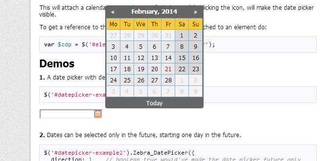
Zebra_Datepicker is a small, compact and highly configurable datepicker jQuery plugin, meant to enrich forms by adding the datepicker functionality to them. This jQuery plugin will automatically add a calendar icon to the indicated input fields which, when clicked, will open the attached datepicker. Users can easily jump between months and years due to the datepicker’s intuitive interface. The selected date will be entered in the input field using the date format of choice, configurable in the datepicker’s options.
Features:
- it is small – it weights around 21KB minified
- it’s compact – unlike other datepickers, this datepicker is one-file only
- it’s cross-browser – works in every major browser; works also in Internet Explorer 6 where it uses an iFrameShim to stay above select controls
- has a default color scheme that blends-in well with almost any design, and it’s easily customizable through the well-organized CSS file; two additional themese are included, one of them being for use with Twitter Bootstrap
- offers an intuitive interface fast and easy navigation through months and years
- offers an intuitive mechanism for disabling dates and date ranges using a syntax similar to cron‘s syntax
- supports defining of custom weekend days for countries that don’t have the weekend on Saturday and Sunday
- supports most of date formats you can think of, borrowing the syntax of PHP’s date function
- supports all sorts of combinations for starting and ending dates
- date pickers can be “paired” – where one or more date pickers will use the value of another date picker as starting date
- supports internationalization
- works by automatically attaching a small calendar icon to the indicated input fields which displays the attached datepicker when clicked.
Requirements
Zebra_Datepicker has no dependencies other than jQuery 1.5.2+ but requires that the page you are using the plugin on to have a strict doctype like
<!doctype html>
How to use
First, load the latest version of jQuery either from a local source or from a CDN.
Load the Zebra_Datepicker jQuery plugin
<script type="text/javascript" src="path/to/zebra_datepicker.js"></script>
Load one of the available themes (default, metallic, bootstrap)
<link rel="stylesheet" href="path/to/default.css" type="text/css">
Now, within the DOM-ready event, attach the Zebra_Datepicker plugin to a <input type=”text”> control
$(document).ready(function() {

    // assuming the controls you want to attach the plugin to
    // have the "datepicker" class set
    $('input.datepicker').Zebra_DatePicker();

 });
This will attach a calendar icon to the specified element(s). Clicking the icon, will make the date picker visible.
To get a reference to the instance of Zebra_DatePicker attached to an element do:
var $zdp = $('#element').data('Zebra_DatePicker');
Configuration
All parameters are optional.
Note that any of the properties below may also be set via HTML5 data attributes. To do this you have prefix the name of the property you want to set with “data-zdp_”. One important thing to remember is that if the value of the property is an array you’ll have to use double quotes inside the square brackets and therefore single quotes around the attribute. See example 14 from above.
| always_visible | boolean |
Should the date picker be always visible? Setting this property to a jQuery element will result in the date picker being always visible, the indicated element acting as the date picker’s container; |
| days | array |
Days of the week. Sunday to Saturday.
Default is |
| days_abbr | mixed |
Abbreviated names of days. By default, the abbreviated name of a day consists of the first 2 letters from the day’s full name. While this is common for most languages, there are also exceptions for languages like Thai, Loa, Myanmar, etc. where this is not correct. For these cases, specify an array with the abbreviations to be used for the 7 days of the week; leave it FALSE to use the first 2 letters of a day’s name as the abbreviation. Default is FALSE |
| direction | mixed |
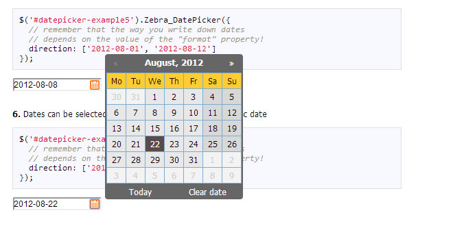
Direction of the calendar. A positive or negative integer: n (a positive integer) creates a future-only calendar beginning at n days after today; -n (a negative integer) creates a past-only calendar ending n days before today; if n is 0, the calendar has no restrictions. use boolean true for a future-only calendar starting with today and use boolean false for a past-only calendar ending today. You may also set this property to an array with two elements in the following combinations: - first item is boolean TRUE (calendar starts today), an integer > 0 (calendar starts n days after today), or a valid date given in the format defined by the “format” attribute (calendar starts at the specified date), and the second item is boolean FALSE (the calendar has no ending date), an integer > 0 (calendar ends n days after the starting date), or a valid date given in the format defined by the “format” attribute and which occurs after the starting date (calendar ends at the specified date) - first item is boolean FALSE (calendar ends today), an integer < 0 (calendar ends n days before today), or a valid date given in the format defined by the "format" attribute (calendar ends at the specified date), and the second item is an integer > 0 (calendar ends n days before the ending date), or a valid date given in the format defined by the “format” attribute and which occurs before the starting date (calendar starts at the specified date) [1, 7] – calendar starts tomorrow and ends seven days after that [true, 7] – calendar starts today and ends seven days after that ['2013-01-01', false] – calendar starts on January 1st 2013 and has no ending date (“format” is YYYY-MM-DD) [false, '2012-01-01'] – calendar ends today and starts on January 1st 2012 (“format” is YYYY-MM-DD) Note that “disabled_dates” property will still apply! Default is 0 (no restrictions). |
| disabled_dates | mixed |
An array of disabled dates in the following format: ‘day month year weekday’ where “weekday” is optional and can be 0-6 (Saturday to Sunday); The syntax is similar to cron’s syntax: the values are separated by spaces and may contain * (asterisk) – (dash) and , (comma) delimiters: ['1 1 2012'] would disable January 1, 2012; ['* 1 2012'] would disable all days in January 2012; ['1-10 1 2012'] would disable January 1 through 10 in 2012; ['1,10 1 2012'] would disable January 1 and 10 in 2012; ['1-10,20,22,24 1-3 *'] would disable 1 through 10, plus the 22nd and 24th of January through March for every year; ['* * * 0,6'] would disable all Saturdays and Sundays; ['01 07 2012', '02 07 2012', '* 08 2012'] would disable 1st and 2nd of July 2012, and all of August of 2012 Default is FALSE, no disabled dates. |
| enabled_dates | mixed |
An array of enabled dates in the same format as required for “disabled_dates” property. To be used together with the “disabled_dates” property by first setting the “disabled_dates” property to something like “[* * * *]” (which will disable everything) and the setting the “enabled_dates” property to, say, “[* * * 0,6]” to enable just weekends. Default is FALSE. |
| first_day_of_week | integer |
Week’s starting day. Valid values are 0 to 6, Sunday to Saturday. Default is 1, Monday. |
| format | string |
Format of the returned date. Accepts the following characters for date formatting: d, D, j, l, N, w, S, F, m, M, n, Y, y borrowing syntax from (PHP’s date function). Note that when setting a date format without days (‘d’, ‘j’), the users will be able to select only years and months, and when setting a format without months and days (‘F’, ‘m’, ‘M’, ‘n’, ‘t’, ‘d’, ‘j’), the users will be able to select only years. Also note that the value of the “view” property (see below) may be overridden if it is the case: a value of “days” for the “view” property makes no sense if the date format doesn’t allow the selection of days. Default is ‘Y-m-d’. |
| header_captions | object |
Captions in the datepicker’s header, for the 3 possible views: days, months, years For each of the 3 views the following special characters may be used borrowing from PHP’s “date” function’s syntax: m, n, F, M, y and Y; any of these will be replaced at runtime with the appropriate date fragment, depending on the currently viewed date. two more special characters are also available Y1 and Y2 (upper case representing years with 4 digits, lowercase representing years with 2 digits) which represent “currently selected year – 7″ and “currently selected year + 4″ and which only make sense used in the “years” view. Even though any of these special characters may be used in any of the 3 views, you should use m, n, F, M for the “days” view and y, Y, Y1, Y2, y1, y2 for the “months” and “years” view or you may get unexpected results! Text and HTML can also be used, and will be rendered as it is, as in the example below (the library is smart enough to not replace special characters when used in words or HTML tags):
header_captions: {
    'days':     'Departure:<br>F, Y',
    'months':   'Departure:<br>Y',
    'years':    'Departure:<br>Y1 - Y2'
}
Default is
header_captions: {
    'days':     'F, Y',
    'months':   'Y',
    'years':    'Y1 - Y2'
}
|
| header_navigation | array |
HTML to be used for the previous month/next month buttons default is ['«','»'] |
| inside | boolean |
Should the icon for opening the datepicker be inside the element? If set to FALSE, the icon will be placed to the right of the parent element, while if set to TRUE it will be placed to the right of the parent element, but *inside* the element itself Default is TRUE. |
| lang_clear_date | string |
the caption for the “Clear” button. |
| months | array |
Months names. Default is ['January', 'February', 'March', 'April', 'May', 'June', 'July', 'August', 'September', 'October', 'November', 'December'], |
| months_abbr | mixed |
Abbreviated names of months. By default, the abbreviated name of a month consists of the first 3 letters from the month’s full name. While this is common for most languages, there are also exceptions for languages like Thai, Loa, Myanmar, etc. where this is not correct. For these cases, specify an array with the abbreviations to be used for the months of the year; leave it FALSE to use the first 3 letters of a month’s name as the abbreviation. Default is FALSE |
| offset | array |
The offset, in pixels (x, y), to shift the date picker’s position relative to the top-right of the icon that toggles the date picker or, if the icon is disabled, relative to the top-right corner of the element Note that this only applies if the position of element relative to the browser’s viewport doesn’t require the date picker to be placed automatically so that it is visible! Default is [5, -5]. |
| pair | object |
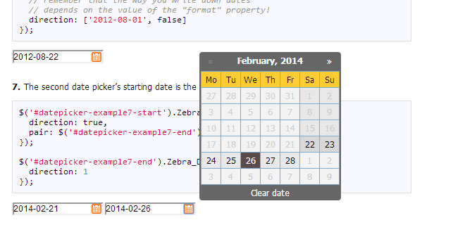
If set as one or more jQuery elements with Zebra_Datepicker attached, those particular date pickers will use the current date picker’s value as starting date Note that the rules set in the “direction” property will still apply, only that the reference date will not be the current system date but the value selected in the current date picker. Default is FALSE (not paired with another date picker) |
| readonly_element | boolean |
Should the element the calendar is attached to, be read-only? If set to TRUE, a date can be set only through the date picker and cannot be entered manually. Default is TRUE. |
| select_other_months | boolean |
Should days from previous and/or next month be selectable when visible? Note that if the value of this property is set to TRUE, the value of “show_other_months” will be considered TRUE regardless of the actual value! Default is FALSE. |
| show_clear_date | mixed |
Should the “Clear date” button be visible? Accepted values are: - 0 (zero) – the button for clearing a previously selected date is shown only if a previously selected date already exists; this means that if the input the date picker is attached to is empty, and the user selects a date for the first time, this button will not be visible; once the user picked a date and opens the date picker again, this time the button will be visible. - TRUE will make the button visible all the time - FALSE will disable the button Default is “0″ (without quotes) |
| show_icon | boolean |
Should a calendar icon be added to the elements the plugin is attached to? When set to TRUE the plugin will attach a calendar icon to the elements the plugin is attached to. Default is TRUE. |
| show_other_months | boolean |
should days from previous and/or next month be visible? Default is TRUE. |
| show_select_today | mixed |
Should the “Today” button be visible? Setting this property to anything but a boolean FALSE will enable the button and will use the property’s value as caption for the button; setting it to FALSE will disable the button Default is “Today”. |
| show_week_number | mixed |
Should an extra column be shown, showing the number of each week? Anything other than FALSE will enable this feature, and use the given value as column title. For example, show_week_number: ‘Wk’ would enable this feature and have “Wk” as the column’s title. Default is FALSE. |
| start_date | string |
A default date to start the date picker with Must be specified in the format defined by the “format” property, or it will be ignored! Note that this value is used only if there is no value in the field the date picker is attached to! Default is FALSE. |
| view | string |
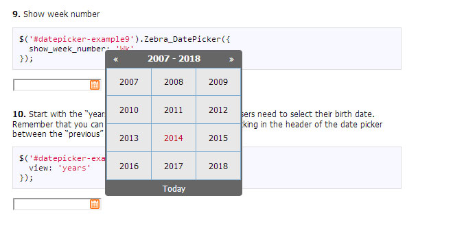
How should the date picker start: Valid values are “days”, “months” and “years”. Note that the date picker is always cycling days-months-years when clicking in the date picker’s header, and years-months-days when selecting dates (unless one or more of the views are missing due to the date’s format) Also note that the value of the “view” property may be overridden if the date’s format requires so! (i.e. “days” for the “view” property makes no sense if the date format doesn’t allow the selection of days) Default is “days”. |
| weekend_days | array |
Days of the week that are considered “weekend days” Valid values are 0 to 6, Sunday to Saturday. Default is [0,6] (Saturday and Sunday). |
| zero_pad | boolean |
Should day numbers < 10 be padded with zero? When set to TRUE, day numbers < 10 will be prefixed with 0. Default is FALSE. |
Events |
||
| onChange |
Callback to be executed whenever the user changes the view (days/months/years), as well as when the user navigates by clicking on the “next”/”previous” icons in any of the views;
The callback function called by this event takes 3 arguments – the first argument represents the current view (can be “days”, “months” or “years”), the second argument represents an array containing the “active” elements (not disabled) from the view, as jQuery elements, allowing for easy customization and interaction with particular cells in the date picker’s view, while the third argument is a reference to the element the date picker is attached to, as a jQuery object. For simplifying searching for particular dates, each element gets a “date” data attribute whose format depends on the value of the “view” argument:
- YYYY-MM-DD for elements in the “days” view Here’s how we could highlight the 24th day of each month of each year:
$('element').Zebra_DatePicker({

  // execute a function whenever the user changes the view
  //(days/months/years), as well as when the user
  // navigates by clicking on the "next"/"previous" icons
  // in any of the views
  onChange: function(view, elements) {

    // on the "days" view...
    if (view == 'days') {

      // iterate through the active elements in the view
      elements.each(function() {

        // to simplify searching for particular dates,
        // each element gets a "date" data attribute which
        // is the form of:
        // - YYYY-MM-DD for elements in the "days" view
        // - YYYY-MM for elements in the "months" view
        // - YYYY for elements in the "years" view

        // so, because we're on a "days" view,
        // let's find the 24th day using a regular
        // expression (notice that this will apply to
        // every 24th day of every month of every year)
        if ($(this).data('date').match(/\-24$/))

          // and highlight it!
          $(this).css({
            backgroundColor:    '#C40000',
            color:              '#FFF'
          });

        });

      }
    }
});
|
|
| onClear |
Callback function to be executed when the user clicks the “Clear” button.
The callback function takes a single argument: |
|
| onSelect |
Callback function to be executed when a date is selected The callback function takes 4 parameters: - the date in the format specified by the “format” attribute; - the date in YYYY-MM-DD format - the date as a JavaScript Date object - a reference to the element the date picker is attached to, as a jQuery object |
|
Methods |
||
|
First, get a reference to the plugin like
var datepicker = $('element').data('Zebra_DatePicker');
Then call a method like datepicker.update(); |
||
| destroy |
Removes the plugin from an element |
|
| show |
Shows the date picker (unless the “always_visible” property is set to TRUE) |
|
| hide |
Hides the date picker (unless the “always_visible” property is set to TRUE) |
|
| update |
Updates configuration options at run-time, and recalculates date picker’s icon position relative to the parent element. You should call this method whenever you show/hide/reposition the parent element, or alter the parent element’s dimensions;
The method accepts an optional argument – an object with configuration options to update:
var datepicker = $('element').data('Zebra_DatePicker');
datepicker.update({
  direction: 1
});
If you just want to update the icon’s position, simply call the method without any arguments:
var datepicker = $('element').data('Zebra_DatePicker');
datepicker.update();
|
|
 JS Tutorial
