- Overview
- Documents
- Demos
This library is used to create Markers that can be styled in different ways, such as changing the color or shape, or adding text labels. Below are examples of how to use this library.
Simple Example
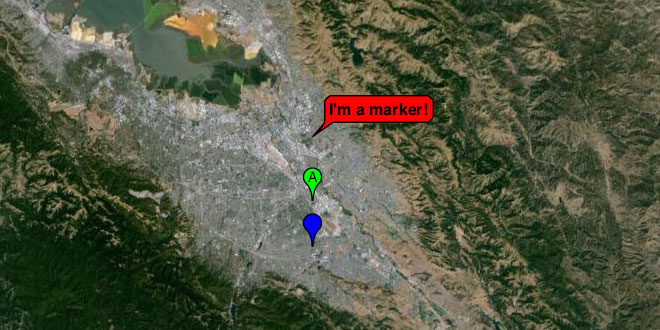
A StyledMarker is a Marker with an additional option passed to the MarkerOptions. Specify styleIcon in the options to create a styled Marker. This option takes a StyledIcon and applies it to the Marker to style it.
var styleMaker1 = new StyledMarker({styleIcon:new StyledIcon(StyledIconTypes.MARKER,{color:"00ff00",text:"A"}),position:myLatLng,map:map});
The StyledIcon constructor takes a StyledIconType and StyledIconOptions. There's two types of StyledIconTypes specified in the StyledIconTypes enum: MARKER and BUBBLE. MARKER creates a traditional lookingMarker while BUBBLE creates a speech bubble that can be labeled with text.
var styleMaker2 = new StyledMarker({styleIcon:new StyledIcon(StyledIconTypes.BUBBLE,{color:"ff0000",text:"I'm a marker!"}),position:new google.maps.LatLng(37.383477473067, -121.880502070713),map:map});
Each StyledIconType has a different set of properties that can define its look. These properties are found in the reference and can be passed to the StyledIconOptions in the StyledIcon constructor. Set these properties to change the Marker color, text, and any other properties defined for that type.
var styleMaker3 = new StyledMarker({styleIcon:new StyledIcon(StyledIconTypes.MARKER,{color:"0000ff"}),position:new google.maps.LatLng(37.263477473067, -121.880502070713),map:map});
Changing Style Properties Example
Properties for the StyledIcon can be changed by using the set method. Pass the name of the property you want to change and the value.
styleIcon.set("text","Elevation: " + results[0].elevation + "m");
Changing Multiple Marker Style Properties Example
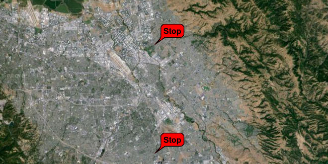
A StyledIcon can be created and passed to more than one StyledMarker to style many markers the same way.
    var styleIcon = new StyledIcon(StyledIconTypes.BUBBLE,{color:"#ff0000",text:"Stop"});
    var styleMaker1 = new StyledMarker({styleIcon:styleIcon,position:new google.maps.LatLng(37.383477473067, -121.880502070713),map:map});
    var styleMaker2 = new StyledMarker({styleIcon:styleIcon,position:new google.maps.LatLng(37.263477473067, -121.880502070713),map:map});
Changing the property on a StyledIcon will change the style of every StyledMarker that StyledIcon is associated with.
    google.maps.event.addDomListener(document.getElementById("changeButton"),"click",function() {
      styleIcon.set("color","#00ff00");
      styleIcon.set("text","Go");
    });
Using Classes Example
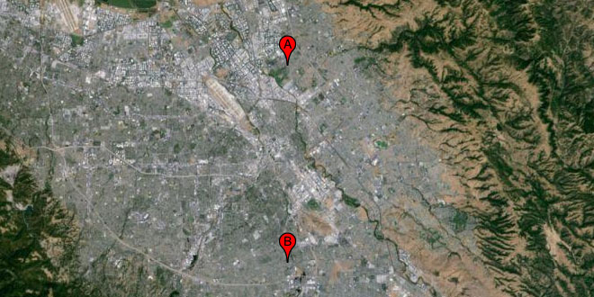
A StyledIcon can be passed as a class to StyledIconOptions to set global properties on multiple StyledIcons. When creating a class use StyledIconType.CLASS.
    var styleIconClass = new StyledIcon(StyledIconTypes.CLASS,{color:"#ff0000"});
    var styleMaker1 = new StyledMarker({styleIcon:new StyledIcon(StyledIconTypes.MARKER,{color:text:"A"},styleIconClass);,position:new google.maps.LatLng(37.383477473067, -121.880502070713),map:map});
    var styleMaker2 = new StyledMarker({styleIcon:new StyledIcon(StyledIconTypes.MARKER,{color:text:"B"},styleIconClass);,position:new google.maps.LatLng(37.263477473067, -121.880502070713),map:map});
This can be useful, for instance, when you want to change the color of multiple StyledMarkers that have different text.
StyledMarker
This library is used to make Markers whose appearance can be customized by setting properties.
class StyledMarker
This class extends Marker.
This class is a Marker with an additional option to set a StyleIcon.
Constructor
| Constructor | Description |
|---|---|
| StyledMarker(styledMarkerOptions:StyledMarkerOptions) | Creates a StyledMarker that can be added to the map. This is a Marker and has all the properties and methods of a normal Marker. For a complete reference on the available options see StyledMarkerOptions |
Properties
| Property | Type | Description |
|---|---|---|
| styleIcon | StyledIcon | The StyledIcon associated with this Marker. |
class StyledMarkerOptions
This class represents optional arguments to the StyledMarker constructor. It has no constructor but is instantiated as an object literal. It is an extension of MarkerOptions and has all the same properties with the addition of the below.
Properties
| Property | Type | Description |
|---|---|---|
| styleIcon | StyledIcon | The StyledIcon to associate with this Marker. |
class StyledIcon
This class extends MVCObject.
This class is applied to a StyledMarker to set up its appearance. Any change to the StyledIcon's properties will affect all StyledMarkers it's been applied to.
Constructor
| Constructor | Description |
|---|---|
|
StyledIcon(styledIconType:StyledIconType, styledIconOptions:StyledIconOptions, styleClass:StyledIcon) |
Creates a StyledIcon that can be applied to a StyledMarker or to another StyledIcon as a StyleClass. A StyledIcon applied as a StyleClass will automatically update, when its properties are changed, all StyledIcons that set it as their StyleClass. If you're creating a StyledIcon as a class passStyledIconTypes.CLASS to StyledIconType. |
Methods
| Method | Return Value | Description |
|---|---|---|
| set(name:String,value:Object) | None | Sets a given style property to the given value. Any Markers using this StyledIcon will be automatically updated. |
| get(name:String) | Object | Returns a given style property |
| getType() | StyledIconType | Returns the StyledIconType associated with the StyledIcon. |
class StyledIconOptions
This class represents optional arguments to the StyledIcon constructor. It has no constructor but is instantiated as an object literal. Its properties are variable and depend on what StyledIconType is passed to the StyledIconconstructor.
class StyledIconTypes
This is an enum of StyledIconType that can be passed to a StyledIcon constructor.
Properties
| Property | Type | Description |
|---|---|---|
| defaults | MARKER | Resembles a default Marker. Can alter color, have an optional character or two placed within it, or a have a star on its corner. |
| defaults | MARKER | Resembles a small InfoWindow with a single line of text. Can alter color or have a string of text placed in it. |
StyledIconTypes.CLASS
This class has no properties of its own. Pass this to StyledIconType when creating a StyledIcon to use as a StyleClass.
StyledIconTypes.MARKER
Properties for StyledIconTypes.MARKER. Pass any of these to StyledIconOptions when using this type.
Properties
| Property | Type | Description |
|---|---|---|
| text | String | Text that will appear within the Marker. Limited to 2 characters. |
| color | String | The color of the Marker. |
| fore | String | The color of any text appearing within the Marker. |
| starcolor | String | The color of the star on the Marker. If this is null or omitted then no star will appear. |
StyledIconTypes.BUBBLE
Properties for StyledIconTypes.BUBBLE. Pass any of these to StyledIconOptions when using this type.
Properties
| Property | Type | Description |
|---|---|---|
| text | String | A string of text that will appear within the Marker. |
| color | String | The color of the Marker. |
| fore | String | The color of any text appearing within the Marker. |
class StyledIconType
This class holds functions for building the information needed to style markers and is used by StyledIcon. It has no constructor but is instantiated as an object literal. Implement this class if you want to use a custom style type. The properties set in the default property are the properties used in StyledIconOptions.
Properties
| Property | Type | Description |
|---|---|---|
| defaults | StyledIconOptions | The properties and their defaults used by this StyledIconType. |
Methods
| Method | Return Value | Description |
|---|---|---|
| getURL(icon:StyledIcon) | String | Returns the URL to an image to be used by the StyledMarker icon. StyledIcon will call this when necessary. |
| getShadowURL(icon:StyledIcon) | String | Returns the URL to an image to be used by the StyledMarker shadow. StyledIcon will call this when necessary. |
| getAnchor(icon:StyledIcon,width:Number,height:Number) | Point | Returns a Point that indicates the point on the image where the StyledMarker is placed on the Map. StyledIcon will call this when necessary. |
| getShadowAnchor(icon:StyledIcon,width:Number,height:Number) | Point | Returns a Point that indicates the point on the shadow image where the StyledMarker's shadow is placed on the Map.StyledIcon will call this when necessary. |
| getShape(icon:StyledIcon,width:Number,height:Number) | MarkerShape | Returns a MarkerShape that indicates where the StyledMarker is clickable. StyledIcon will call this when necessary. |
 JS Tutorial
