Download
Demo
- Overview
- Documents
User Rating: 0/5 ( 0 votes)
Your Rating:
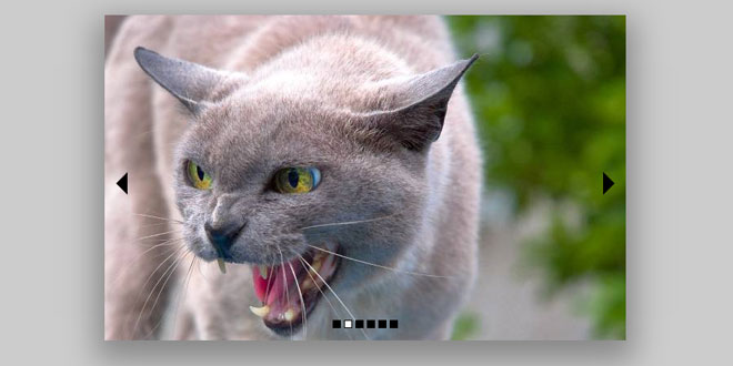
Slider is a jQuery slide plugin for creating a responsive & cross-browser image slider that supports full screen, multiple effects, navigation, autoplay, easing, change speed and trigger...
Source: fengyuanchen.github.io
1. INCLUDE JS FILES
<script src="/path/to/jquery.js"></script><!-- jQuery is required -->
<script src="/path/to/slider.js"></script>
2. HTML
<div class="slider">
<div class="slider-content">
<div><img src="img/picture-1.jpg" alt="Picture 1"></div>
<div><img src="img/picture-2.jpg" alt="Picture 2"></div>
<div><img src="img/picture-3.jpg" alt="Picture 3"></div>
</div>
<div class="slider-nav">
<div class="slider-active"></div>
<div></div>
<div></div>
</div>
<div class="slider-prev slider-disabled">‹</div>
<div class="slider-next">›</div>
</div>
3. JAVASCRIPT
$(".slider").slider({
    activeClass: "slider-active",
    autoplay: true,
    contentClass: "slider-content",
    disableClass: "slider-disabled",
    duration: 5000,
    effect: "fade",
    easing: "swing",
    navClass: "slider-nav",
    nextClass: "slider-next",
    prevClass: "slider-prev",
    speed: 1000,
    trigger: "click"
});
4. OPTIONS
Setup with $("#target").slider(options), or global setup with $.fn.slider.setDefaults(options).
Options can be passed via data attributes or JavaScript. For data attributes, append the option name to data-, as in data-fast="true".
| Name | Type | Default | Description |
|---|---|---|---|
| activeClass | string | "slider-active" | A active state class for nav items. |
| autoplay | boolean | true | Auto play the slide after initialized. |
| contentClass | string | "slider-content" | The content container. |
| disableClass | string | "slider-disabled" | A disable state class for prev and next button. |
| duration | number | 5000 | The duration milliseconds of each slide item. |
| effect | string | "fade" | Also support "scrollx" and "scrolly", powered by jQuery. |
| easing | string | "swing" | Also support "linear". Powered by jquery. |
| navClass | string | "slider-nav" | The navigation container. |
| prevClass | string | "slider-prev" | The prev button. |
| nextClass | string | "slider-next" | The next button. |
| speed | number | 1000 | The speed of the animation. |
| trigger | string | "click" | The event of trigger sliding. |
5. METHODS
- render - Render the slider.
- start - Start the slider.
- stop - Stop the slider.
- enable - Enable the slider.
- disable - Disable the slider.
Usage example:
$("#target").slider({
    autoplay: false
}).slider("start");
 JS Tutorial


