User Rating: 0/5 ( 0 votes)
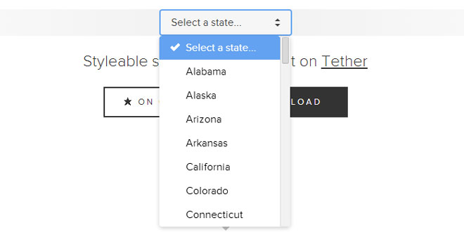
Select is a Javascript and CSS library for creating styleable select elements. Unlike many other select-replacements, Select is designed from the ground up to replicate the behavior of native select controls as much as is possible, providing a seemless experience for users. That means it works properly when you type characters, use tab for focus, etc.
Use Select where you would use a native select. It doesn't, and will never, provide any sort of autocomplete functionality, so you probably don't want to use it on a list of more than a few hundred elements.
Select uses Tether to efficiently position its element container.
Usage
Initialization
To initialize a single selectElement, simply create a new Select object.
new Select({
  el: selectElement
});
To initialize all selects on a page, you can use the Select.init method:
Select.init();
By default, that will init all select elements, pass a selector to be more specific:
Select.init({
  selector: '.my-select'
});
You can pass any options you'd like to init your select's with into init:
Select.init({
  className: 'select-theme-dark'
});
The Select Object
The Select constructor returns a Select object. You can also get the select instance by reading the.selectInstance property off of the original select element:
var MySelect;

MySelect = new Select({
  el: myElement
});

new Select({
  el: myElement
});

MySelect = el.selectInstance;
The Select object has the following properties:
-
.close(): Close the dropdown, if it's open
-
.open(): Open the dropdown, if it's closed
-
.toggle(): Toggle between open and closed
-
.isOpen(): Returns true if the dropdown is open
-
.change(val): Change the select to the option with the value provided
-
.update(): Update the dropdown with new options. This happens automatically when you change the underlying select, so you should never have to call it.
-
.value: The current value of the select
You can also bind events on the select object:
-
.on(event, handler, [context]): When event happens, call handler, with context
-
.off(event, [handler]): Unbind the provided event - handler combination
-
.once(event, handler, [context]): The next time event happens, call handler, with context
Events:
-
open
-
close
-
change
-
highlight
When the select's value changes, the value of the original select element it's based on will change as well, so feel free to read the value from that element, or listen to it's change event.
Changing the theme
To change from the default theme, change the className property.
new Select({
  el: selectElement,
  className: 'select-theme-dark'
});
Changing the positioning
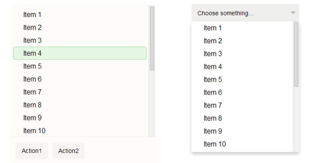
Select has an option called alignToHighlighted which allows you to change whether the drop is positioned like a real select element (with the currently selected option over the element) or like a canonical dropdown menu.
By default, this property is set to "auto", meaning it will align the drop like a select only when the number of items in the options chooser does not cause it to scroll. The other options are "always" and never "never".
In this example, we Select to always open the drop like a dropdown menu.
new Select({
  el: selectElement,
  alignToHighlighted: 'never'
});
Native controls
By default, select fallsback to opening the native browser select on touch devices which are less than or equal to 640px in either height or width.
To disable this:
new Select({
  el: selectElement,
  useNative: false
});
Themes
Currently there are three themes for Select.js.
Default, Dark, Chosen
 JS Tutorial


