- Overview
- Documents
- Demos
Royal Slider is an image gallery and content slider plugin.
Features
-
Modular
Script architecture allows you to create your own version of the script using online tool and include in build only features that you need.
-
Touch-friendly
Touch navigation for slider and thumbnails, vertical or horizontal.
-
Responsive down to mobile
Size of slides and thumbnails can be dynamically changed (all sliders on this site are responsive).
-
HTML content in slides and thumbs
Any content can be inserted inside each slide and thumbnail. Links are automatically blocked when dragging, inputs are handled too.
-
Super customizable
50+ js options, 4 skins with photoshop files, 9 pre-built templates (and more coming). Everything can be customized and dynamically resized via CSS.
-
Semantic and SEO friendly
All images are visible to search engines. Slider requires as low markup as possible. Tag names can be changed (slider can be created from an unordered list, as well as from a list of divs).
-
Smart Autoplay
Auto slideshow that wait until image is loaded, and has an option to stop at first user action or pause on hover.
-
Smart lazy-loading
Gallery loads nearby images in background, so users don't need to wait each time and images are available instantly. You may set how many images to preload in options.
-
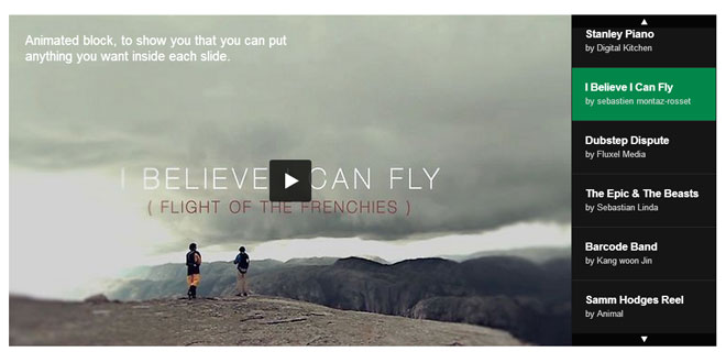
Animated Blocks
Slider can contain blocks of HTML that appear after slide transition using the fade or move effects. Provided as a module, and can be easily removed from build to save performance.
-
Native Fullscreen
Slider supports fullscreen mode and automatically loads larger images in it.
-
Video support
YouTube or Vimeo can be added to any slider. Video is hidden under the image placeholder and doesn't load heavy iframe until required. Also, there is an API and instructions to add another video sources. Provided as a module.
-
User-friendly
Doesn't block vertical scrolling, doesn't block default browser zoom, works if javascript is disabled, allows navigating as fast as user wants (doesn't block navigation), has options to disable mouse/touch drag for slides and thumbnails.
-
Permalinks (deeplinking)
You may link to each slide from address bar by adding #hash to the end of URL. Optionally you can make URL automatically change when slide changes.
-
Thumbnails, tabs or bullets
Thumbnails are controlled by swipe gestures, can be positioned verticaly or horizontaly and resized separately from main slider area.
-
Auto image scaling
Images can "fit into area", "fill the area", "fit area only if image is smaller" or don't scale at all.
-
Unminified Source
You get unminified version of JS code and nicely organized CSS files. You're free to modify any source files to fit your needs.
-
Lifetime Support
Free lifetime support to help you if something went wrong. Provided by direct script developers, nothing is outsourced.
-
Free Updates
Slider is now in its 9th version, and each of these updates were free. Plugin is always under development, feel free to request new modules or templates.
Source: dimsemenov.com
1. INCLUDE CSS AND JS FILES
<!-- basic stylesheet -->
<link rel="stylesheet" href="royalslider/royalslider.css">

<!-- skin stylesheet (change it if you use another) -->
<link rel="stylesheet" href="royalslider/skins/default/rs-default.css">

<!-- Plugin requires jQuery 1.7+  -->
<!-- If you already have jQuery on your page, you shouldn't include it second time. -->
<script src='royalslider/jquery-1.8.3.min.js'></script>

<!-- Main slider JS script file -->
<!-- Create it with slider online build tool for better performance. -->
<script src="royalslider/jquery.royalslider.min.js"></script>
2. HTML
<div class="royalSlider rsDefault">
    <!-- simple image slide -->
    <img class="rsImg" src="image.jpg" alt="image desc" />

    <!-- lazy loaded image slide -->
    <a class="rsImg" href="image.jpg">image desc</a>

    <!-- HTML content slide -->
    <p>Content goes here</p>

    <!-- image and content -->
    <div>
        <img class="rsImg" src="image.jpg" data-rsVideo="https://vimeo.com/44878206" />
        <p>Some content after...</p>
    </div>

    <!-- HTML content -->
    <div>
        Put any HTML content here
    </div>

    <!-- HTML content (100% with and height) -->
    <div class="rsContent">
        Put any HTML content here
    </div>
</div>
3. JAVASCRIPT
jQuery(document).ready(function($) {
        $(".royalSlider").royalSlider({
            // options go here
            // as an example, enable keyboard arrows nav
            keyboardNavEnabled: true
        });
});
4. CSS
.royalSlider {
  width: 100%;
  height: 300px;
}
Apply size to slider via CSS (optional). If you want slider to scale height based on width, take a look at the autoScaleSlider option. Basically, to make it responsive (scale height based on width), all you need is to apply `autoScaleSlider` options.
5. OPTIONS
| Variable | Default Value | Description |
|---|---|---|
| autoScaleSlider | false | Automatically updates slider height based on base width. |
| autoScaleSliderWidth | 800 | Base slider width. Slider will autocalculate the ratio based on these values. |
| autoScaleSliderHeight | 400 | Base slider height |
| imageScaleMode | 'fit-if-smaller' | Scale mode for images. "fill", "fit", "fit-if-smaller" or "none". |
| imageAlignCenter | true | Aligns image to center of slide. |
| imageScalePadding | 4 | Distance between image and edge of slide (doesn't work with 'fill' scale mode). |
| controlNavigation | 'bullets' | Navigation type, can be 'bullets', 'thumbnails', 'tabs' or 'none' |
| arrowsNav | true | Direction arrows navigation. |
| arrowsNavAutoHide | true | Auto hide arrows. |
| arrowsNavHideOnTouch | false | Hides arrows completely on touch devices. |
| imgWidth | null | Adds base width to all images for better-looking loading. Can be specified separately for each image. |
| imgHeight | null | Same as above, just for height. |
| slidesSpacing | 8 | Spacing between slides in pixels. |
| startSlideId | 0 | Start slide index |
| loop | false | Makes slider to go from last slide to first. |
| loopRewind | false | Makes slider to go from last slide to first with rewind. Overrides prev option |
| randomizeSlides | false | Randomizes all slides at start. |
| numImagesToPreload | 4 | Number of slides to preload on sides. If you set it to 0, only one slide will be kept in the display list at once. |
| usePreloader | true | Enables spinning preloader, you may style it via CSS (class rsPreloader). Since 9.3 version. |
| slidesOrientation | 'horizontal' | Can be 'vertical' or 'horizontal'. |
| transitionType | 'move | 'move' or 'fade'. Important note about fade transition, slides must have background as only one image is animating. |
| transitionSpeed | 600 | Slider transition speed, in ms. |
| easeInOut | 'easeInOutSine' | Easing function for simple transition. Read more in the easing section of the documentation. |
| easeOut | 'easeOutSine' | Easing function of animation after ending of the swipe gesture. Read more in the easing section of the documentation. |
| controlsInside | true | If set to true adds arrows and fullscreen button inside rsOverflow container, otherwise inside root slider container.. |
| navigateByClick | true | Navigates forward by clicking on slide. |
| sliderDrag | true | Mouse drag navigation over slider. |
| sliderTouch | true | Touch navigation of slider. |
| keyboardNavEnabled | false | Navigate slider with keyboard left and right arrows. |
| fadeinLoadedSlide | true | Fades in slide after it's loaded. |
| allowCSS3 | true | Allows usage of CSS3 transitions. Might be useful if you're experiencing font-rendering problems, or other CSS3-related bugs. |
| globalCaption | false | Adds global caption element to slider, read more in the global caption section of documentation. |
| addActiveClass | false | Adds rsActiveSlide class to current slide before transition. |
| minSlideOffset | 10 | Minimum distance in pixels to show next slide while dragging. Added in version 9.1.7. |
| autoHeight | false |
Scales and animates height based on current slide. Please note: if you have images in slide that don't have rsImg class) or don't have fixed size, use $(window).load() instead of$(document).ready() before initializing slider. Also, autoHeight doesn't work with properties like autoScaleSlider, imageScaleMode and imageAlignCenter. |
| slides | null | Overrides HTML of slides, used for creating of slides from HTML that is not attached to DOM. More info in knowledge base. |
Caption
Slider can automatically grab an image caption from alt attribute (if img is used),
from contents of image a tag, or from element with class rsCaption inside slide (tag name doesn't matter).
See examples below:
<div class="royalSlider">
    <!-- simple image  -->
    <img class="rsImg" src="image1.jpg" alt="This is caption text" />

    <!-- lazy loaded image -->
    <a class="rsImg" href="image1.jpg">This is caption <b>HTML</b> text</a>

    <!-- slide with any content -->
    <div>
        <img class="rsImg" src="image1.jpg" alt="This text will be IGNORED!" />
        <figure class="rsCaption">This caption <b>HTML</b> text will be used.</figure>
    </div>
</div>
globalCaption:true option must be added to slider to make slider parse this data. Generated element with caption will have class rsGCaption class and will be placed in root slider element, you can style and position it however you need.
Content of caption changes before animation of slides start. Global caption module must be present in build. You can see example in visible nearby gallery template.
Thumbnails & tabs
To get thumbnail slider searches for an element with class rsTmb inside slide. If not found, it searches for image URL indata-rsTmb attribute of slide and creates image based on it. To enable thumbnails you need to set them as navigation in slider options. controlNavigation: 'thumbnails'. If you wish to put navigation on top or at left side of slider, check this article.
In contrast to thumbnails, tabs can have different size but cannot be scrollable. Tabs use same rsTmb markup.
<div class="royalSlider rsDefault">
    <!-- simple image with thumbnail -->
    <img class="rsImg" src="image.jpg" data-rsTmb="small-image.jpg" alt="image description" />

    <!-- lazy loaded image with thumbnail -->
    <a class="rsImg" href="image.jpg">image description<img src="small-image.jpg" class="rsTmb" /></a>

    <!-- Image with HTML thumbnail -->
    <div class="rsContent">
        <img class="rsImg" src="image.jpg" alt="image description" />
        <div class="rsTmb">Thumbnail HTML content</div>
    </div>
</div>
Thumbnails options:
| Variable | Default Value | Description |
|---|---|---|
| drag | true | Thumbnails mouse drag |
| touch | true | Thumbnails touch |
| orientation | 'horizontal' | 'horizontal' or 'vertical'. If you want them to appear above the slider, check this article. |
| arrows | true | Thumbnails arrows |
| spacing | 4 | Spacing between thumbs |
| arrowsAutoHide | false | Auto hide thumbnails arrows on hover |
| autoCenter | true | Automatically centers container with thumbs if there are small number of items |
| transitionSpeed | 600 | Thumbnails transition speed. |
| fitInViewport | true | Reduces size of main viewport area by thumbnails width or height, use it when you set 100% width to slider. This option is always true, when slider is in fullscreen mode. |
| firstMargin | true | Margin that equals thumbs spacing for first and last item. |
| arrowLeft | null | Replaces default thumbnail arrow. Variable accepts jQuery element $('This is left arrow') that will be used as arrow. You have to add it to DOM manually. Option added in version 9.1.9 + |
| arrowRight | null | Same as option above, just for right arrow. |
| appendSpan | false | Adds span element with class thumbIco to every thumbnail. Useful for styling. Addeom in 9.2.0. |
Example of initializing slider with thumbnails options:
jQuery(document).ready(function($) {
    $(".royalSlider").royalSlider({
    	// general options go gere
    	autoScaleSlider: true,
    	thumbs: {
    		// thumbnails options go gere
    		spacing: 10,
    		arrowsAutoHide: true
    	}
    });
});
Fullscreen
You may specify larger images when slider is in fullscreen mode by adding data-rsBigImg attribute to rsImg element. A few examples:
<a class="rsImg" data-rsBigImg="bigimage.jpg" href="normalimage.jpg">Image desc</a>
<img class="rsImg" data-rsBigImg="bigimage.jpg" src="normalimage.jpg" alt="image desc" />
Fullscreen module options:
| Variable | Default Value | Description |
|---|---|---|
| enabled | false | Fullscreen functions enabled. |
| keyboardNav | true | Force keyboard arrows nav in fullscreen. |
| buttonFS | true | Fullscreen button at top right. |
| nativeFS | false | Native browser fullscreen. |
JavaScript API to enter and exit fullscreen can be found in API section. Example of using fullscreen options:
jQuery(document).ready(function($) {
    $(".royalSlider").royalSlider({
    	// general options go gere
    	autoScaleSlider: true,
    	fullscreen: {
    		// fullscreen options go gere
    		enabled: true,
    		nativeFS: false
    	}
    });
});
Deep linking
Deep linking module makes URL automatically change when you switch slides and you can easily link to specific slide (aka permalink). Options:
| Variable | Default Value | Description |
|---|---|---|
| enabled | false | Linking to slides by appending #SLIDE_INDEX to url. Slides count starts from 1. If change is set to false hash is only read once, after page load. |
| change | false | Automatically change URL after transition and listen for hash change. |
| prefix | '' | Prefix that will be added to hash. For example if you set it to 'gallery-', hash would look like this: #gallery-5 |
Example of slider with deep linking module:
jQuery(document).ready(function($) {
    $(".royalSlider").royalSlider({
    	// general options go gere
    	autoScaleSlider: true,
    	deeplinking: {
    		// deep linking options go gere
    		enabled: true,
    		prefix: 'slider-'
    	}
    });
});
Autoplay
Autoplay slideshow can be enabled via slider options. Delay between items can be set globally via delay option, or specifically for each item by adding data-rsDelay="1000" to root element of the slide (1000 = 1sec).
| Variable | Default Value | Description |
|---|---|---|
| enabled | false | Enable autoplay or not. |
| stopAtAction | true | Stop autoplay at first user action. |
| pauseOnHover | true | Pause autoplay on hover. |
| delay | 3000 | Delay between items in ms. |
Example of slider with autoplay options:
jQuery(document).ready(function($) {
    $(".royalSlider").royalSlider({
    	// general options go gere
    	autoScaleSlider: true,
    	autoPlay: {
    		// autoplay options go gere
    		enabled: true,
    		pauseOnHover: true
    	}
    });
});
Example of slide specific delay:
<div class="royalSlider">
    <!-- slide with any content -->
    <div data-rsDelay="2000">
        <img class="rsImg" src="image1.jpg" alt="This text will be IGNORED!" />
        <figure class="rsCaption">This caption <b>HTML</b> text will be used.</figure>
    </div>
</div>
Video
To add video to slide, you need to add data-rsVideo="" attribute to image. It can contain link to YouTube or Vimeo video. Examples:
<div class="royalSlider">
    <!-- simple image with Vimeo video -->
    <img class="rsImg" src="image.jpg" data-rsVideo="https://vimeo.com/44878206" />

    <!-- lazy loaded image with YouTube video -->
    <a class="rsImg" href="image.jpg" data-rsVideo="http://www.youtube.com/watch?v=Eip7JrQ6IdE">This is caption <b>HTML</b> text</a>

    <!-- slide with any content -->
    <div>
        <img class="rsImg" src="image.jpg" data-rsVideo="https://vimeo.com/44878206" />
        <p>Some content after...</p>
    </div>
</div>
Video options:
| Variable | Default Value | Description |
|---|---|---|
| autoHideArrows | true | Auto hide arrows when video is playing |
| autoHideControlNav | false | Auto hide navigation when video is playing. |
| autoHideBlocks | false | Auto hide animated blocks when video is playing. |
| youTubeCode | '<iframe src="http://www.youtube.com/embed/%id%?rel=1&autoplay=1&showinfo=0" frameborder="no"></iframe>' | Youtube embed code. %id% is replaced by video id. |
| vimeoCode | '<iframe src="http://player.vimeo.com/video/%id%?byline=0&portrait=0&autoplay=1" frameborder="no" webkitAllowFullScreen mozallowfullscreen allowFullScreen></iframe>' | Vimeo embed code. %id% is replaced by video id. |
If you want to use another video player, please check how to add another player article.
Example of slider with video options:
jQuery(document).ready(function($) {
    $(".royalSlider").royalSlider({
    	// general options go gere
    	autoScaleSlider: true,
    	video: {
    		// video options go gere
    		autoHideBlocks: true,
    		autoHideArrows: false
    	}
    });
});
Animated blocks
All elements inside slide that have class rsABlock will be treated by slider as animated blocks (tag name doesn't matter). Blocks can not be nested, but you can put multiple instances of them into one slide, or make slide itself animated block.
Block examples:
<div class="royalSlider rsDefault">
    <!-- image + animated block with text -->
    <div class="rsContent">
        <img class="rsImg" src="image.jpg" data-rsTmb="small-image.jpg" alt="image description" />
        <div class="rsABlock">Block content</div>
    </div>

    <!-- two animated blocks in one slide -->
    <div class="rsContent">
        <h2 class="rsABlock">Block content 1</h2>
        <p class="rsABlock">Block <b>content</b> 2</p>
    </div>

    <!-- HTML content + animated block as an image -->
    <div class="rsContent">
        HTML content...
        <img class="rsABlock" src="block-image.jpg" />
    </div>

    <!-- image + animated block with HTML title and text -->
    <div class="rsContent">
        <img class="rsImg" src="image.jpg" alt="image description" />
        <div class="rsABlock">
            <h2>Dummy title</h2>
            <p>Dummy text of block with title and text.</p>
        </div>
    </div>
</div>
By default blocks have absolute position and can be positioned with left, right, top or bottom CSS properties. Please note, if you set position to bottom or right, so you need to set top:auto and left:auto;. But you may set position: relative; to them too.
It's not recommended to apply any CSS3 transitions or transforms to element with class rsABlock, but you can style it's child elements however you want. Also, you shouldn't set margin to block in percents or em's, as this property is animated.
Please use animation wisely and minify the number of blocks as much as possible.
Block-specific options:
data-fade-effect="true"	// fade effect, can be 'true' or 'false'

data-move-effect="left"	// direction of move effect,
                        // can be 'left', 'right', 'top', 'bottom' or 'none'

data-move-offset="20"	// distance of move effect in pixels

data-speed="300"	// transition speed of block, in ms
data-delay="400"	// delay before block will show up
data-easing="easeOutSine"  // animation easing function, read more in easing types section
Example of using block-specific options:
<div class="rsABlock" data-move-effect="left" data-fade-effect="false">Content</div>
Animated blocks global options (overriden by block-specific options):
| Variable | Default Value | Description |
|---|---|---|
| fadeEffect | true | true or false |
| moveEffect | 'top' | Move effect direction. Can be 'left', 'right', 'top', 'bottom' or 'none'. |
| moveOffset | 20 | Distance for move effect in pixels. |
| speed | 400 | Transition speed of block, in ms. |
| easing | 'easeOutSine' | Easing function of block animation. Read more in easing section of docs. |
| delay | 200 | Delay between each block show up, in ms. |
Example of slider with block options:
jQuery(document).ready(function($) {
    $(".royalSlider").royalSlider({
    	// general options go gere
    	autoScaleSlider: true,
    	block: {
    		// animated blocks options go gere
    		fadeEffect: false,
    		moveEffect: 'left'
    	}
    });
});
Visible-nearby
Module "reveals" next and previous slides, like in this template. Available since 9.3 version.
| Variable | Default Value | Description |
|---|---|---|
| enabled | true | Enable visible-nearby. |
| centerArea | 0.6 | Ratio that determines area of center image. For example for 0.6 - 60% of slider area will get center image and 20% for two images on sides. |
| center | true | Alignment of center image, if you set it to false center image will be aligned to left. |
| navigateByCenterClick | true | Disables navigation to next slide by clicking on current slide (if navigateByClick is true). |
| breakpoint | 0 | Used for responsive design. Changes centerArea value to breakpointCenterArea when width of slider is less then value in this option. Set to 0 to disable. Should be number. |
| breakpointCenterArea | 0.8 | Same as centerArea option, just for breakpoint. Can be changed dynamically via `sliderInstance.st.breakpointCenterArea`. |
Example of slider with visible nearby images:
jQuery(document).ready(function($) {
    $(".royalSlider").royalSlider({
    	// general options go gere
    	keyboardNavEnabled: true,
        visibleNearby: {
            enabled: true,
            centerArea: 0.5,
            center: true,
            breakpoint: 650,
            breakpointCenterArea: 0.64,
            navigateByCenterClick: true
        }
    });
});
If you wish to add zooming or fading effect to nearby slides, you need to activate addActiveClass option and include active-class module, which adds rsActiveSlide CSS class to current slide. And add these effects using CSS3 transitions, like so:
.royalSlider .rsSlide img {
    opacity: 0.45;
    -webkit-transition: all 0.3s ease-out;
    -moz-transition: all 0.3s ease-out;
    transition: all 0.3s ease-out;

    -webkit-transform: scale(0.9);
    -moz-transform: scale(0.9);
    -ms-transform: scale(0.9);
    -o-transform: scale(0.9);
    transform: scale(0.9);
}
.royalSlider .rsActiveSlide img {
    opacity: 1;
    -webkit-transform: scale(1);
    -moz-transform: scale(1);
    -ms-transform: scale(1);
    -o-transform: scale(1);
    transform: scale(1);
}
Please note that such opacity transition here may conflict with fadeInLoadedSlide option, so you should disable it.
6. API
Important note: if you bind any custom events to elements in slider, you should do this before initialization or using event delegation, as slider doesn't keep all slides in DOM at once (to save memory).
You can easily override any function without modifying slider code (even "private") by extending slider prototype.
Public methods:
// All public methods can be called jQuery-way - $(".royalSlider").royalSlider('startAutoPlay');
// Another example: $(".royalSlider").royalSlider('goTo', 3);

// But it's recommended to get instance once if you have many calls:

// You can get slider instance from royalSlider data:
var slider = $(".royalSlider").data('royalSlider');

slider.goTo(3); // go to slide with id
slider.next();  // next slide
slider.prev();  // prev slide

slider.destroy(); // removes all events and clears all slider data
                  // use on ajax sites to avoid memory leaks

// Dynamic slides adding/removing
// More info in Javascript API section of support desk - http://dimsemenov.com/private/forum.php
slider.appendSlide( HTML_jQuery_object, index(optional) );
slider.removeSlide( index(optional) );

slider.updateSliderSize(); // updates size of slider. Use after you resize slider with js.
slider.updateSliderSize(true); // Function has "forceResize" Boolean paramater.

// Thumbnails public methods
slider.setThumbsOrientation('vertical'); // changes orientation of thumbnails
slider.updateThumbsSize(); // updates size of thumbnails

// Fullscreen public methods
slider.enterFullscreen();
slider.exitFullscreen();

// Autoplay public methods
slider.startAutoPlay();
slider.stopAutoPlay();
slider.toggleAutoPlay();

// Video public methods
slider.toggleVideo();
slider.playVideo();
slider.stopVideo();
Public properties:
slider.currSlideId // current slide index
slider.currSlide // current slide object

slider.numSlides // total number of slides

slider.isFullscreen // indicates if slider is in fullscreen mode
slider.nativeFS		// indicates if browser supports native fullscreen

slider.width // width of slider
slider.height // height of slider

slider.dragSuccess // Boolean, changes on mouseup, indicates if slide was dragged. Used to check if event is drag or click.

slider.slides // array, contains all data about each slide
slider.slidesJQ // array, contains list of HTML slides that are added to slider

slider.st // object with slider settings
slider.ev // jQuery object with slider events
Events:
// In each listener event.target is slider instance

slider.ev.on('rsAfterSlideChange', function(event) {
    // triggers after slide change
});
slider.ev.on('rsBeforeAnimStart', function(event) {
    // before animation between slides start
});
slider.ev.on('rsBeforeMove', function(event, type, userAction ) {
    // before any transition start (including after drag release)
    // "type" - can be "next", "prev", or ID of slide to move
    // userAction (Boolean) - defines if action is triggered by user (e.g. will be false if movement is triggered by autoPlay)
});
slider.ev.on('rsBeforeSizeSet', function(event) {
    // before size of slider is changed
});
slider.ev.on('rsDragStart', function(event) {
    // mouse/touch drag start
});
slider.ev.on('rsDragRelease', function() {
    // mouse/touch drag end
});
slider.ev.on('rsBeforeDestroy', function() {
    // triggers before slider in destroyed
});
slider.ev.on('rsOnCreateVideoElement', function(e, url)) {
    // triggers before video element is created, after click on play button.
    // Read more in Tips&Tricks section
});
slider.ev.on('rsSlideClick', function(event, originalEvent) {
    // originalEvent - the original jQuery click event. Parameter available since RoyalSlider v9.5.1
    // triggers when user clicks on slide
    // doesn't trigger after click and drag
});
slider.ev.on('rsEnterFullscreen', function() {
    // enter fullscreen mode
});
slider.ev.on('rsExitFullscreen', function() {
    // exit fullscreen mode
});

slider.ev.on('rsVideoPlay', function() {
    // video start
});
slider.ev.on('rsVideoStop', function() {
    // video stop
});

slider.slides[2].holder.on('rsAfterContentSet', function() {
    // fires when third slide content is loaded and added to DOM
});
// or globally
slider.ev.on('rsAfterContentSet', function(e, slideObject) {
    // fires when every time when slide content is loaded and added to DOM
});


// Next events TRIGGER DIRECTLY ON SLIDER INITIALIZATION
// if you bind them after slider init they'll not fire
// used for module development
slider.ev.on('rsAfterInit', function() {
    // after slider is initialized,
});
slider.ev.on('rsBeforeParseNode', function(e, content, obj) {
    // before slide node is parsed
    // content - HTML object of slide that is parsed
    // obj - RoyalSlider data object (stores image URLs)
});
 JS Tutorial
