Download
User Rating: 0.6/5 ( 1 votes)
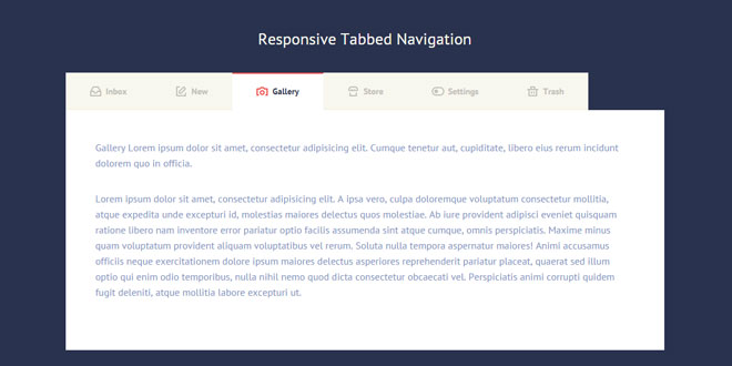
Tabbed navigations are very useful when you need to organize a considerable amount of side content. It’s very common to use tabs in a product page, for information like delivery options, product material info etc. Another use of tabs is in dashboards, where users need a quick way to switch from one panel to the other.
The code behind this snippet is very straightforward. Mostly CSS, plus a bit of jQuery to animate content height. The interesting point is the way we handled the user experience on small devices: in order to allow users to have as many buttons as they want, we decided to let the navigation scroll horizontally on small devices – instead of hiding it completely or firing a drop-down menu.
Source: codyhouse.co
1. INCLUDE JS FILES
<script src="js/jquery-2.1.1.js"></script>
<script src="js/main.js"></script> <!-- Resource jQuery -->
2. HTML
The HTML is structured in 2 unordered lists (.cd-tabs-navigation and .cd-tabs-content) – the first one is the navigation and the second one the content, both wrapped into the. cd-tabs div.
<div class="cd-tabs">
    <nav>
        <ul class="cd-tabs-navigation">
            <li><a data-content="inbox" class="selected" href="#0">Inbox</a></li>

            <li><!-- ... --></li>
        </ul> <!-- cd-tabs-navigation -->
    </nav>

    <ul class="cd-tabs-content">
        <li data-content="inbox" class="selected">
            <p>Inbox Lorem ipsum dolor sit amet, consectetur adipisicing elit. Earum recusandae rem animi accusamus quisquam reprehenderit sed voluptates, numquam, quibusdam velit dolores repellendus tempora corrupti accusantium obcaecati voluptate totam eveniet laboriosam?</p>

            <p>Inbox Lorem ipsum dolor sit amet, consectetur adipisicing elit. Earum recusandae rem animi accusamus quisquam reprehenderit sed voluptates, numquam, quibusdam velit dolores repellendus tempora corrupti accusantium obcaecati voluptate totam eveniet laboriosam?</p>
        </li>

        <li><!-- ... --></li>
    </ul> <!-- cd-tabs-content -->
</div> <!-- cd-tabs -->
3. CSS
We used CSS media queries to change the navigation positioning from horizontal to vertical, and vice versa. Since we embraced the mobile-first approach, the <nav> element has an overflow:auto to hide part of the unordered list – whose width is higher. Besides we used -webkit-overflow-scrolling: touch to have a smooth scrolling on touch devices – always applied to the <nav> element.

.cd-tabs nav {
    overflow: auto;
    -webkit-overflow-scrolling: touch;
    /*...*/
}
The rest of the CSS and the jQuery are pretty easy, you can download the source file and experimenting with them ;)
 JS Tutorial


