Download
User Rating: 0/5 ( 0 votes)
How many times did you have to deal with columns? And how often did you need layout that would be responsive? Pretty darn often, I bet. Fluid (responsive, adaptive) layout is today a default requirement when developing a website and, whether we want it or not, we somehow re-orient our thinking towards a tablet-like approach in working with website layouts.
So, the big deal is not making, let say, two columns with gaps between them and making them fluid (putting their width in percentage). The tricky part is when your designer drives you crazy with the fact that the gap is changing along with the browser size. In that situation, it is useless to explain that 2% of 900px is way different than 2% of 600px. In a situation like this, you need something that will calculate widths for you.
Unfortunately, CSS is not yet ready for that task, so advanced techniques like CSS columns or box-sizing are not the best solutions (yet!), because we still have our good old friend Internet Explorer with an army of users. All this means only one thing: javascript. Well, what is better for on-the-fly calculations on client side than good old JS?
Installation guide:
You will need the following:
1. jQuery core
2. grid system JS
3. some lines in CSS
4. proper HTML structure
As always, we will start by including jQuery core in your page:
<script src="//ajax.googleapis.com/ajax/libs/jquery/1.10.2/jquery.min.js"></script>
Next, include the gridSystem JS after the jQuery core:
<script src="js/gridSystem.js"></script>
Your JS is quite ready. Let us move to some HTML. Idea with column here is to have all elements organized in rows, so we will use container for each row, as:
<div class="row clearfix">
<div class="column column-1-3">1/3</div>
<div class="column column-2-3">2/3</div>
</div>
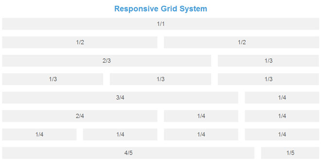
So, you will notice that we have, for each row, an element that surrounds its children. That is a div with class “row”. Inside of every row you have children and they have a generic class “column” as well as a specific class that will tell you how big it is, and whether it is “column-1-3″ – or “column-2-3″ in our case. Since this column system is made to support 6 columns, you can have all combinations of columns, from 1 to 6.
Initialization
Once you have JS included and HTML organized in a way you like, the only thing needed is to call the JS that will take care of your layout.
It is easy as:
$(document).ready(function() {

    $('body').gridSystem();

});
Our plugin gives you two options to change and you can use them:
$(document).ready(function() {

    $('body').gridSystem({
        gridGap: 20,
        widthThreshold: 640
    });

});
where parameters are, as you may guess:
gridGap: margin between elements (default value is 20)
widthThreshold: width of the viewport under which JS will consider devices as mobile and transform layout to one-column layout
Conclusion
This approach makes life much easier when you have to deal with columns and responsive layout. As always, it has some issues and the main one is that javascript needs some time to load, calculate and reposition elements, so for a moment after the page is loaded content may be messed. Of course, you can always find a way around it, but this is up to you.
Otherwise, the gridSystem plugin is there to help you calculate and deal with columns and I’m sure it will save you some headaches.
 JS Tutorial


