- Overview
- Documents
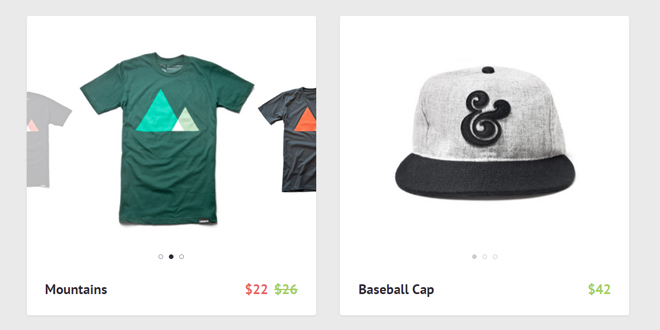
Product Preview Slider is an easy way to show more product images and variations right in the product gallery.
While you scroll through pages of products, you often base your decision to “know more” about a product on pictures only. Visual impact, in particular on mobile devices, is essential to everyone’s buying process.
What if a product is available in different colors? This is a piece of information generally not available to the user until he/she is willing to go to the product page. A different UX approach, the one of today’s resource, is to let the user interact with the product preview right in the main gallery page. A simple slider, to check product variations before jumping into the product page, could be a way to increase conversion rates.
Source: codyhouse.co
1. HTML
The HTML structure is an unordered list. Each list item contains a nested unordered list (with product images) and the product info (title and price).
<ul class="cd-gallery">
	<li>
		<a href="http://codyhouse.co/">
			<ul class="cd-item-wrapper">
				<li class="selected">
					<img src="img/ugmonk-tshirt-1.jpg" alt="Preview image">
				</li>

				<li class="move-right" data-sale="true" data-price="$22">
					<img src="img/ugmonk-tshirt-2.jpg" alt="Preview image">
				</li>

				<li>
					<img src="img/ugmonk-tshirt-3.jpg" alt="Preview image">
				</li>
			</ul> <!-- cd-item-wrapper -->
		</a>

		<div class="cd-item-info">
			<b><a href="#0">Mountains</a></b>

			<em class="cd-price">$26</em>
		</div> <!-- cd-item-info -->
	</li>

	<!-- other list items here -->
</ul> <!-- cd-gallery -->
Note that the .cd-dots elements (dots navigations for each product slider) and the .cd-new-price (new price if product is on sale) are not directly inserted in the html but created using jQuery.
2. CSS
On small screens, the product preview images are visible by default: we assume the user will see one product at a time so he/she won’t get distracted. User can then browse through them both by swiping or clicking on the preview images.
By default, the list items are in absolute position and translated on the right (outside their .cd-gallery parent) so they are not visible. We then declared 4 classes to properly style them: .selected (added to the first list item – main visible image), .move-right(added to the second list item – preview image on the right), .move-left (preview image on the left) and .hide-left (hidden items on the left).
.cd-item-wrapper li {
  position: absolute;
  top: 0;
  left: 25%;
  width: 50%;
  opacity: 0;
  transform: translateX(200%) scale(0.7);
}
.cd-item-wrapper li.selected {
  /* selected item */
  position: relative;
  opacity: 1;
  transform: translateX(0) scale(1.3);
}
.cd-item-wrapper li.move-right {
  /* item on right - preview visible */
  transform: translateX(100%) scale(0.7);
  opacity: 0.3;
}
.cd-item-wrapper li.move-left {
  /* item on left - preview visible */
  transform: translateX(-100%) scale(0.7);
  opacity: 0.3;
}
.cd-item-wrapper li.hide-left {
  /* items hidden on the left */
  transform: translateX(-200%) scale(0.7);
}
On bigger screens, user sees more products at a time so we decided to hide the preview images to assure a cleaner experience.
When user hovers over one of the product, we assume his focus is on that particular product so the preview images are shown. 3 additional classes have been declared: .hover(assigned to the preview item when user hovers over it), .focus-on-right, (assigned to the .selected and .move-left items when user hovers over the .move-right element) and .focus-on-left (assigned to the .selected and .move-right items when user hovers over the .move-left element).
@media only screen and (min-width: 1048px) {
  .cd-item-wrapper li.move-left,
  .cd-item-wrapper li.move-right {
    /* hide preview items */
    opacity: 0;
  }
  .cd-item-wrapper li.focus-on-left {
    /* class added to the .selected and .move-right items when user hovers over the .move-left item (item preview on the left) */
    transform: translateX(3%) scale(1.25);
  }
  .cd-item-wrapper li.focus-on-left.move-right {
    transform: translateX(103%) scale(0.7);
  }
  .cd-item-wrapper li.focus-on-right {
    /* class added to the .selected and .move-left items when user hovers over the .move-right item (item preview on the right) */
    transform: translateX(-3%) scale(1.25);
  }
  .cd-item-wrapper li.focus-on-right.move-left {
    transform: translateX(-103%) scale(0.7);
  }
  .cd-item-wrapper li.hover {
    /* class added to the preview items (.move-left or .move-right) when user hovers over them */
    opacity: 1;
  }
  .cd-item-wrapper li.hover.move-left {
    transform: translateX(-97%) scale(0.75);
  }
  .cd-item-wrapper li.hover.move-right {
    transform: translateX(97%) scale(0.75);
  }
}
3. EVENTS HANDLING
We used jQuery to implement the product image slider (with touch swipe navigation, previous/next and dots navigation).
Besides, we defined the updatePrice() function to update the product price (if on sale). This function checks if the selected item is on sale (data-sale="true") and, if that’s the case, adds the on-sale class to the .cd-price element (crossing line visible on the old price) and inserts a new .cd-new-price element (its text equals to the selected item data-price).
You can see the live effect in our demo on the t-shirt product.
function updatePrice(container, n) {
	//container -> each one of the $('.cd-gallery').children('li')
	//n -> index of the selected item in the .cd-item-wrapper
	var priceTag = container.find('.cd-price'),
		selectedItem = container.find('.cd-item-wrapper li').eq(n);
	if( selectedItem.data('sale') ) {
		// if item is on sale - cross old price and add new one
		priceTag.addClass('on-sale');
		var newPriceTag = ( priceTag.next('.cd-new-price').length > 0 ) ? priceTag.next('.cd-new-price') : $('<em class="cd-new-price"></em>').insertAfter(priceTag);
		newPriceTag.text(selectedItem.data('price'));
		setTimeout(function(){ newPriceTag.addClass('is-visible'); }, 100);
	} else {
		// if item is not on sale - remove cross on old price and sale price
		priceTag.removeClass('on-sale').next('.cd-new-price').removeClass('is-visible').on('webkitTransitionEnd otransitionend oTransitionEnd msTransitionEnd transitionend', function(){
			priceTag.next('.cd-new-price').remove();
		});
	}
}
 JS Tutorial


