Usage
Running the plugin is about as standard as it gets.
$('.tooltips').powerTip(options);
Where options is an object with the various settings you want to override (all defined below).
For example, if you want to attach tootips to all elements with the “info” class, and have those tooltip appear above and to the right of those elements you would use the following code:
$('.info').powerTip({
	placement: 'ne' // north-east tooltip position
});
Setting tooltip content
Generally, if your tooltips are just plain text then you probably want to set your tooltip text with the HTML title attribute on the elements themselves. This approach is very intuitive and backwards compatible. But there are several ways to specify the content.
Title attribute
The simplest method, as well as the only one that will continue to work for users who have JavaScript disabled in their browsers.
<a href="/some/link" title="This will be the tooltip text.">Some Link</a>
data-powertip
Basically the same as setting the title attribute, but using an HTML5 data attribute. You can set this in the markup or with JavaScript at any time. It only accepts a simple string, but that string can contain markup. This will also accept a function that returns a string.
$('#element').data('powertip', 'This will be the <b>tooltip text</b>.');
or
$('#element').data('powertip', function() {
	return 'This will be the <b>tooltip text</b>.';
});
or
<a href="/some/link" data-powertip="This will be the <b>tooltip text</b>.">Some Link</a>
data-powertipjq
This is a data interface that will accept a jQuery object. You can create a jQuery object containing complex markup (and even events) and attach it to the element via jQuery’s .data() method at any time. This will also accept a function that returns a jQuery object.
var tooltip = $('<div>This will be the tooltip text. It even has an onclick event!</div>');
tooltip.on('click', function() { /* ... */ });

$('#element').data('powertipjq', tooltip);
or
$('#element').data('powertipjq', function() {
	var tooltip = $('<div>This will be the tooltip text. It even has an onclick event!</div>');
	tooltip.on('click', function() { /* ... */ });
	return tooltip;
});
data-powertiptarget
You can specify the ID of an element in the DOM to pull the content from. PowerTip will replicate the markup of that element in the tooltip without modifying or destroying the original.
<div id="myToolTip">
	<p><b>Some Title</b></p>
	<p>This will be the tooltip text.</p>
	<p><a href="#">This link will be in the tooltip as well.</a></p>
</div>
$('#element').data('powertiptarget', 'myToolTip');
Options
The tooltip behavior is determined by a series of options that you can override. You can pass the options as an object directly to the plugin as an argument when you call it. For example:
$('.tips').powerTip({
	option1: 'value',
	option2: 'value',
	option3: 'value'
});
The settings will only apply to those tooltips matched in the selector. This means that you can have different sets of tooltips on the same page with different options. For example:
$('.tips').powerTip(/** options for regular tooltips **/);

$('.specialTips').powerTip(/** options for special tooltips **/);
You can change the default options for all tooltips by setting their values in the $.fn.powerTip.defaults object before you call powerTip(). For example:
// change the default tooltip placement to south
$.fn.powerTip.defaults.placement = 's';

$('.tips').powerTip(); // these tips will appear underneath the element
Of course those defaults will be overridden with any options you pass directly to the powerTip() call.
List of options
|
Name |
Default |
Type |
Description |
|
followMouse |
false |
Boolean |
If set to true the tooltip will follow the users mouse cursor. |
|
mouseOnToPopup |
false |
Boolean |
Allow the mouse to hover on the tooltip. This lets users interact with the content in the tooltip. Only works if followMouse is set to false. |
|
placement |
'n' |
String |
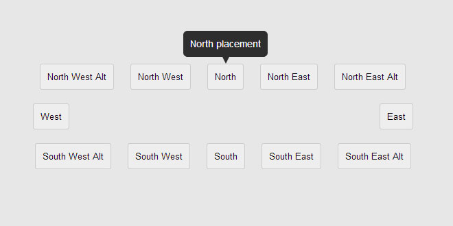
Placement location of the tooltip relative to the element it is open for. Values can be n, e, s, w, nw, ne, sw, se, nw-alt, ne-alt, sw-alt, orse-alt (as in north, east, south, and west). This only matters iffollowMouse is set to false. |
|
smartPlacement |
false |
Boolean |
When enabled the plugin will try to keep tips inside the browser view port. If a tooltip would extend outside of the view port then its placement will be changed to an orientation that would be entirely within the current view port. Only applies if followMouse is set to false. |
|
popupId |
'powerTip' |
String |
HTML id attribute for the tooltip div. |
|
offset |
10 |
Number |
Pixel offset of the tooltip. This will be the offset from the element the tooltip is open for, or from from mouse cursor if followMouse is true. |
|
fadeInTime |
200 |
Number |
Tooltip fade-in time in milliseconds. |
|
fadeOutTime |
100 |
Number |
Tooltip fade-out time in milliseconds. |
|
closeDelay |
100 |
Number |
Time in milliseconds to wait after mouse cursor leaves the element before closing the tooltip. This serves two purposes: first, it is the mechanism that lets the mouse cursor reach the tooltip (cross the gap between the element and the tooltip div) for mouseOnToPopup tooltips. And, second, it lets the cursor briefly leave the element and return without causing the whole fade-out, intent test, and fade-in cycle to happen. |
|
intentPollInterval |
100 |
Number |
Hover intent polling interval in milliseconds. |
|
intentSensitivity |
7 |
Number |
Hover intent sensitivity. The tooltip will not open unless the number of pixels the mouse has moved within the intentPollInterval is less than this value. These default values mean that if the mouse cursor has moved 7 or more pixels in 100 milliseconds the tooltip will not open. |
|
manual |
false |
Boolean |
If set to true then PowerTip will not hook up its event handlers, letting you create your own event handlers to control when tooltips are shown (using the API to open and close tooltips). |
PowerTip includes some base CSS that you can just add to your site and be done with it, but you may want to change the styles or even craft your own styles to match your design. PowerTip is specifically designed to give you full control of your tooltips with CSS, with just a few basic requirements.
I recommend that you either adapt one of the base stylesheets to suit your needs or override its rules so that you don’t forget anything.
Important notes:
-
The default id of the PowerTip element is powerTip. But this can be changed via the popupId option.
-
The PowerTip element is always a direct child of body, appended after all other content on the page.
-
The tooltip element is not created until you run powerTip().
-
PowerTip will set the display, visibility, opacity, top, left, right, and bottom properties using inline styles.
CSS requirements
The bare minimum that PowerTip requires to work is that the #powerTip element be given absolute positioning and set to not display. For example:
#powerTip {
	position: absolute;
	display: none;
}
CSS recommendations
High z-index
You will want your tooltips to display over all other elements on your web page. This is done by setting the z-index value to a number greater than the z-index of any other elements on the page. It’s probably a good idea to just set the z-index for the tooltip element to the maximum integer value (2147483647). For example:
#powerTip {
	z-index: 2147483647;
}
CSS arrows
You probably want to create some CSS arrows for your tooltips (unless you only use mouse-follow tooltips). This topic would be an article unto itself, so if you want to make your own CSS arrows from scratch you should just Google “css arrows” to see how it’s done.
CSS arrows are created by using borders of a specific color and transparent borders. PowerTip adds the arrows by creating an empty :before pseudo element and absolutely positioning it around the tooltip.
It is important to note that if you increase the size of the tooltip arrows and want users to be able to interact with the tooltip content via the mouseOnToPopup option then you will probably need to increase the closeDelay option to provide enough time for the cursor to cross the gap between the element and the tooltip div.
Fixed width
It is recommend, but not required, that tooltips have a static width. PowerTip is designed to work with elastic tooltips, but it can look odd if you have huge tooltips so it is probably best for you to set a width on the tooltip element or (if you have short tooltip text) disable text wrapping. For example:
#powerTip {
	width: 300px;
}
or
#powerTip {
	white-space: nowrap;
}
API
There are times when you may need to open or close a tooltip manually. To make this possible PowerTip exposes a couple of API methods on the $.powerTip object.
|
Method |
Description |
|
show(element, event) |
This function will force the tooltip for the specified element to open. You pass it a jQuery object with the element that you want to show the tooltip for. If the jQuery object you pass to this function has more than one matched elements then only the first element will show its tooltip. You can also pass it the event (a $.Event) with the pageX and pageY properties for mouse tracking. |
|
hide(element, immediate) |
Closes any open tooltip. You do not need to specify which tooltip you would like to close (because there can be only one). If you set immediate to true there will be no close delay. |
|
reposition(element) |
Repositions an open tooltip on the specified element. Use this if the tooltip or the element it opened for has changed its size or position. |
|
destroy(element) |
This will destroy and roll back any PowerTip instance attached to the matched elements. |
You can also pass the API method names as strings to the powerTip() function. For example$('#element').powerTip('show'); will cause the matched element to show its tooltip.
Examples
// run powertip on submit button
$('#submit').powerTip();

// open tooltip for submit button
$.powerTip.show($('#submit'));

// close (any open) tooltip
$.powerTip.hide();
PowerTip Events
PowerTip will trigger several events during operation that you can bind custom code to. These events make it much easier to extend the plugin and work with tooltips during their life cycle. Using events should not be needed in most cases, they are provided for developers who need a deeper level of integration with the tooltip system.
List of events
|
Event Name |
Description |
|
powerTipPreRender |
The pre-render event happens before PowerTip fills the content of the tooltip. This is a good opportunity to set the tooltip content data (e.g. data-powertip, data-powertipjq). |
|
powerTipRender |
Render happens after the content has been placed into the tooltip, but before the tooltip has been displayed. Here you can modify the tooltip content manually or attach events. |
|
powerTipOpen |
This happens after the tooltip has completed its fade-in cycle and is fully open. You might want to use this event to do animations or add other bits of visual sugar. |
|
powerTipClose |
Occurs after the tooltip has completed its fade-out cycle and fully closed, but the tooltip content is still in place. This event is useful do doing cleanup work after the user is done with the tooltip. |
Using events
You can use these events by binding to them on the element(s) that you ran powerTip() on, the recommended way to do that is with the jQuery on() method. For example:
$('.tips').on({
	powerTipPreRender: function() {
		console.log('powerTipRender', this);

		// generate some dynamic content
		$(this).data('powertip' , '<h3 class="title">Default title</h3><p>Default content</p>');
	},
	powerTipRender: function() {
		console.log('powerTipRender', this);

		// change some content dynamically
		$('#powerTip').find('.title').text('This is a dynamic title.');
	},
	powerTipOpen: function() {
		console.log('powerTipOpen', this);

		// animate something when the tooltip opens
		$('#powerTip').find('.title').animate({ opacity: .1 }, 1000).animate({ opacity: 1 }, 1000);
	},
	powerTipClose: function() {
		console.log('powerTipClose', this);

		// cleanup the animation
		$('#powerTip').find('.title').stop(true, true);
	}
});
 JS Tutorial


