- Overview
- Documents
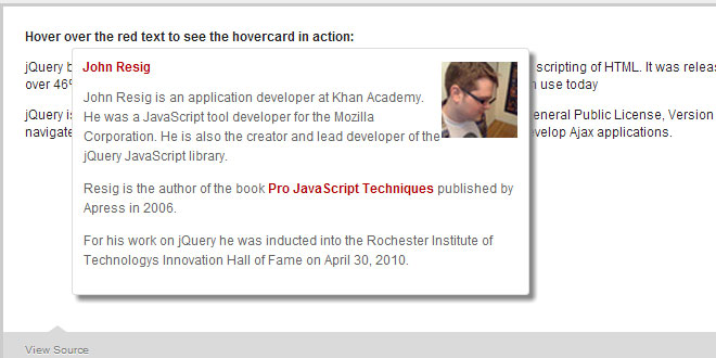
A free light weight jQuery plugin that enables you to display related information with the hovered label, link, or any html element of your choice. A hovercard can be useful when displaying Person bio, Book author and price, loading related information with Ajax and Editing in place. You may also add your own custom data source and display the profile data using existing card format.
What is so cool about this plugin!
- Smoothly fades the name into a hovered card (in place).
- Uses minimum css and no external stylesheets to download.
- Full control over html to be displayed.
- Comes with built in Twitter and Facebook hovercard.
- Supports callback functions on hover in and hover out.
- New! Auto adjust on the edges of viewport
How to use:
Following is a very basic example of how to use hovercard. You can also check out live demos with the source for each.
//html---
<p>
jQuery by <label id="demo-basic">John Resig</label> is a cross-browser JS library
designed to simplify the client-side scripting of HTML. It was released
in January of 2006 at BarCamp NYC. Used by over 46% of the 10,000 most
visited websites, it's the most popular JavaScript library in use today.
</p>
//plugin script---
<script type="text/javascript">
$(document).ready(function () {
    var hoverHTMLDemoBasic = '<p>' +
        'John Resig is an application developer at Khan Academy.
            He was a ' +
        'JavaScript tool developer for the Mozilla Corporation.
            He is also the' +
        'creator and lead developer of the jQuery JavaScript
            library.<p>';

    $("#demo-basic").hovercard({
        detailsHTML: hoverHTMLDemoBasic,
        width: 400,
        cardImgSrc: 'http://ejohn.org/files/short.sm.jpg'
    });
});
</script>
Plugin Options:
Width in px for the hovercard i.e. 400, or 400px.
By default hovercard tries to expand towards right. And If there isn't enough available viewport on right, the plugin adjusts itself to open on left. Set 'openOnLeft' to true if want the hovercard to always open on left.
By default hovercard tries to expand towards bottom. And If there isn't enough available viewport on below, the plugin adjusts itself to open on top. Set 'openOnTop' to true if want the hovercard to always open on top. See demo on jsFiddle.
The hovercard has an optional placeholder for one default image with a width of 70px. This image is positioned on top right for hovercard opening on right, and top left for hovercard opening on left.
You can write any html markup (with your classes or ids) for your hovercard details. Or even a simple string would do! There will be no styles added by the plugin to this section of html. This gives you the flexibility to use the hovercard for anything you want. Make it an in place editor, use ajax, show tweets, flicker images etc. This is your html, do whatever!
Background for your hovercard. You can use the css shorthand notation for setting backgrounds
i.e. background: #CCCCCC; or background: transparent url('your-background-image.jpg') no-repeat 0 0 scroll;
Callback function when you hover in over the label (or any element) you are using hovercard for.
Callback function when you are hovered out from the hovercard.
Displays a built in twitter card format for a twitter screenname. Maximum 150 twitter lookup per hour. The plugin only makes one twitter request (when first hovered) for each hovercard, avoiding subsequent lookups.
Note: When using TwitterCard or FacebookCard with detailsHTML, Twitter or Facebook profile data is added before details HTML.
Twitter screen name for the hovercard.
If no username/screenname or data-hovercard is provided, hovercard attempts to look up for hovered text.
Displays a built in facebook card format for a facebook username/pages/events etc. Works best with Facebook pages.
Facebook username/id/page/event/group/etc. for the hovercard. Like twitterScreename, you can also provide the facebook username by adding a 'data-hovercard' attribute with the hovered label/link etc. Read data-hovercard details under twitterScreenName option. If no username/pagename/id/etc. is provided either by data-hovercard or in options, hovercard attempts to look up for hovered text.
You may now add your own custom data source and display the profile data using existing card format. Couple of ways to use this:
<label data-hovercard="http://yourwebsite.com/user/id/911" class="hoverme" >
    User with id 911!
</label>
$('.hoverme').hovercard({
    showCustomCard: true
});
Note: The remote data url should return the specific JSON format as shown in the next example.
<label class="hoverme" > My Name! </label>

//Required JSON format with both local or remote data source:
var myProfile = {
    "name": "My profie name",
    "image": "url_for_my_profile_image.jpg",
    "link": "http://www.aboutmelink.com/",
    "bio": "My bio or short description here",
    "website": "http://mywebsite.com",
    "email": "[email protected]"
}

$('.hoverme').hovercard({
    showCustomCard: true,
    customCardJSON: myProfile
});
Check this working example of showCustomCard on jsFiddle.
Provide the local json data to display with showCustomCard. See showCustomCard explanation on how to use this.
Add a delay in hovercard appearance.
Turn off the plugin's auto adjustment feature.
 JS Tutorial


