- Overview
- Documents
- Demos
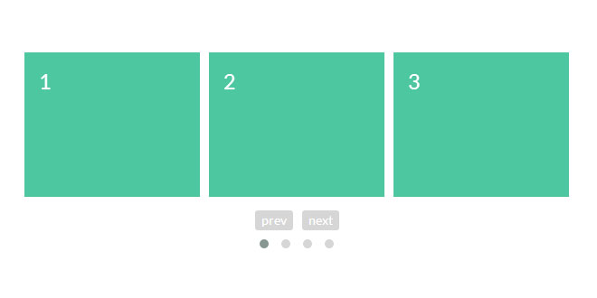
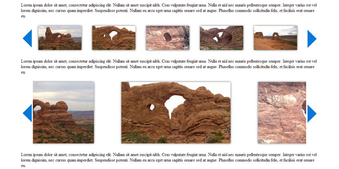
Owl Carousel 2 is a Touch enabled jQuery plugin that lets you create beautiful responsive carousel slider.
Features:
Fully Customisable
Over 60 options. Easy for novice users and even more powerful for advanced developers.
Touch and Drag Support
Designed specially to boost mobile browsing experience. Mouse drag works great on desktop too!
Fully Responsive
Almost all options are responsive and include very intuitive breakpoints settings.
Modern Browsers
Owl uses hardware acceleration with CSS3 Translate3d transitions. Its fast and works like a charm!
Zombie Browsers
CSS2 falback supported for older browser.
Modules and Plugins
Owl Carousel supports plugin modular structure. Therefore, you can dettach plugins that you wont use on project or create new ones that fit your needs
Source: owlcarousel.owlgraphic.com
1. INCLUDE CSS AND JS FILES
<link rel="stylesheet" href="owlcarousel/owl.carousel.min.css">
<link rel="stylesheet" href="owlcarousel/owl.theme.default.min.css">
<script src="jquery.min.js"></script>
<script src="owlcarousel/owl.carousel.min.js"></script>
2. HTML
<!-- Set up your HTML -->
<div class="owl-carousel">
  <div> Your Content </div>
  <div> Your Content </div>
  <div> Your Content </div>
  <div> Your Content </div>
  <div> Your Content </div>
  <div> Your Content </div>
  <div> Your Content </div>
</div>
3. JAVASCRIPT
$(document).ready(function(){
  $(".owl-carousel").owlCarousel();
});
4. OPTIONS
items: The number of items you want to see on the screen.
Type: Number
Default: 3
margin: margin-right(px) on item.
Type: Number
Default: 0
loop: Inifnity loop. Duplicate last and first items to get loop illusion.
Type: Boolean
Default: false
center: Center item. Works well with even an odd number of items.
Type: Boolean
Default: false
mouseDrag: Mouse drag enabled.
Type: Boolean
Default: true
touchDrag: Touch drag enabled.
Type: Boolean
Default: true
pullDrag: Stage pull to edge.
Type: Boolean
Default: true
freeDrag: Item pull to edge.
Type: Boolean
Default: false
stagePadding: Padding left and right on stage (can see neighbours).
Type: Number
Default: 0
merge: Merge items. Looking for data-merge='{number}' inside item.
Type: Boolean
Default: false
mergeFit: Fit merged items if screen is smaller than items value.
Type: Boolean
Default: true
autoWidth: Set non grid content. Try using width style on divs.
Type: Boolean
Default: false
startPosition: Start position or URL Hash string like '#id'.
Type: Number/String
Default: 0
URLhashListener: Listen to url hash changes. data-hash on items is required.
Type: Boolean
Default: false
nav: Show next/prev buttons.
Type: Boolean
Default: false
navRewind: Go to first/last.
Type: Boolean
Default: true
navText: HTML allowed.
Type: Array
Default: ['next','prev']
slideBy: Navigation slide by x. 'page' string can be set to slide by page.
Type: Number/String
Default: 1
dots: Show dots navigation.
Type: Boolean
Default: true
dotsEach: Show dots each x item.
Type: Number/Boolean
Default: false
dotData: Used by data-dot content.
Type: Boolean
Default: false
lazyLoad: Lazy load images. data-src and data-src-retina for highres. Also load images into background inline style if element is not <img>
Type: Boolean
Default: false
lazyContent: lazyContent was introduced during beta tests but i removed it from the final release due to bad implementation. It is a nice options so i will work on it in the nearest feature.
Type: Boolean
Default: false
autoplay: Autoplay.
Type: Boolean
Default: false
autoplayTimeout: Autoplay interval timeout.
Type: Number
Default: 5000
autoplayHoverPause: Pause on mouse hover.
Type: Boolean
Default: false
smartSpeed: Speed Calculate. More info to come.
Type: Number
Default: 250
fluidSpeed: Speed Calculate. More info to come.
Type: Boolean
Default: Number
autoplaySpeed: autoplay speed.
Type: Number/Boolean
Default: false
navSpeed: Navigation speed.
Type: Number/Boolean
Default: false
dotsSpeed: Pagination speed.
Type: Boolean
Default: Number/Boolean
dragEndSpeed: Drag end speed.
Type: Number/Boolean
Default: false
callbacks: Enable callback events.
Type: Boolean
Default: true
responsive: Object containing responsive options. Can be set to false to remove responsive capabilities.
Type: Object
Default: empty object
responsiveRefreshRate: Responsive refresh rate.
Type: Number
Default: 200
responsiveBaseElement: Set on any DOM element. If you care about non responsive browser (like ie8) then use it on main wrapper. This will prevent from crazy resizing.
Type: DOM element
Default: window
responsiveClass: Optional helper class. Add 'owl-reponsive-' + 'breakpoint' class to main element. Can be used to stylize content on given breakpoint.
Type: Boolean
Default: false
video: Enable fetching YouTube/Vimeo videos.
Type: Boolean
Default: false
videoHeight: Set height for videos.
Type: Number/Boolean
Default: false
videoWidth: Set width for videos.
Type: Number/Boolean
Default: false
animateOut: CSS3 animation out.
Type: String/Bolean
Default: false
animateIn: CSS3 animation in.
Type: String/Bolean
Default: false
fallbackEasing: Easing for CSS2 $.animate.
Type: String
Default: swing
info: Callback to retrieve basic information (current item/pages/widths). Info function second parameter is Owl DOM object reference.
Type: Function
Default: false
nestedItemSelector: Use it if owl items are deep nasted inside some generated content. E.g 'youritem'. Dont use dot before class name.
Type: String/Class
Default: false
itemElement: DOM element type for owl-item.
Type: String
Default: div
stageElement: DOM element type for owl-stage.
Type: String
Default: div
navContainer: Set your own container for nav.
Type: String/Class/ID/Bolean
Default: false
dotsContainer: Set your own container for nav.
Type: String/Class/ID/Bolean
Default: false
5. EVENTS
initialize.owl.carousel: When the plugin initializes.
Type: attachable
Callback: onInitialize
initialized.owl.carousel: When the plugin has initialized.
Type: attachable
Callback: onInitialized
resize.owl.carousel: When the plugin gets resized.
Type: attachable
Callback: onResize
resized.owl.carousel: When the plugin has resized.
Type: attachable
Callback: onResized
refresh.owl.carousel: When the plugin refreshes.
Type: attachable, cancelable, triggerable
Callback: onRefresh
Parameter: [event, speed]
refreshed.owl.carousel: When the plugin has refreshed.
Type: attachable
Callback: onRefreshed
update.owl.carousel
Type: attachable
Callback: onUpdate
on classes update.
updated.owl.carousel: on classes update.
Type: attachable
Callback: onUpdated
drag.owl.carousel: When the dragging of an item has started.
Type: attachable
Callback: onDrag
dragged.owl.carousel: When the dragging of an item has finished.
Type: attachable
Callback: onDragged
translate.owl.carousel: When the translation of the stage starts.
Type: attachable
Callback: onTranslate
translated.owl.carousel: When the translation of the stage has finished.
Type: attachable
Callback: onTranslated
animateto.owl.carousel: When the position changes.
Type: attachable
Callback: onAnimateto
changed.owl.carousel: When something has changed.
Type: attachable
Callback: onChanged
next.owl.carousel: Goes to next item.
Type: triggerable
Parameter: [speed]
prev.owl.carousel: Goes to previous item.
Type: triggerable
Parameter: [speed]
to.owl.carousel: Goes to postion.
Type: triggerable
Parameter: [position, speed]
destroy.owl.carousel: Destroys carousel.
Type: triggerable
replace.owl.carousel: Removes current content and add a new one passed in the parameter.
Type: triggerable
Parameter: data
add.owl.carousel: Adds a new item on a given position.
Type: triggerable
Parameter: [data, position]
remove.owl.carousel: Removes an item from a given position.
Type: triggerable
Parameter: position
play.owl.autoplay: Runs autoplay.
Type: triggerable
Parameter: [timeout, speed]
stop.owl.autoplay: Stops autoplay.
Type: triggerable
load.owl.lazy: When lazy image loads.
Type: attachable
Callback: onLoadLazy
loaded.owl.lazy: When lazy image has loaded.
Type: attachable
Callback: onLoadedLazy
stop.owl.video: When video has unloaded.
Type: attachable
Callback: onStopVideo
play.owl.video: When video has loaded.
Type: attachable
Callback: onPlayVideo
6. CLASSES
This is an example of how html is rendered. With the following options you can change almost every class the way you want
<div class="owl-carousel owl-theme owl-loaded">
    <div class="owl-stage-outer">
        <div class="owl-stage">
            <div class="owl-item">...</div>
            <div class="owl-item">...</div>
            <div class="owl-item">...</div>
        </div>
    </div>
    <div class="owl-controls">
        <div class="owl-nav">
            <div class="owl-prev">prev</div>
            <div class="owl-next">next</div>
        </div>
        <div class="owl-dots">
            <div class="owl-dot active"><span></span></div>
            <div class="owl-dot"><span></span></div>
            <div class="owl-dot"><span></span></div>
        </div>
    </div>
</div>
themeClass: Theme Class.
Type: Class/String
Default: owl-theme
baseClass: Base element Class.
Type: Class/String
Default: owl-carousel
itemClass: Item Class.
Type: Class/String
Default: owl-item
centerClass: Center Class.
Type: Class/String
Default: center
activeClass: Active Class.
Type: Class/String
Default: active
navContainerClass: Nav container Class.
Type: Class/String
Default: owl-nav
navClass: Nav buttons Classes.
Type: Array/Class/String
Default: ['owl-prev','owl-next']
controlsClass: Controls Class - wrapper for navs and dots.
Type: Class/String
Default: owl-controls
dotClass: Dot Class.
Type: Class/String
Default: owl-dot
dotsClass: Dots Class - Container for dots..
Type: Class/String
Default: owl-dots
autoHeightClass: Auto height Class.
Type: Class/String
Default: owl-height
 JS Tutorial


