1. INCLUDE JS AND CSS FILES
<!-- jQuery or Zepto -->
<script src="jquery / zepto.js"></script>

<!-- The noUiSlider script and stylesheet -->
<link href="jquery.nouislider.css" rel="stylesheet">
<script src="jquery.nouislider.js"></script>
2. HTML
<div id="range-slider"></div>
3. JAVASCRIPT
$("#range-slider").noUiSlider({
	start: 40,
	range: {
		'min': 0,
		'max': 100
	}
});
4. OPTIONS
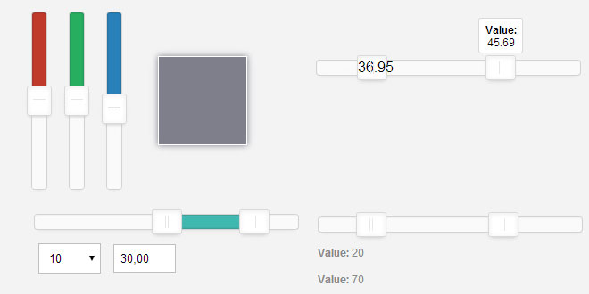
Start: The start option sets the number of handles and their start positions, relative to range.
Default: none
Accepted values: number, array[number], array[number, number]
$("#slider-start").noUiSlider({
	start: [20, 80],
	range: {
		'min': [ 0 ],
		'max': [ 100 ]
	}
});
Connect: The connect setting can be used to control the bar between the handles, or the edges of the slider. Use "lower" to connect to the lower side, or "upper" to connect to the upper side. Setting truesets the bar between the handles.
Default: false
Accepted values: "lower", "upper", true, false
$("#slider-connect").noUiSlider({
	start: 40,
	connect: "lower",
	range: {
	  'min': 0,
	  'max': 100
	}
});
Margin: When using two handles, the minimum distance between the handles can be set using the margin option. The margin value is relative to the value set in 'range'. This option is only available on standard linear sliders.
Default: none
Accepted values: number
$("#slider-margin").noUiSlider({
	start: [ 20, 80 ],
	margin: 30,
	range: {
		'min': 0,
		'max': 100
	}
});
Step: By default, the slider slides fluently. In order to make the handles jump between intervals, you can use this option. The step option is relative to the values provided to range.
Default: none
Accepted values: number
$("#slider-step").noUiSlider({
	start: [ 20, 80 ],
	step: 10,
	range: {
	  'min': 0,
	  'max': 100
	}
});
Orientation: The orientation setting can be used to set the slider to"vertical" or "horizontal"
Default: "horizontal"
Accepted values: "vertical", "horizontal"
$("#slider-vertical").noUiSlider({
	start: 40,
	orientation: "vertical",
	range: {
		'min': 0,
		'max': 100
	}
});
Direction: By default the sliders are top-to-bottom and left-to-right, but you can change this using the direction option, which decides where the upper side of the slider is.
Default: "ltr"
Accepted values: "ltr", "rtl"
$("#slider-direction").noUiSlider({
	start: 20,
	direction: "rtl",
	range: {
		'min': 0,
		'max': 100
	}
});
5. EVENTS
noUiSlider offers several ways to listen to interaction: 'change', 'set' and 'slide'. You can use these events all at the same time.
Slide
This event is useful when you want to update a value or perform an actions every time a handle is dragged. For example, you can use the 'slide' event to update graphs. For convenience, this function also fires on a change by 'tap'.
Alternative available.noUiSlider has a powerful serialization feature, which probably does everything you need slide for, such as displaying numbers in text labels or input fields. Additionally, it can also format the slider output. Read more about serialization.
Set
Whenever a slider is changed to a new value, this event is fired. This function will trigger every time a slider stops changing, optionally even on calls to the .val()method. Because this creates the hazard of an infinite loop, any .val() call will have to explicitly request this event. You can consider this 'end of slide'.
// Won't trigger the 'set' callback:
$('.slider').val(30);

// Will trigger the 'set' callback:
$('.slider').val(30, { set: true });
Change
This event is great when you use the slider as 'just-another-input-type'. When your slider is part of a form, you can keep listening to the form change events, without using any events specific to the slider.
 JS Tutorial


