Download
Demo
- Overview
- Documents
User Rating: 4.6/5 ( 8 votes)
Your Rating:
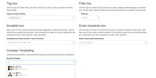
MagicSuggest is a jquery pluagin that makes multiple selection combobox built for bootstrap themes.
Source: nicolasbize.com
1. INCLUDE CSS AND JS FILES
<link href="lib/bootstrap/css/bootstrap.min.css" rel="stylesheet">
<link href="assets/magicsuggest/magicsuggest-min.css" rel="stylesheet">
<script src="https://ajax.googleapis.com/ajax/libs/jquery/1.11.0/jquery.min.js"></script>
<script src="lib/bootstrap/js/bootstrap.min.js"></script>
<script src="assets/magicsuggest/magicsuggest-min.js"></script>
2. HTML
<div id="magicsuggest"></div>
3. JAVASCRIPT
$(function() {
    $('#magicsuggest').magicSuggest({
        [...] // configuration options
    });
});
4. OPTIONS
allowFreeEntries: allows the user to enter non-suggested entries.
type: boolean
default: true
since: 1.0
autoSelect: automatically selects a result if only one match is found.
type: boolean
default: true
since: 1.0
cls: specifies an additional CSS class to apply to the container element.
type: string
default: ''
since: 1.0
data: provides the entries to fill up the combo box.
type: object
default: null
since: 1.0
dataUrlParams: adds additionals parameters given to the ajax call.
type: object
default: {}
since: 1.2
jayesbee
disabled: initializes the combo in a disabled state.
type: boolean
default: false
since: 1.0
displayField: specifies the JSON property to be used for display.
type: string
default: 'name'
since: 1.0
editable: enables or prevents keyboard interaction.
type: boolean
default: true
since: 1.0
expanded: sets the starting state for the combo.
type: boolean
default: false
since: 1.0
expandOnFocus: automatically expands the combo upon focus.
type: boolean
default: false
since: 1.0
groupBy: specifies the JSON property to be used for grouping.
type: string
default: null
since: 1.1
hideTrigger hides the right trigger.
type: boolean
default: false
since: 1.0
highlight: emphasizes the typed text in the combo's suggestions.
type: boolean
default: true
since: 1.0
id: gives the component a specific identifier.
type: string
default: null
since: 1.1
infoMsgCls: adds a class to the information text.
type: string
default: ''
since: 1.1
inputCfg: adds properties to the input dom element.
type: object
default: {}
since: 1.1
invalidCls: specifies the class to be used to style an invalid entry.
type: string
default: 'ms-inv'
since: 1.0
matchCase: filters data using case sensitivity.
type: boolean
default: false
since: 1.0
maxDropHeight: defines how tall the expanded combobox can be.
type: integer
default: 290
since: 1.0
maxEntryLength: defines the max number of characters for free entries.
type: integer
default: null
since: 1.1
maxEntryRenderer: sets the helper message for entries that are too long.
type: function
default: [...]
since: 1.1
maxSuggestions: defines how many items the combo box can display at once.
type: integer
default: null
since: 1.0
maxSelection: sets the limit of items that can be selected.
type: integer
default: 10
since: 1.0
method: sets the HTTP protocol method.
type: string
default: 'post'
since: 1.1
minChars: defines the minimum amount of characters before expanding the combo.
type: integer
default: 0
since: 1.0
minCharsRenderer: sets the helper message for input that is too short.
type: function
default: [...]
since: 1.1
name: used in the current form.
type: string
default: null
since: 1.2
iambibhas
noSuggestionText is the text displayed when no match is found.
type: string
default: '...'
since: 1.1
placeholder is the text displayed when the combo is empty.
type: string
default: [...]
since: 1.0
renderer will format the combo's results with custom HTML.
type: function
default: null
since: 1.1
required ensures that at least one selection has been made.
type: boolean
default: false
since: 1.1
resultAsString displays the selection as comma separated values.
type: boolean
default: false
since: 1.1
resultsField specifies the JSON property that contains the suggestions data.
type: string
default: 'results'
since: 1.0
selectionCls modifies the way selections look.
type: string
default: ''
since: 1.0
selectionPosition defines where the selected items should be rendered.
type: string
default: 'inner'
since: 1.0
selectionRenderer defines how the selected items should be displayed.
type: function
default: null
since: 1.3
selectionStacked will stack the selection vertically.
type: boolean
default: false
since: 1.0
sortDir sorts data in a given direction.
type: string
default: 'asc'
since: 1.0
sortOrder sorts data according to a given property field.
type: string
default: null
since: 1.0
strictSuggest: filters out entries that do not start with the given input.
type: boolean
default: false
since: 1.3
style: adds inline CSS to the component's container.
type: string
default: ''
since: 1.1
toggleOnClick: expands the component when clicked upon.
type: boolean
default: false
since: 1.3
psulek
typeDelay: sets the time in ms before triggering AJAX calls.
type: integer
default: 400
since: 1.2
jayesbee
useTabKey: makes Tab behave like Enter.
type: boolean
default: false
since: 1.0
useCommaKey makes Comma behave like Enter.
type: boolean
default: false
since: 1.0
useZebraStyle renders odd lines with more shades of grey.
type: boolean
default: false
since: 1.0
value sets an initial value.
type: object
default: null
since: 1.0
valueField specifies the JSON property to be used for value.
type: string
default: 'id'
since: 1.0
vregex regulates the type of entries set.
type: regex
default: null
since: 2.0
vtype requires an entry to match a given type.
type: string
default: null
since: 2.0
5. METHODS
addToSelection([object] objs, [boolean] silent) adds items to the selection.
clear([boolean] silent) the selection.
collapse([boolean] silent) the combo.
disable() the combo.
empty() what the user was typing.
enable() the combo.
expand() the component.
getData() returns the combo suggestions.
return array
foglerek
isDisabled() returns the status of the component.
return boolean
isValid() checks if the selection is valid.
return boolean
getDataUrlParams() returns the list of extra URL paramaters set for AJAX requests.
return object
getName() returns the name used for HTML form submission.
return string
getSelection() returns an array of selected JSON objects.
return array
getRawValue() returns the current text being entered by the user.
return string
getValue() returns an array containing only the selected JSON values.
return array
removeFromSelection([object] objs, [boolean] silent) removes items from the selection.
setData([array] cbItems) sets the objects listed in the combo.
travishaagen
setName([string] name) sets the name to be used for form submission.
setSelection(object[]) sets the selection with a given array of objects.
setValue([array] ids) sets the selection according to given values.
setDataUrlParams([object] params) sets extra parameters for AJAX requests.
6. EVENTS
beforeload(e, this) is fired before the AJAX request is performed.
blur(e, this) is fired when the component looses focus.
collapse(e, this) is fired when the combo is collapsed.
expand(e, this) is fired when the combo is expanded.
focus(e, this) is fired when the combo gains focus.
keydown(e, this, keyevent) is fired when the user presses a key.
keyup(e, this, keyevent) is fired when the user releases a key.
load(e, this, records[]) is fired when the AJAX request has been performed.
selectionchange(e, this, records[]) is fired when the user has changed the selection.
triggerclick(e, this) is fired when the user has changed the selection.
 JS Tutorial


