- Overview
- Documents
Looper.js
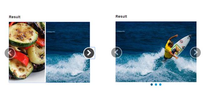
Cycle through your content without writing a single line of Javascript. To keep things simple, transition effects are optional and have been limited to slide and cross-fade. In browsers that don't support CSS transitions, jQuery's animate is used.
Key Features
- No coding required
- Fully accessible with ARIA attributes, tab focus and keyboard navigation
- LESS support with configuration variables
- Easily extensible through events
Known Browser Compatibility
- IE 8+
- Chrome
- Firefox
- Safari
Setup
Before getting started, make sure everything is setup properly. Below is a basic HTML template to use as an example for including the plugin into your projects.
Attention! This is just an example and contains the minimum requirements for including Looper.js into your project. All ./path/toreferences need to be replaced with proper paths.
To initialize a plugin instance, simply add data-looper="go" to your element. Be sure to add the looper class for proper styling.
Plugin instances are stored in the looperjs key on each element's data store and can easily be accessed by using jQuery's datamethod.
Options can be passed via data attributes or JavaScript. For data attributes, append the option name to data-, as in data-interval="3000".
When to pause the auto-loop. Set to false to disable.
All methods can be executed with the data-looper attribute and require a data-target or href attribute whose value must correspond to the ID of a Looper.js element. See below for examples.
Initializes an instance with an optional options object.
Starts/resumes the auto-loop.
Via data attribute
Pause the auto-loop.
Via data attribute
Show the next item.
Via data attribute
Show the previous item.
Via data attribute
Show the item at the specified position.
Be aware! The position argument is one-based. A value of 1 corresponds to the first item. Negative, zero and out-of-range positions will be ignored.
Via data attribute
The data-args attribute is used to pass arguments to a method.
Fires before a new item is shown.
Use e.preventDefault() on this event to cancel the showing of an item.
Fired after a new item has been shown.
Items can be shown with a sliding and/or cross-fade effect. To apply a transition, simply add the proper CSS class. For a sliding transition, add slide. For a cross-fade effect, add xfade. The slide transition has 3 optional classes: right, up and down. Each optional class corresponds to the sliding direction.
Images for these examples are provided by the amazing lorempixel service.
The following example will auto-loop through items at the specified duration without a transition.
This example will auto-loop through items with a slide transition.
<!DOCTYPE html>
<html>
<head>
    <title>Looper.js</title>
    <meta charset="utf-8">
    <link rel="stylesheet" href="./path/to/looper.css">
</head>
<body>
    <!-- Your HTML goes here -->
    <script src="./path/to/jquery.js"></script>
    <script src="./path/to/looper.js"></script>
</body>
</html>
Via data attributes
<div data-looper="go" class="looper">
    ...
</div>
Via Javascript
$('.looper').looper();
Accessing instances
var myLooper = $('.looper').data('looperjs');
Options
Name
Type
Default
Description
interval
number
5000
The amount of time (in milliseconds) to display an item. To disable the auto-loop, set to false.
pause
string
hover
Value
Pauses
hover
when an item is hovered
prev
when the prev() method is called
next
when the next() method is called
to
when the to() method is called
speed
number
500
The amount of time (in milliseconds) that corresponds to the CSS transition speed specified in looper.css. This value is used to ensure transitions are completed and as the animation speed for browsers that don't support CSS transitions.
Methods
$('.looper').looper({
    interval: 3000
});
<div id="myLooper" class="looper">
    ...
</div>
<a data-looper="looper" href="#myLooper">Looper</a>
<a data-looper="pause" href="#myLooper">Pause</a>
<a data-looper="next" href="#myLooper">Next</a>
<a data-looper="prev" href="#myLooper">Previous</a>
<a data-looper="to" data-args="3" href="#myLooper">Go to item 3</a>
Events
Name
Description
init
Fires after an instance has been initialized.
show
Property
Description
relatedTarget
The item element being shown.
relatedIndex
The index of the item element being shown.
shown
Property
Description
relatedTarget
The item element that was shown.
relatedIndex
The index of the item element shown.
Transitions
Default slide from the right
<div class="looper slide">
    ...
</div>
Slide up
<div class="looper slide up">
    ...
</div>
Cross-fade
<div class="looper xfade">
    ...
</div>
Slide down with cross-fade
<div class="looper xfade slide down">
    ...
</div>
Examples
Basic
HTML
<div data-looper="go" class="looper">
    <div class="looper-inner">
        <div class="item">
            <img src="http://lorempixel.com/320/240/sports" alt="">
        </div>
        <div class="item">
            <img src="http://lorempixel.com/320/240/animals" alt="">
        </div>
        <div class="item">
            <img src="http://lorempixel.com/320/240/food" alt="">
        </div>
    </div>
</div>
Transitions
Slide
HTML
<div data-looper="go" class="looper slide">
    <div class="looper-inner">
        <div class="item">
            <img src="http://lorempixel.com/320/240/sports" alt="">
        </div>
        <div class="item">
            <img src="http://lorempixel.com/320/240/animals" alt="">
        </div>
        <div class="item">
            <img src="http://lorempixel.com/320/240/food" alt="">
        </div>
    </div>
</div>
Slide up
HTML
<div data-looper="go" class="looper slide up">
    <div class="looper-inner">
        <div class="item">
            <img src="http://lorempixel.com/320/240/sports" alt="">
        </div>
        <div class="item">
            <img src="http://lorempixel.com/320/240/animals" alt="">
        </div>
        <div class="item">
            <img src="http://lorempixel.com/320/240/food" alt="">
        </div>
    </div>
</div>
 JS Tutorial


