- Overview
- Documents
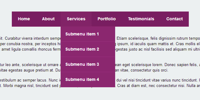
Flaunt.js is a jQuery script that allows you to create a responsive, nested navigation out the box. Flaunt was built to overcome responsive design challenges which faced a huge percentage of websites. This challenge was to show nested navigation items on click-demand, without the event taking you through to the page you've pressed...
For instance, let's say 'Services' is a top level menu item, and the nested navigation are the list of services, once clicked on the 'Services' tab, this will then direct you to 'services.php' won't it. But how does someone visit an individual services page when the nested items are hidden, on a touch device? They can't rely on :hover pseudo selectors for this - so let's look at what Flaunt does.
HTML
Let's establish the markup to see how Flaunt will benefit us:
<!-- Nav -->
<nav class="nav">
  <ul class="nav-list">
    <li class="nav-item">
      <a href="?=home">Home</a>
      <ul class="nav-submenu">
        <li class="nav-submenu-item">
          <a href="?=submenu-1">Submenu item 1</a>
        </li>
        <li class="nav-submenu-item">
          <a href="?=submenu-2">Submenu item 2</a>
        </li>
        <li class="nav-submenu-item">
          <a href="?=submenu-3">Submenu item 3</a>
        </li>
        <li class="nav-submenu-item">
          <a href="?=submenu-4">Submenu item 4</a>
        </li>
      </ul>
    </li>
    <li class="nav-item">
      <a href="?=about">About</a>
    </li>
    <li class="nav-item">
      <a href="?=services">Services</a>
      <ul class="nav-submenu">
        <li class="nav-submenu-item">
          <a href="?=submenu-1">Submenu item 1</a>
        </li>
        <li class="nav-submenu-item">
          <a href="?=submenu-2">Submenu item 2</a>
        </li>
        <li class="nav-submenu-item">
          <a href="?=submenu-3">Submenu item 3</a>
        </li>
        <li class="nav-submenu-item">
          <a href="?=submenu-4">Submenu item 4</a>
        </li>
      </ul>
    </li>
    <li class="nav-item">
      <a href="?=portfolio">Portfolio</a>
    </li>
    <li class="nav-item">
      <a href="?=testimonials">Testimonials</a>
    </li>
    <li class="nav-item">
      <a href="?=contact">Contact</a>
    </li>
  </ul>
</nav>
<!-- /Nav -->
Nothing out the ordinary, no extra components, in essence, it's a bare-bones HTML5 navigation structure. This is where Flaunt comes in to establish some grounding and read your code.
jQuery
First I'm going to take a plugin coding style to the approach, wrapping the jQuery function in a protective case:
;(function($) {
  // Go jQuery
})(jQuery);
This passes 'jQuery' (you can see the brackets at the end) and uses the dollar sign, which is good for two reasons, using with other libraries, and it's wrapped in an IIFE, immediately-invoked function expression. This technically calls itself once loaded. You'll notice a semi-colon at the beginning also, this is a safety net for any other scripts on the page booting up console errors, we don't want it damaging our script!
I'm going to take this frame, and add a DOM ready wrapper inside it also so it fires as soon as the document tree is established:
;(function($) {

  // DOM ready
  $(function() {
    // Go jQuery
  });

})(jQuery);
Now we actually need to do something. Let's create that three-line button for toggling our navigation's visibility. Noting back to our HTML, our navigation is class named '.nav', so let's target that:
$('.nav').append($('<div class="nav-mobile"></div>'));
jQuery will then parse this function and create our markup for us on-the-fly, and append it to the '.nav' class.
Now we need to add our toggle button, which will contain the arrow for clicking:
$('.nav-item').has('ul').prepend('<span class="nav-click"><i class="nav-arrow"></i></span>');
I originally used jQuery's $.each(); function for this, but I've managed to save doing that. Using jQuery's class selector, we've already created a loop, just this has an extension of additionally filtering for .has(); function, which saves around 5 lines of code altogether.
Our newly created <span> and <i> elements will act as our clickable item, the <i> element is to hold the arrow, which I want to use CSS3 transforms to invert it once clicked (and not the containing wrapper as this interferes with our styles). Styling the elements looks like so:
.nav-click {
  position:absolute;
  top:0;
  right:0;
  display:none;
  border-left:1px solid #8B2870;
  height:49px;
  width:50px;
  cursor:pointer;
}
.nav-click i {
  display:block;
  height:48px;
  width:48px;
  background:url(../img/drop.svg) no-repeat center center;
  background-size:20px;
}
I've positioned the element absolute (and of course relative on the parent) to gain access to the inside of the container. I've used an (SVG)[toddmotto.com/mastering-svg-use-for-a-retina-web-fallbacks-with-png-script] as well for the image, which means retina displays (and normal displays even look better) will look crisp with no distortion. SVG's aren't pixel-based so are infinitely scalable.
Now the elements are in place and good to ship, we need to add some functionality! Let's give the mobile nav some clickability:
$('.nav-mobile').click(function(){
  $('.nav-list').toggle();
});
Again, as per my previous article on responsive navigation, this keeps animation down to a low, it sucks on mobile and instead of animation I've used a simple .toggle(); function, which essentially changes the styles from display:none; todisplay:block;, in toggle fashion.
The next part is where things get interesting and we need to dynamically attach an event, to dynamically created markup. We can't simple run a click function on this, as the markup doesn't have event handlers attached. See above article link for a pure JavaScript way of doing this, but in this we're using jQuery, which is where the .on(); function sits quite nicely.
First thing's first, the way we attach event handlers is to think parent then child. So first we need to target the parent of wherever the dynamically created element will sit:
$('.nav-list').on('click');
...And then specify our dynamically created element inside of it:
$('.nav-list').on('click', '.nav-click', function(){
  // Dynamic events
});
I can then toggle the visibility of the nested menu using the .toggle(); method:
$(this).siblings('.nav-submenu').toggle();
I want to now signify to the user that something has happened, thankfully the :hover CSS selector takes care of a simulated '.active' class, but let's invert that arrow so it looks like it has open and close functionality. This is simply done by toggling a class:
$(this).children('.nav-arrow').toggleClass('nav-rotate');
The above targets our dynamically created <i> element, which we flip upside down using CSS3. The above toggles the 'nav-rotate' class, which the CSS for looks like this:
.nav-rotate {
  -webkit-transform:rotate(180deg);
  -moz-transform:rotate(180deg);
  -ms-transform:rotate(180deg);
  -o-transform:rotate(180deg);
  transform:rotate(180deg);
}
'Disabling' hover events for 'mobile'
This navigation was meant to be built to overcome hover events on touch devices, which means that there was one problem: desktop navigation hover events. I used a simple show/hide for the desktop navigation, which uses CSS to change the display method. This causes problems however when trying to hover over the same elements, whilst in responsive view...
...The hover event fires, revealing the nested menu, damn! The responsive navigation is only allowed to open once the arrow is clicked, which is bad news for us when we use a mouse on desktops as hover events fire, and also we don't want it opening when the hover event is simulated on touch too (when something is clicked). So what I've done is simply block the navigation inside the media queries, to simply display:none; for mobile responsive view. Here's how it's done:
@media only screen and (min-width: 320px) and (max-width: 768px) {
  .nav-item:hover .nav-submenu {
    display:none;
  }
}
This tells it to display absolutely nothing upon hovering, which is a neat little trick to avoid using the !important method...
Learning curve
I'll be honest, I ran into the above problem and only managed to fix it with the !important method as a dirty little hack in the media queries and jQuery. It was only when writing this up the solution came into my head (another reason to write this stuff down!). Here's what I had for the .on(); event:
var clicks = $(this).data('clicks');
if (!clicks) {
  $(this).siblings('.nav-submenu').attr('style','display: block !important');
} else {
  $(this).siblings('.nav-submenu').removeAttr('style');
}
$(this).data('clicks', !clicks);
This effectively simulates odd and even clicks, allowing me to use an overpowering 'display:block' with !important attached, and then remove the style completely on the next click. It then dawned on me that instead of using a 'display:none !important;' on the nested navigation, I could fire an empty event using the pseudo selector just as easy with CSS! Take a look:
.nav-submenu {
  display:none !important;
}
So that's what I had in the media query, telling it to never ever ever display block! And then using the above 'display: block !important' in the jQuery to totally override that as well. Well, a nice learning curve nonetheless, and one I felt was worth sharing as you can easily turn a hack technique into a fix idea and final solution that works perfectly.
Altogether now
Putting the above together, you can see the final solution:
;(function($) {

  // DOM ready
  $(function() {

    // Append the mobile icon nav
    $('.nav').append($('<div class="nav-mobile"></div>'));

    // Add a <span> to every .nav-item that has a <ul> inside
    $('.nav-item').has('ul').prepend('<span class="nav-click"><i class="nav-arrow"></i></span>');

    // Click to reveal the nav
    $('.nav-mobile').click(function(){
      $('.nav-list').toggle();
    });

    // Dynamic binding to on 'click'
    $('.nav-list').on('click', '.nav-click', function(){

      // Toggle the nested nav
      $(this).siblings('.nav-submenu').toggle();

      // Toggle the arrow using CSS3 transforms
      $(this).children('.nav-arrow').toggleClass('nav-rotate');

    });

  });

})(jQuery);
 JS Tutorial


